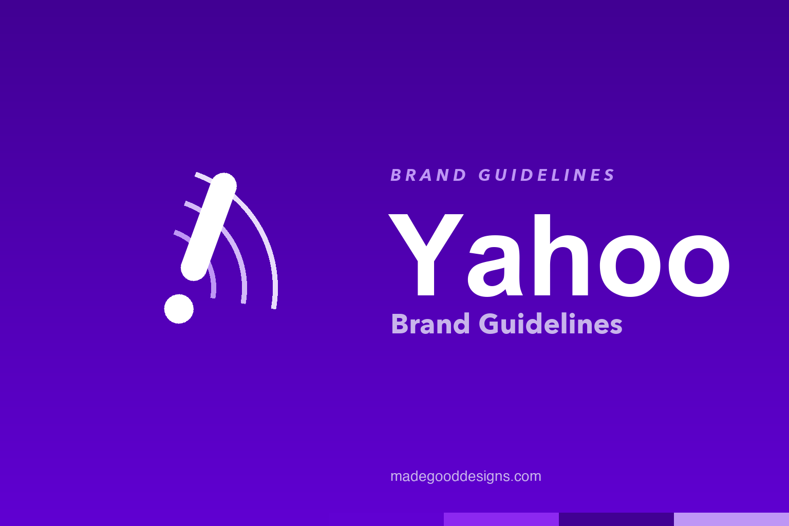
Yahoo Brand Guidelines
A purple exclamation point tilted at a precise 22.5 degrees — the whole rebrand pivots on one very deliberate angle.
Aa
Two ideas: the exclamation as an amplifier, tilted 22.5°, and a geometric voice. Homage renderings — deliberately not the Yahoo! wordmark or its exact mark.
The amplification mark
The exclamation point has been part of “Yahoo!” since 1995 — the 2019 rebrand finally made it the whole point.
In 2019, Pentagram — partner Michael Bierut and team — redrew the Yahoo identity around a single geometric idea: the “y” and the exclamation mark are both set at exactly 22.5 degrees, precisely one-sixteenth of a circle, bracketing the wordmark between two matching diagonals. The concept positions Yahoo as an “amplification brand,” with the “!” as the amplifier — it turns up the volume on everything beside it. It replaced the widely-criticised 2013 logo, and the discipline of that one repeated angle is what gives the mark its snap.
A quarter-turn of history
Few big brands have redesigned quite as publicly — or as awkwardly — as Yahoo did in 2013.
The “Yahoo!” name has carried its exclamation mark since 1995, through the quirky late-’90s wordmark and the flat purple versions that made purple the signature colour around 2009. The infamous chapter came in 2013, when a redesign was done in-house under CEO Marissa Mayer and teased through a “30 Days of Change” campaign — a new provisional logo revealed every day for a month before the final reveal. It was widely mocked. The 2019 Pentagram work was, in effect, the grown-up correction: keep the purple and the “!”, lose the fussiness.
Colour: grape jelly
Yahoo’s purple has playful official names but no official hex. Click a swatch to copy the (reconstructed) values.
Here’s a fun honesty note: Pentagram published the palette as names, not hex codes — the primary purple is called “grape jelly,” with secondaries “hulk pants” and “malbec.” The value everyone cites for grape jelly is #6001D2, but that’s a community reconstruction, not an official number, so treat the hexes below as approximate. Purple has anchored Yahoo since 2009; the 2019 refresh simply made it richer and more confident. Copy them below.
Type: Centra No. 2
The wordmark isn’t a bespoke “Yahoo font” — it’s a sharpened cut of an existing geometric sans.
A common myth is that Yahoo commissioned a custom typeface. It didn’t: the wordmark is set in Centra No. 2 Extrabold by Sharp Type (designer Josh Finklea), with the letters customised to be more geometric and compact. It’s a smart, economical approach — take a strong existing geometric sans and tune it, rather than build from scratch. The result feels modern and friendly without losing Yahoo’s playful streak. The specimen below is set in a comparable geometric sans.
Turn it up
Compact, geometric and confident — a wordmark tuned for that amplified, exclamatory energy. (Specimen set in Sora, a geometric sans in Centra’s spirit.)
The name, the backronym and the yodel
Before the purple and the exclamation point, Yahoo was a joke about being a jumble — and one of the most famous sounds in advertising.
The name comes from Jonathan Swift’s Gulliver’s Travels, where the “Yahoos” are crude, uncivilised brutes — founders Jerry Yang and David Filo reportedly liked calling themselves yahoos. The company later supplied a tongue-in-cheek backronym: “Yet Another Hierarchically Organized Oracle,” a nod to Yahoo’s origins in 1994 as a hand-built directory of the early web rather than a search algorithm. The trailing exclamation mark has been part of the wordmark almost from the very beginning — the small piece of punctuation that the 2019 rebrand eventually promoted to the star of the whole identity.
Yahoo’s other great brand asset was sound. The three-second, a-cappella “Yahoo!” yodel, introduced in late-1990s television advertising, became one of the most recognisable pieces of sonic branding ever made — a cheerful, human exclamation that matched the company’s playful, slightly goofy personality. Performed by a professional yodeler and tweaked over the years, it stayed lodged in people’s memories long after the ads themselves faded. That exclamatory energy — the “!”, the yodel, the loud purple — is the connective thread across every era of a company that changed shape constantly. Seen that way, Pentagram’s 2019 work simply distilled what was always there: the amplification idea is really just the yodel, drawn as a mark.
Explore & save
Keep Yahoo’s system on hand — save it to a board in the Made Good inspiration library.
Yahoo identity set
Pin the amplification mark, the purple and the geometric type to your own board.