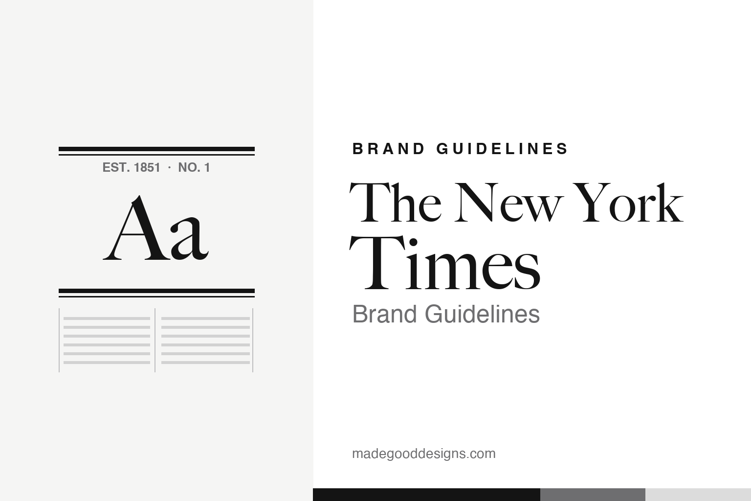
The New York Times Brand Guidelines
A blackletter nameplate that has barely changed since 1851, a signature serif, and a palette of exactly two colours.
EST. 1851 · NO. 1Aa
Aa
Two constants: the ruled masthead and a blackletter tradition. Homage renderings — deliberately not the “New York Times” wordmark, which is protected.
The paper of record
Almost everything about the brand is designed to say one thing: trust us, we’ve been doing this a very long time.
The paper published its first issue on 18 September 1851 as the New-York Daily Times — hyphen and all. When Adolph Ochs took over in 1896, he dropped the hyphen from “New-York,” coined the slogan “All the News That’s Fit to Print” (on the front page from early 1897), and set the tone that still defines the brand: sober, authoritative, the self-described “paper of record.” The blackletter nameplate — a Textura gothic, hand-lettered rather than set in any off-the-shelf font — is the visual anchor of all of it. In an industry that rebrands constantly, its greatest asset is how little it has changed.
The masthead that barely changed
The one significant redraw in over 170 years cost the paper a thousand readers — over a single full stop.
For more than a century, the nameplate carried a period at the end — “The New York Times.” On 21 February 1967, lettering artist Ed Benguiat, working with art director Louis Silverstein, subtly redrew the wordmark: he reshaped the letters, swapped a small motif inside the “T” (out went a tiny arrow, in came a diamond), and removed the period. The change was so quietly beloved that the paper reportedly lost around a thousand subscribers in protest. It’s the perfect illustration of masthead equity: when a mark is this trusted, even a punctuation mark is a design decision with consequences.
Colour: black and white
There is no “Times blue.” The absence of a brand colour is itself the brand. Click a swatch to copy the hex.
The Times has, effectively, no accent colour — it lives in black ink on white paper, with a ladder of greys for hierarchy on screen. That restraint reads as seriousness: no bright hue is trying to sell you anything, which is exactly the impression a paper of record wants. It’s a useful counter-example to the modern instinct that every brand needs an ownable colour. Sometimes the most distinctive choice is to own none, and let the typography and the century of trust do the work. The greyscale below is a working system, not an official palette.
Type: Cheltenham & the custom families
Behind the gothic nameplate sits one of the most carefully tuned typographic systems in publishing.
The signature headline face is Cheltenham — originally drawn around 1896 by architect Bertram Grosvenor Goodhue — which the Times commissioned Matthew Carter to redraw as a bespoke NYT Cheltenham. It sits within a whole custom family: NYT Franklin (a Franklin Gothic for decks and UI), NYT Karnak (a bold slab for display) and NYT Imperial (the workhorse text face), most of it overseen by Carter. On the web, the Times reads in Georgia — also a Carter design — chosen for on-screen legibility. It’s a masterclass in a coherent type system: several voices, one accent.
All the News
That’s Fit to Print
A crisp old-style serif that signals authority without shouting. (Specimen set in Libre Caslon, an old-style serif in Cheltenham’s tradition.)
Beyond the nameplate: the graphics desk
The Times’ most modern design achievement has nothing to do with blackletter — it lives in its graphics and interactives.
For all the reverence around the 1851 nameplate, some of the paper’s most influential design work is barely a decade old. The Times’ graphics department has become a benchmark for data visualisation and digital storytelling: the 2012 feature “Snow Fall,” which wove text with full-bleed video and scroll-triggered graphics, won a Pulitzer and effectively named a genre of immersive web journalism that others rushed to copy. Election nights brought the famous live “needle,” a nerve-jangling real-time gauge that became appointment viewing in its own right.
This is the quiet other half of the brand. The blackletter masthead and the black-and-white restraint say permanence; the interactive and charting work says the institution can lead on new platforms rather than merely survive them. Crucially, the two never fight: the graphics inherit the same disciplined typographic system — the custom serifs and Franklin sans, tight grids, a sparing use of colour — so a Times chart reads as unmistakably the Times. It is the same lesson the nameplate teaches, applied to a screen: trust is built by consistency, and a paper of record earns the label by being as careful with a data graphic as with a front page.
Explore & save
Keep the Times’ system on hand — save it to a board in the Made Good inspiration library.
The New York Times identity set
Pin the masthead device, the blackletter tradition and the type to your own board.