National Geographic Brand Guidelines
A yellow rectangle that started life as a decorative magazine border — and became a window onto the whole world.
Aa
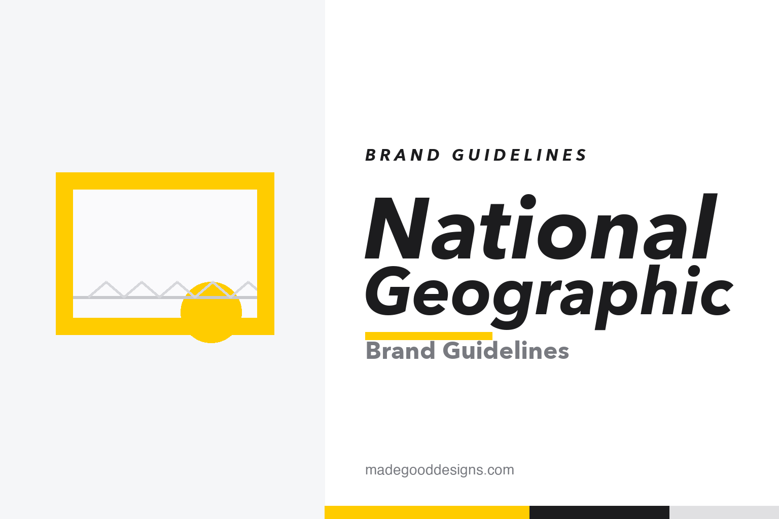
Two ideas: the yellow frame as a window onto the world, and a clean grotesque voice. Homage renderings — deliberately not the registered logo or the wordmark.
The most famous frame in publishing
It began as a decorative border and slowly stripped itself down to a single rectangle of yellow.
The yellow border first framed a National Geographic cover in February 1910 — then wrapped in an ornate wreath of oak and laurel leaves. Over the decades the ornament fell away: in 1959 the magazine began running photographs on the cover and shed the leafy trim, leaving just the strong yellow band. By the late 1990s that band had been distilled into a standalone yellow rectangle — an open frame that could stand entirely on its own, no illustration required. It is now one of the most recognized marks on earth, and a textbook lesson in reduction: a brand that spent a century subtracting until only the essential shape and colour remained.
A window on the world
The rectangle isn’t just a border — it’s a metaphor the brand builds everything around.
Read literally, the yellow frame is a window, a viewfinder, the edge of a magazine cover — a portal you look through to see somewhere far away. That single idea does an enormous amount of work: it positions National Geographic as the frame around exploration itself, whether the thing inside is a photograph, a film, or a map. Because the mark is an empty frame, it’s endlessly flexible — drop any image inside and the brand instantly claims it. Our homage above keeps that idea (a frame around a horizon) while staying deliberately clear of the real, trademarked proportions and lockup.
Colour
One saturated golden yellow does almost all the branding. Click a swatch to copy the hex.
National Geographic doesn’t publish a public brand-colour spec, so every value here is a community-reconstructed approximation — treat them as a starting point, not gospel. The yellow is most often reproduced around #FFCC00 (some references cite #FFD51C), roughly Pantone 115, and it’s paired almost entirely with black and white so nothing competes with it. The discipline is the point: a near-monochrome system that lets a single warm yellow do the recognizing.
The typeface: Geograph
In 2018 the brand commissioned a bespoke grotesque to match a mark that had to work everywhere.
For its 2018 identity overhaul, National Geographic worked with Klim Type Foundry — designers Kris Sowersby and Noe Blanco — on a custom typeface called Geograph, released that spring in display and editorial cuts. It’s a clean, neutral grotesque (drawing on Super Grotesk and Bauer Futura) built to stay quiet so the photography and the yellow can lead. Before Geograph, the brand paired Verlag for display with Neue Haas Grotesk for text. Geograph is licensed exclusively to National Geographic and isn’t sold, so the specimen below is set in a comparable open grotesque.
Explore Aa
A neutral grotesque that gets out of the way — so the image and the yellow frame carry the page. (Specimen set in Archivo, a grotesque in Geograph’s spirit.)
The Society behind the frame
The yellow rectangle carries so much authority because of what stands behind it: a scientific society nearly a century older than the logo.
The National Geographic Society was founded in 1888 in Washington, D.C., by a group of explorers and scholars as a nonprofit dedicated to “the increase and diffusion of geographic knowledge.” Its journal, National Geographic, first appeared in October 1888 as a dry scientific bulletin and only slowly became the photograph-led magazine the world knows. For well over a century the Society has funded expeditions, research and conservation, from deep-sea dives to archaeological digs. That heritage is the reason the yellow frame reads as trustworthy rather than merely decorative: the mark is backed by real fieldwork and real discovery.
It also explains why the “window” metaphor fits so naturally. An organization whose entire purpose is to bring distant places closer needs an identity that behaves like a viewfinder, and the empty yellow rectangle does exactly that — a border you look through at the wider world. As the brand extended from the magazine to television, maps and digital media, the frame travelled with it, lending the Society’s scientific authority to each new format. The genius of the identity is that a single shape can carry an institution’s whole mission: exploration, evidence and the quiet promise that whatever sits inside the yellow border has been judged worth looking at closely.
Explore & save
Keep the yellow-frame system on hand — save it to a board in the Made Good inspiration library.
National Geographic identity set
Pin the window device, the yellow and the grotesque voice to your own board.


