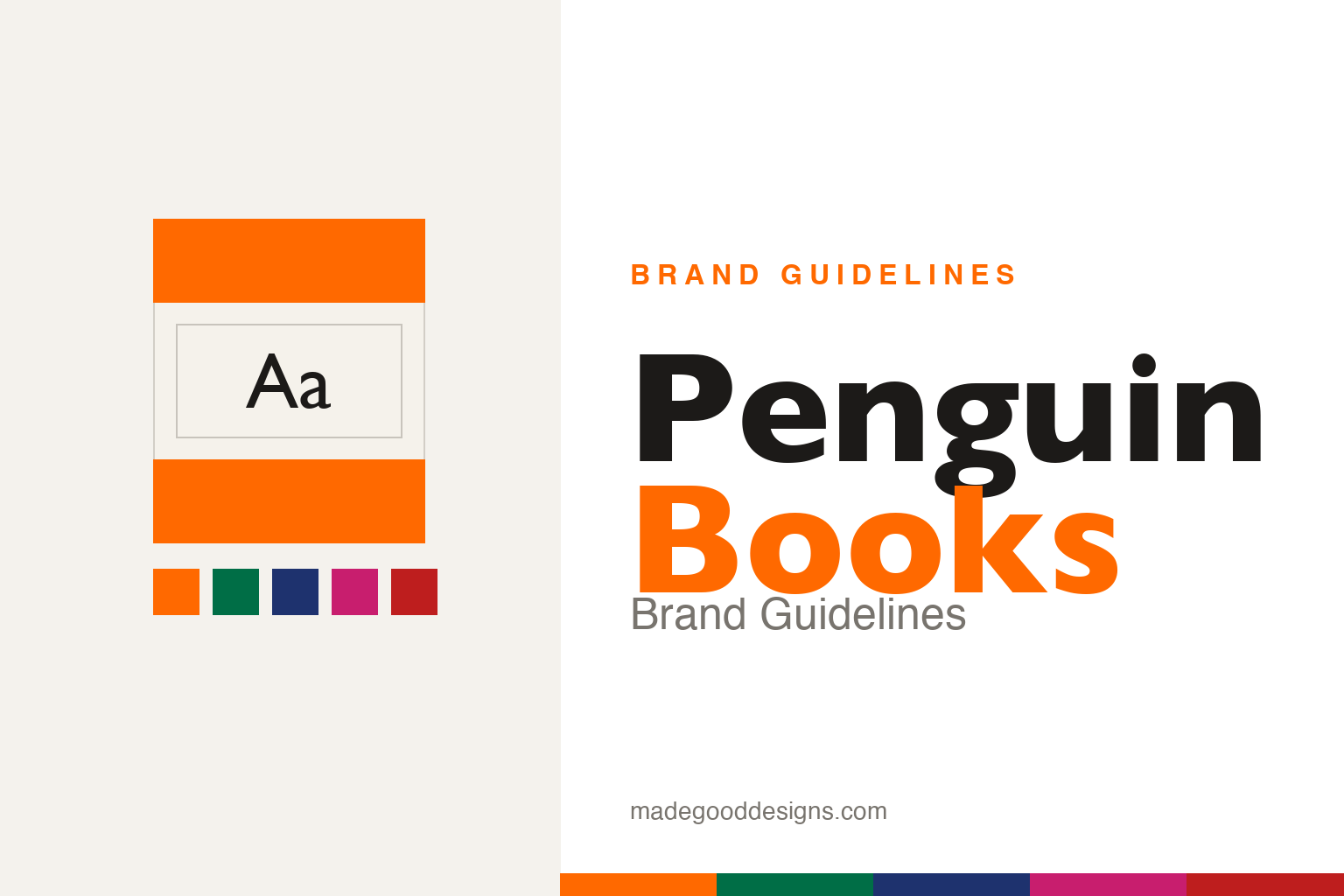
Penguin Books Brand Guidelines
A sixpenny paperback, three horizontal bands, and a grid so good it turned a publisher into a design institution.
Aa
Aa
Two constants: the three-band grid and a humanist sans in the Gill Sans lineage. Homage renderings — deliberately no penguin device and no “Penguin” imprint used as our own.
The book that cost a pack of cigarettes
A cheap paperback, priced at sixpence, that decided it could also be beautifully designed.
Penguin Books was founded in 1935 by Allen Lane, on the then-radical idea that quality writing could be sold as cheap paperbacks — sixpence each, the price of a packet of cigarettes — without looking cheap. Lane asked a young office colleague, Edward Young, to draw the emblem; Young reportedly went to London Zoo to sketch the penguins, and the brief for the little bird was famously “dignified but flippant.” That phrase captures the whole enterprise: serious books, presented with wit and impeccable design — a combination that made Penguin a cultural institution, not just a publisher.
The horizontal grid
Three bands and a colour code — the most influential paperback layout ever drawn.
Young’s 1935 cover system was gloriously simple: three horizontal bands — colour top and bottom, a white panel in the middle for the title and author, set in Gill Sans. The masterstroke was colour-coding by genre, so the shelf itself became a filing system: orange for fiction, green for crime, dark blue for biography, cerise for travel & adventure, red for drama (more colours followed later). A reader could spot the kind of book they wanted from across a shop. It’s information design decades ahead of its time — a grid so recognisable that a bare three-band layout still reads instantly as “Penguin.”
Note: these are historically printed ink colours; the hex values above are modern approximations, not an official spec.
The Marber grid
Twenty-six years later, one designer rebuilt the grid — and let the pictures back in.
By the early 1960s the rigid three-band look was feeling dated. In 1961, designer Romek Marber was commissioned to rework the Penguin Crime covers and produced the Marber grid — a proportioned system (based on Golden-Section-like proportions) that packed the title, author and price into thin boxes across the upper third, freeing the lower two-thirds for illustration and photography. Rolled out from 1962, it kept the branded green for crime but made the covers image-forward and modern. It’s a model lesson in evolving a beloved system: keep the recognisable bones (the grid, the colour), update everything else.
Type: Gill Sans & Tschichold
A humanist British sans and a Swiss master who wrote the rulebook.
Gill Sans — Eric Gill’s humanist sans-serif of 1928 — was used on Penguin covers from 1935 and became inseparable from the brand’s calm, literate look. Then, from 1947 to 1949, Penguin hired the great typographer Jan Tschichold to overhaul its typography across hundreds of titles. He wrote the four-page “Penguin Composition Rules,” a tight set of standards for setting text — indents, punctuation, capitals, folios — that lifted the internal typography to match the covers. Between Young’s grid and Tschichold’s rules, Penguin became a case study in total design: the object was considered from spine to last page.
Dignified
but flippant
A humanist sans that feels both authoritative and friendly — exactly Penguin’s tone. (Specimen set in Cabin, a humanist sans in the Gill Sans lineage.)
A library for everyone
Penguin’s design was never only about covers — it was the visible edge of a mission to put good books in every pocket.
Allen Lane’s gamble was social as much as commercial: that a mass audience would buy serious literature if it were cheap, portable and unpatronising. The tri-band grid served that mission by making a sixpenny paperback look considered rather than disposable, and the idea scaled into a family of sibling imprints, each with its own colour identity — the pale-blue Pelican non-fiction line launched in 1937 to bring ideas and scholarship to general readers, and Puffin bringing well-designed books to children. The same modular thinking that colour-coded fiction and crime let Penguin spin up a whole ecosystem of imprints that felt distinct yet unmistakably part of one house.
That is why a bare three-band cover still functions as cultural shorthand for accessible, trustworthy reading nearly ninety years on. The covers became collectable precisely because the system was so disciplined: a shelf of them reads as a designed set, and later art directors — from the image-forward Marber era to contemporary series like the Great Ideas and the clothbound Classics — have kept reinventing the surface while honouring the underlying grid. Penguin endures as the textbook case of identity as infrastructure: a rigorous, humane framework strong enough to carry decades of changing taste, and generous enough that the design itself quietly argued good things should be available to all.
Explore & save
Keep Penguin’s grid on hand — save it to a board in the Made Good inspiration library.
Penguin Books identity set
Pin the tri-band grid, the genre colours and the humanist type to your own board.


