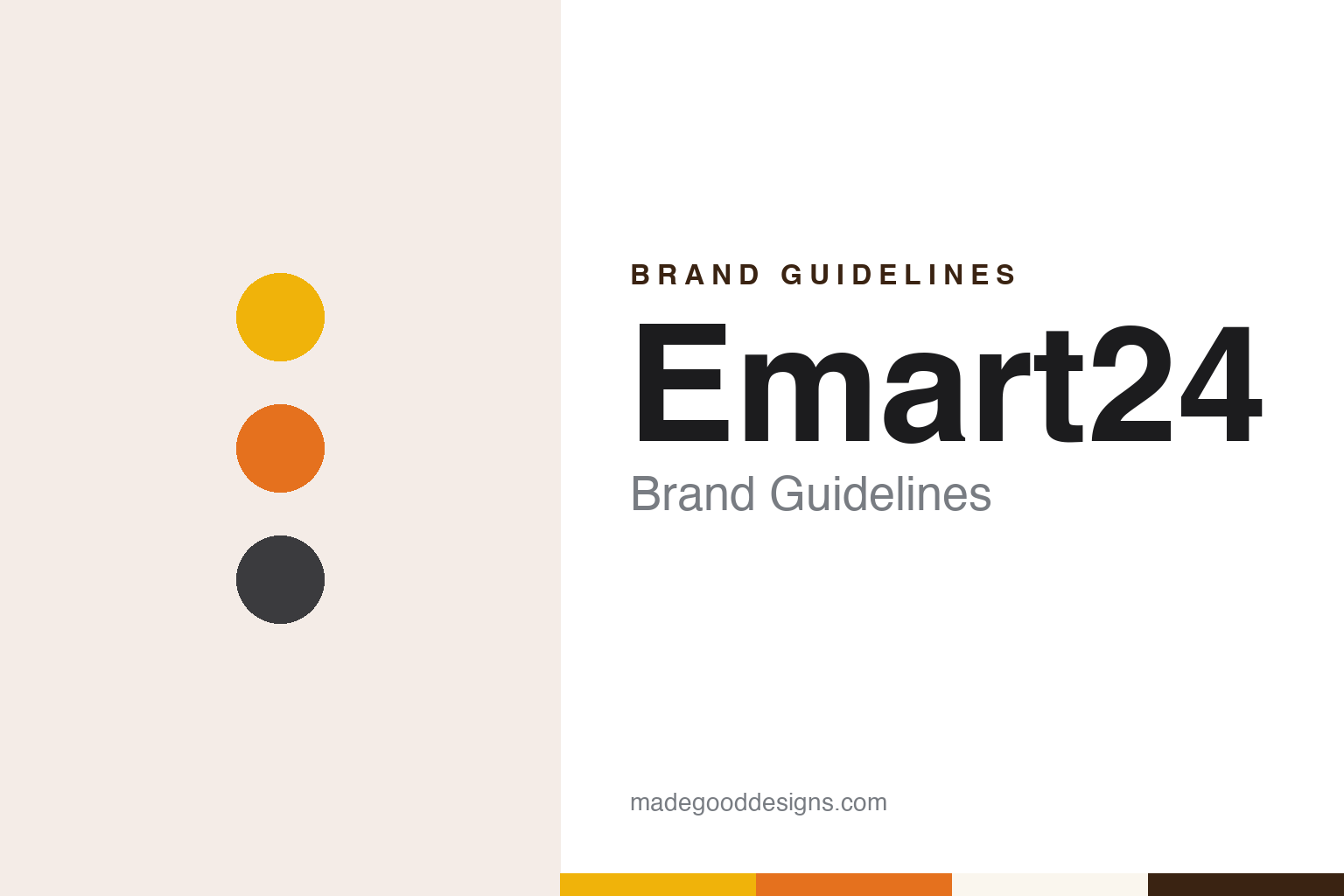
Emart24 Brand Guidelines
A small chain that borrowed its parent’s yellow, then turned orange.
Aa
Two constants: a deep yellow, orange and charcoal palette and a geometric grotesque register. Abstract homage — not an Emart24 or Shinsegae product or mark; no sign, logo or package is reproduced.
With Me
A small chain and a new kind of franchise.
Emart24 started life under another name. Korean Wikipedia says its predecessor, the convenience-store chain With Me, was founded in January 2003 and passed 100 stores in 2011. Korea JoongAng Daily reported in July 2014 that Shinsegae Group had acquired With Me the previous year, and the Korean business news site Bizwatch dates the purchase to December 2013. Korean Wikipedia places it in January 2014 and says the chain became a subsidiary of E-Mart, the group’s hypermarket company.
Shinsegae relaunched the chain with an unusual franchise model. At a press conference at the Westin Chosun Hotel in central Seoul in July 2014, Korea JoongAng Daily reported, the group said store owners would pay a fixed monthly fee instead of a royalty based on their sales, would no longer pay penalties on expected future revenue if they closed a shop, and could set their own opening hours and holidays rather than trade 24 hours a day, 365 days a year. The group would also supply goods to the stores on a monthly basis. At the time there were 130 With Me stores, a small number beside the large chains, the paper said.
Bizwatch wrote in December 2025 that Shinsegae began recruiting franchisees in 2014 on those terms, including the end of compulsory 24-hour opening. A photograph in the 2014 report showed a With Me banner in Banpo-dong, in southern Seoul, being changed to a new design. Korean Wikipedia says the operating company, previously called Emart FS, was renamed Emart Withme on 1 July 2016.
Colour
Emart’s name and Emart’s yellow.
On 13 July 2017 Shinsegae announced that With Me would be rebranded as Emart24, Korea JoongAng Daily reported, writing the name as Emart 24. The idea, the paper said, was to carry the recognisable identity of the group’s Emart discount chain over to its convenience stores, so that customers would see at once that the shops were run by Shinsegae. Emart’s characteristic yellow was to be used in the store interiors, and each shop would have a corner for Emart’s in-house brands, including No Brand and Peacock. Shinsegae had 1,765 With Me branches at the end of 2016, according to the same report.
The relaunch leaned towards a premium format, with larger shops than usual and some stores combined with cultural spaces. The paper cited a With Me branch in Chungmuro, central Seoul, opened in May 2017, which was four storeys tall with two floors fitted out as a cafe. Bizwatch dates the switch of brand name to August 2017, and Korean Wikipedia to July 2017. The company itself writes the name in lower case, as emart24.
Own labels have multiplied since. In December 2025 Bizwatch listed own brands sold only at Emart24, including Yellow, Seongsu310 and the wine label Como, alongside E-Mart’s No Brand. In November 2026 Yonhap reported seven bakery, snack and ready-meal products made with The Story, a publisher of first-edition facsimiles, each packed with a bookmark drawn from one of 12 classics, such as The Little Prince and Demian, printed with the original first-edition cover on the front and a line from the work on the back.
Typography
How Korean retailers present themselves.
South Korea’s large retailers tend to present themselves through formats before slogans. A single group may run hypermarkets, warehouse stores, supermarkets, convenience stores and online malls side by side, each with its own name on the fascia, and corporate pages usually open with a timeline: the first branch, the district it stood in, the year it opened, and then each new format as it was added.
The big-box stores carry much of their identity on the shelf. Hypermarkets sell groceries alongside clothing, household goods and electronics under one roof, and own labels give them names to point to in the aisle, from value ranges to premium ready meals. Warehouse formats lean on large packs and goods shown in boxes or on pallets, so that the display itself signals the way the store sells.
Department stores and convenience chains work at opposite scales. Department-store groups put their weight into the building, the façade and the flagship in a city centre, while convenience chains rely on a short name and a bright fascia that has to read from a street corner and repeat across a large network of small shops. Beauty and lifestyle chains, and the apps that sit alongside all of these stores, carry the same names into a much smaller frame.
Behind the shop fronts sit corporate structures that the companies set out in plain terms: founding groups, spin-offs, joint ventures with foreign retailers, private-equity owners and listings on the Korea Exchange. Names have changed as partners arrived or left, and some chains have gone through court-supervised rehabilitation. For a designer, that history explains why a fascia, a logotype or an own-label pack looks the way it does today.
Aa
A geometric grotesque for a lower-case name and a number. (Specimen set in Manrope, a sans STAND-IN; NOT the Emart24 logo.)
Emart24
A deeper yellow, an orange sign and a white logo.
Eight years after the rebrand, the shops changed again. Maeil Business Newspaper reported that a flagship called Trend Lab Seongsu opened on 28 November 2025 outside Seongsu station in Seoul: a 100-square-metre, 24-hour shop finished in exposed concrete and steel columns, and the first flagship since the rebranding, with zones for brand pop-ups, character goods and a takeaway cafe. On 3 December 2025 the company opened the Magok Premium store in Gangseo District, Seoul, which Bizwatch described as the first complete redesign of a store since 2017 and a prototype for new openings.
Bizwatch described the change in colour. The old Emart24 sign set the “e” and the “24” in yellow on a yellow and grey ground, using the same yellow as the parent company E-Mart to show that this was E-Mart’s convenience store. The new sign uses a deeper yellow and an orange base with a white logo. Inside, the older stores’ black fittings and dark orange lighting give way to bright white light and wood tones, and the floor is divided into three zones: Live Playground for new and trend-led products, Fresh Lane for chilled and fresh food, and CVS Essentials for everyday goods and services such as parcels.
The network has shrunk in recent years. According to Bizwatch, Emart24 had 6,598 stores at the end of 2023, 6,130 at the end of 2024 and 5,747 at the end of September 2025. Abroad, the trade site Marketing-Interactive reported in June 2021 that emart24 had opened a first “reserve store” in Bangsar South, Malaysia, with its first general store to follow in Hartamas, selling Korean street food, fresh coffee and the I’m e and No Brand private labels; Korean Wikipedia dates the Malaysian launch to 1 July 2021.
For a design guide, Emart24 shows how a small chain can borrow a parent’s colour to be recognised, and then move to a palette of its own when it redesigns its stores. Compare E-Mart, the hypermarket chain whose name and yellow it took, and CU, another South Korean convenience chain. For this guide we use a deep yellow, an orange and a charcoal grey with a sans, an unofficial interpretation; no product or logo is reproduced.
Explore & save
Keep Emart24’s identity on hand — save it to a board in the Made Good inspiration library.
Emart24 identity set
Pin the Emart24 deep yellow, orange and charcoal palette and the geometric grotesque register to your own board.