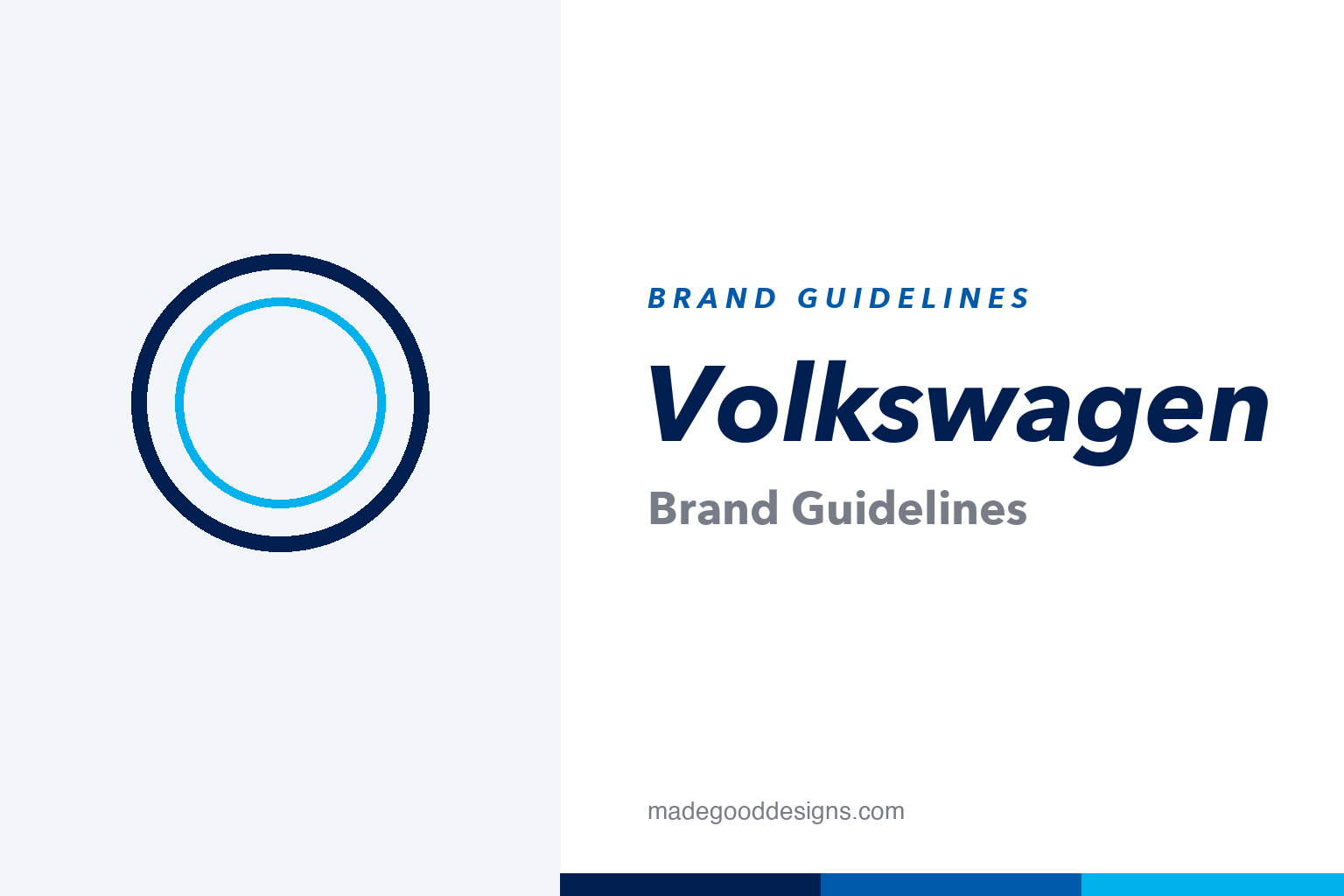
Volkswagen Brand Guidelines
One of the world’s most continuous logos, flattened from shiny chrome into clean blue lines for the electric age.
Aa
Two ideas: a flat blue ring and a clean grotesque voice. Homage renderings — deliberately not the V-over-W roundel, which is a protected trademark.
The flattening
The 2019 rebrand did to the badge what the whole industry did to logos — took away the shine.
At the 2019 Frankfurt Motor Show, Volkswagen unveiled a new identity on its ID.3 electric car: the old 3D chrome roundel was flattened into a minimal 2D mark — a single thin ring with the letters as clean open negative space. Framed as the “start of a new era,” it was a deliberate reset toward e-mobility (and, quietly, a fresh start after Dieselgate). The work was developed largely in-house with agency partners, led by MetaDesign alongside Grabarz & Partner and others. It’s a textbook example of the 2010s “flat design” wave reaching even a 1930s car badge.
A monogram from the 1930s
The V-stacked-over-W has survived war, reinvention and eight decades of car design almost untouched.
The V-over-W monogram inside a circle has anchored the brand since the late 1930s, and every redesign since has restyled the same mark rather than replaced it — remarkable continuity for any logo. Its origins are genuinely debated: it’s commonly credited to Franz Reimspieß, said to have won an in-house design competition around 1937, though a rival claim by designer Nikolai Borg (1939) was heard and rejected by a Vienna court in 2005. Early versions carried a cog-toothed ring and “wings”; the modern mark stripped all that away. Treat the authorship as “commonly credited,” not settled — a good habit with any famous origin story.
Colour: Volkswagen navy
A deep petrol-navy, joined by a fresh lighter blue for the electric era. Click a swatch to copy the hex.
The one well-verified brand colour is Volkswagen navy #001E50 (Pantone 2766 C) — the deep blue of the 2019 flat mark. The rebrand also “expanded” the palette with a lighter, cleaner blue to signal clean energy, but here’s the honest caveat: no official hex for that lighter blue is publicly documented, so values like #00B1EB below are community reconstructions, not confirmed brand numbers. Copy the working values below, treating only the navy as verified.
Type: VW Head & VW Text
A bespoke two-part type system, drawn to stay legible from a billboard down to a dashboard.
Volkswagen uses a custom pairing — VW Head for headlines and large sizes, and VW Text for body copy — designed by Hannes von Döhren (HvD Fonts) with Livius Dietzel and released in 2015, replacing the earlier “VW Headline” that had been in use since 1997. They’re clean, humanist, screen-optimised sans-serifs — quietly doing the unglamorous work of consistency across every touchpoint. One myth to retire while we’re here: the famous “Das Auto” slogan was dropped around 2015–16 (post-Dieselgate), not as part of the 2019 logo change. The specimen below is set in a comparable grotesque.
A new era
Humanist, neutral and screen-ready — type built to be invisible and everywhere at once. (Specimen set in Archivo, a grotesque in VW Head’s spirit.)
The People’s Car and “Think Small”
The name means “people’s car” — and the most famous chapter of VW’s design story was written not on the badge but in its advertising.
Volkswagen translates literally as “the people’s car,” a mass-market ideal that shaped how the brand presents itself: approachable, unpretentious, quietly clever. Nothing carried that further than the legendary “Think Small” campaign, created for VW by the New York agency Doyle Dane Bernbach (DDB) in 1959 to sell the Beetle in a country obsessed with big chrome cars. Acres of white space, a tiny car marooned in the corner of the page, dry self-deprecating headlines — it was the opposite of everything American advertising did at the time, and it is routinely voted one of the greatest ad campaigns of the twentieth century.
That campaign set a tone the brand still trades on: honest, minimal, confident enough to make a joke at its own expense. It’s the same instinct that, sixty years later, produced a flat, stripped-back roundel and a clean grotesque type system — reduction as a design value, inherited directly from “Think Small.” The modern identity’s calm navy and generous spacing are recognisably descended from those 1960s layouts. For a company whose history also includes genuine turmoil — its wartime origins and the 2015 Dieselgate scandal — the plain, friendly design language does real work, positioning Volkswagen once again as the sensible, human choice. The badge may be the constant, but the brand’s character lives in that restraint.
Explore & save
Keep Volkswagen’s system on hand — save it to a board in the Made Good inspiration library.
Volkswagen identity set
Pin the flat-ring idea, the blue palette and the grotesque type to your own board.