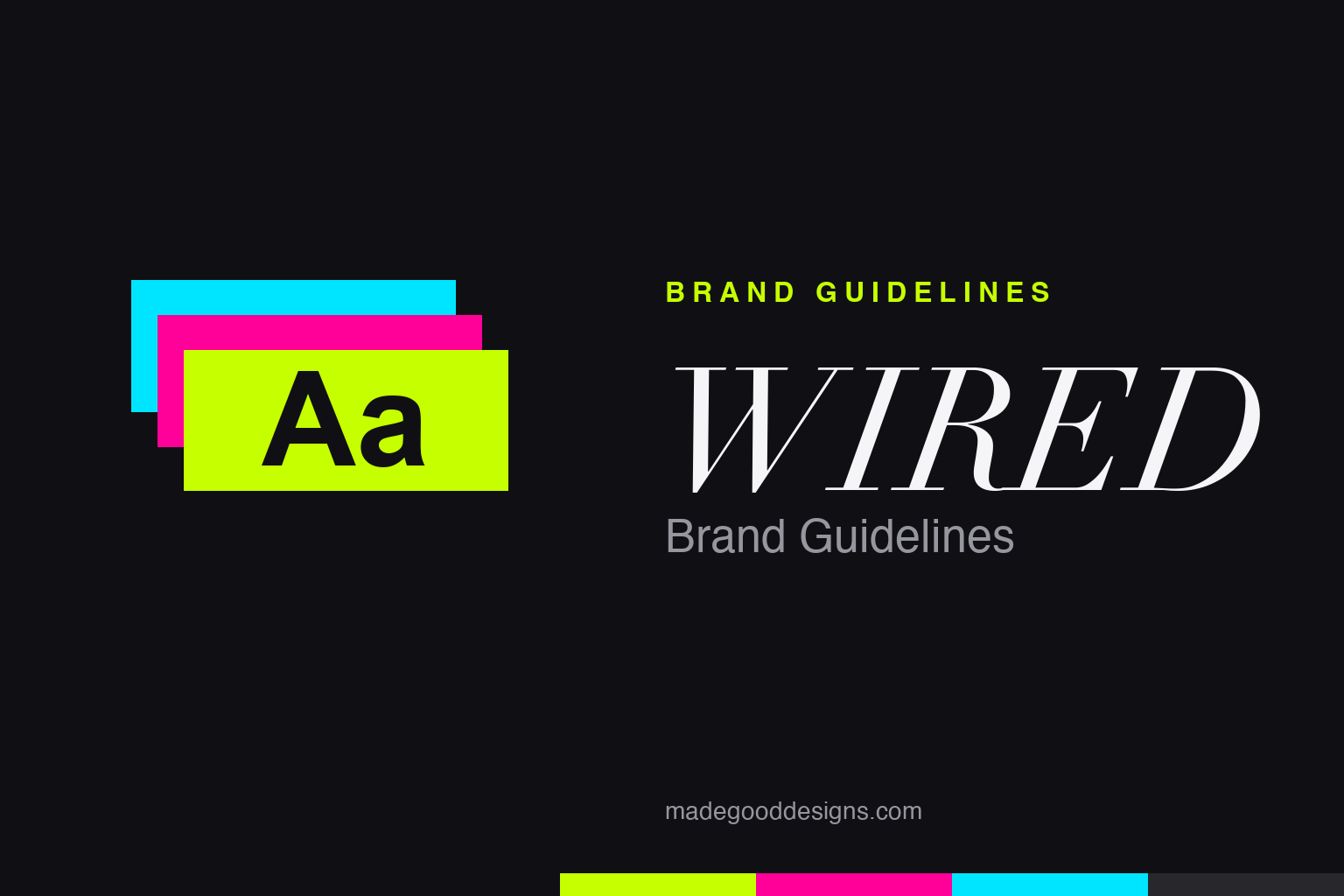
WIRED Brand Guidelines
A 1993 magazine that printed the future in fluorescent ink — and broke every rule of how a page was supposed to look.
Aa
Aa
Two poles: day-glo fluorescent energy and a high-contrast Didone for headlines. Homage renderings — a colour/type study, deliberately not the WIRED wordmark.
The magazine that looked like the future
WIRED didn’t just write about the digital revolution — it made the printed page look like it had already arrived.
WIRED launched in 1993, founded by Louis Rossetto and Jane Metcalfe, with an identity by designers John Plunkett and Barbara Kuhr (Plunkett+Kuhr). The look was gleefully chaotic: clashing type, layered layouts, and — most famously — fluorescent and metallic inks. It read as techno-optimism made visible, and it broke enough conventions that people called it “the Rolling Stone of technology.” Condé Nast acquired it fully in 1998. The through-line ever since: WIRED’s design is supposed to feel a step ahead of everyone else’s.
Ink you could almost hear
The early WIRED’s signature wasn’t a logo — it was a printing decision most magazines would never dare make.
To get those electric colours, early WIRED was printed on a six-colour press — the kind normally reserved for glossy annual reports — loaded with day-glo fluorescents and metallics. Pages buzzed. Type ran hot pink on lime, silver on black; readability sometimes came second to energy. It was a deliberate provocation: if the subject was a loud, accelerating digital future, the object in your hands should feel loud and accelerating too. Few brands have ever matched form to subject this literally — the magazine about the future was printed like nothing from the present.
Colour: the day-glo heritage
Fluorescent by birth, stark black-and-white today. Click a swatch to copy the hex.
Here’s the honest caveat: WIRED has no publicly documented brand-colour palette, so every hex is a reconstruction — but the heritage is unmistakably fluorescent: electric limes, hot magentas, cyans. The modern US flagship reads mostly as black-on-white editorial with a bold accent, a calmer descendant of the day-glo years. The swatches below evoke that heritage energy; treat them as illustrative, not an official spec. Copy them below.
Type: Ambroise & custom headlines
The grown-up WIRED swapped chaos for a razor-sharp Didone — a total gear-change in tone.
From around 2013, WIRED leaned heavily on Ambroise — a high-contrast Didone display family by Jean François Porchez (Typofonderie) — pairing its elegant hairlines against bold sans text. Between 2014 and 2018 the magazine also ran custom headline lettering drawn on demand by Type Supply (Tal Leming). The 1990s launch used wilder, experimental type that’s harder to pin to specific names. The arc — from fluorescent anarchy to a poised Didone — is a neat lesson in how a brand can mature without losing its edge. The specimen below is set in a comparable Didone.
The future, now
Sharp hairlines and heavy stems — a Didone that feels expensive and modern at once. (Specimen set in Bodoni Moda, a Didone in Ambroise’s spirit.)
Covers that argued with you
WIRED’s design didn’t stay inside the magazine — its covers and art direction helped rewire how technology itself was pictured.
From the start, a WIRED cover was a statement, not a headshot. Where business magazines put serious executives in suits, WIRED put conceptual portraits, surreal illustration and typography that fought for attention, treating the digital future as a subject worthy of real visual ambition. Its art directors — the founding Plunkett+Kuhr team and later editors like Scott Dadich, whose redesigns won a stack of National Magazine Awards — turned the title into a proving ground for editorial design and information graphics, influencing a whole generation of technology and culture publications that followed in its wake.
The look always served an argument. WIRED launched with a genuine worldview — techno-optimism, the coming “digital revolution,” ideas evangelised by founding contributors like Nicholas Negroponte — and the maximalist design was that optimism made physical, a page that behaved like the accelerating world it described. Even as the US flagship matured into cleaner black-on-white spreads anchored by a sharp Didone, the instinct survived: WIRED covers still aim to feel a beat ahead, and the brand has carried that sensibility across global editions and a heavily art-directed website. The lesson designers keep taking from it is that form can be an argument — that how a story looks can insist on why it matters. Few magazines have ever matched their medium to their message quite so literally, or quite so loudly.
Explore & save
Keep WIRED’s system on hand — save it to a board in the Made Good inspiration library.
WIRED identity set
Pin the day-glo heritage, the fluorescent palette and the Didone to your own board.