Herman Miller Brand Guidelines
A red ‘M’ drawn in about an hour in 1946 — for the company that gave the world the Eames chair and the Aeron.
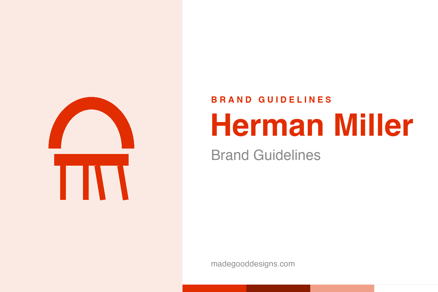
An abstract mid-century chair — the design idea, not the M. Deliberately not the Herman Miller mark.
An hour’s work, seventy-five years of service
Herman Miller’s M is a small masterpiece of speed and instinct.
The stylised red “M” of Herman Miller was created in 1946 by Irving Harper, working in the office of the legendary designer George Nelson. The story is design folklore: Nelson had first approached Paul Rand, who declined, so Harper reportedly drew the mark himself in about an hour — originally with a wood-grain texture, a nod to the company’s furniture. That quick, confident geometric M has served the brand for the better part of a century. It’s proof that great design isn’t always agonised over; sometimes a skilled hand and a clear idea produce something right, fast — and it lasts. Our homage nods to the company’s real glory, its furniture, with an abstract mid-century chair.
The best design money can sit on
Herman Miller’s logo represents a genuine design institution.
The M carries real weight because of what it stands for. Herman Miller isn’t just a furniture maker; it’s one of the most important names in modern design, the company that manufactured Charles and Ray Eames‘s chairs, George Nelson’s clocks and, later, the Aeron chair that redefined the modern office. To sit in a Herman Miller chair is to sit in design history. So the little red M functions as a seal of design credibility — a mark that says “this object was made by a company that takes design as seriously as anyone alive.” Few logos get to stand for a genuine canon of iconic products, and that association is the M’s real power.
From Zeeland to the world
The company behind the modern classics has humble roots.
Herman Miller’s origins are modest: it began as the Star Furniture Company in Zeeland, Michigan, in 1905, and was renamed Herman Miller in 1923 when D.J. De Pree bought the company and named it after his father-in-law, Herman Miller, a shareholder. So the brand is named after a man who was less a designer than a backer — another reminder that brand names are often quirks of history. What transformed the company was its decision, from the 1930s onward, to bet on modern design, partnering with figures like Gilbert Rohde, George Nelson and the Eameses. That gamble — treating design as the core of the business — is what turned a small Michigan furniture firm into a global icon, and it’s the substance behind the confident red M.
Into MillerKnoll
Two design giants, now under one roof.
In 2021, Herman Miller acquired its great rival Knoll (another titan of modern furniture, home to Mies van der Rohe and Saarinen designs) and the combined company became MillerKnoll — uniting two of the most storied names in 20th-century design. Through that change, the Herman Miller M endured as a product brand, its equity far too valuable to retire.
The endurance of that 1946 mark is the real lesson. A logo tied to a genuine legacy of great work becomes almost impossible to improve upon — it isn’t just a graphic, it’s a guarantee backed by decades of iconic objects. Harper’s hour-long sketch has outlived furniture trends, office revolutions and a mega-merger, because what it represents never went out of style: the belief that everyday objects deserve serious design. For a company whose whole identity is “we make design classics,” a clean, confident, mid-century M is exactly the right face — timeless in the same way the Eames chair is timeless. The smartest thing MillerKnoll can do with it is keep it, and keep earning it.
It’s worth restating the throughline, because it reaches far beyond Herman Miller: the marks that endure are the ones built on a single clear idea, drawn with restraint, and repeated faithfully long enough to mean something. Fashions fade and technologies change, but a distinctive, well-chosen symbol backed by real substance only grows more valuable with time. The lesson for anyone building an identity is not to be the loudest or the newest, but to be the most consistent and the most authentic — and then to hold that line for as long as it takes.
Type & the wordmark
A clean modern sans, in keeping with the furniture.
Herman Miller pairs the M with clean, modern sans-serif lettering — understated and contemporary, matching the restraint of its products. The specimen below stands in with a neutral sans.
Design for living
Even, modern, quiet — type as considered as a well-made chair. (Specimen set in Archivo, a neutral stand-in.)
Herman Miller red
One warm, confident red. Click a swatch to copy the hex.
Herman Miller’s mark lives in a warm red #E22D00, with black and white. Lead with the red below.
Explore & save
Keep the design-classic idea on hand — save the chair homage and the red to a board.
Herman Miller identity set
Pin the mid-century-chair homage, Herman Miller red and the modern wordmark to your own board.