Toblerone Brand Guidelines
A bear hidden in a mountain, a triangle borrowed from a cabaret — and a logo that recently lost its Swiss home.
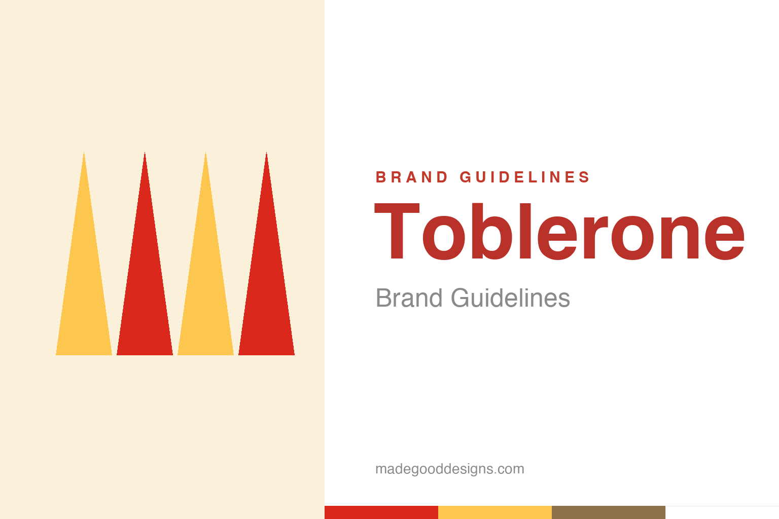
Abstract triangular prisms — the bar shape, not the mark. Deliberately not the Toblerone logo or mountain.
The most famous hidden logo
Toblerone’s mountain has a bear inside it — on purpose.
Toblerone’s packaging hides one of the design world’s favourite secrets. Inside the illustration of the Matterhorn mountain, in the shading, is the silhouette of a rearing bear. The bear is a nod to Bern, the Swiss city where Toblerone was made — Bern is nicknamed the “city of bears” and carries a bear on its coat of arms. Once you see it you can’t un-see it, and it has delighted fans for generations. (A caveat for the record: the hidden bear wasn’t in the very first 1908 design; it was worked into later renderings of the mountain.) It’s a perfect example of a logo rewarding a closer look. Our homage keeps the triangular-prism idea, without the mountain or the bear.
A triangle from a cabaret, not a mountain
The famous shape’s origin is a bigger surprise than the bear.
Everyone “knows” the triangular Toblerone bar is shaped like the Matterhorn — but that’s very likely a myth, a story retrofitted by later marketing. According to founder Theodor Tobler‘s own sons, the real inspiration for the distinctive triangular prism was the Folies-Bergères in Paris: specifically a pyramid formation the dancers made at the end of their show. So the shape that now reads as pure Swiss-Alpine may actually descend from a Parisian cabaret finale. It’s a delicious correction to make on a citation-grade page — the mountain association came after the shape, not before it. The bar’s geometry was showbiz before it was scenery.
Switzerland’s first patented chocolate
Toblerone is a genuine piece of chocolate history.
Toblerone was created in 1908 in Bern by Theodor Tobler and his cousin Emil Baumann, who developed its signature honey-and-almond nougat recipe. The name is a clever blend of “Tobler” and “torrone,” the Italian word for that kind of nougat. It was one of the first chocolate bars to be patented (its shape and process protected around 1909), a mark of how novel the triangular format was. From the start, then, Toblerone was built on distinctiveness — a unique shape, a unique recipe, a unique name — which is exactly why it became such a strong brand. When a product looks like nothing else on the shelf, the packaging design is already halfway to iconic.
The day it stopped being Swiss enough
A 2023 twist tested how much of the brand is the mountain.
In 2023, Toblerone made headlines for a strange reason: it had to remove the Matterhorn from its packaging. Owner Mondelēz had moved some production from Switzerland to Slovakia, and under Switzerland’s strict “Swissness” law, a product not made entirely in Switzerland can’t use national symbols like the Matterhorn or the phrase “Swiss chocolate.” So the mountain was swapped for a generic peak, and the packaging now reads “Established in Switzerland in 1908” rather than “of Switzerland.” (The hidden bear, reportedly, survived the redesign.)
It’s a fascinating collision of branding and law. A logo can be so tied to a place that a government regulates whether you’re allowed to use the place’s imagery — and a change in where you make a chocolate bar can force a redesign of a century-old identity. For designers and brand-owners it’s a sharp reminder that visual identity doesn’t exist in a vacuum: it’s bound up with provenance, regulation and authenticity claims. Toblerone’s mountain wasn’t just decoration; it was a legal assertion of Swissness — and when the substance behind that claim changed, the design had to change too. Few brand stories illustrate so neatly that a symbol is a promise, and promises can be held to account.
Type & the wordmark
A bold, heritage wordmark above the peak.
The Toblerone wordmark is a bold, characterful set of capitals with a heritage feel, sitting above the mountain illustration. The specimen below stands in with a sturdy display sans.
Triangle of talk
Bold, characterful, heritage — type with the confidence of a 1908 original. (Specimen set in Archivo, a neutral stand-in.)
Red & gold
Alpine red with a warm gold. Click a swatch to copy the hex.
Toblerone’s palette pairs a red #DA291C with a warm gold #FDC64F (and nougat browns), over white. Lead with red and gold below.
Explore & save
Keep the hidden-bear idea on hand — save the prism homage and the palette to a board.
Toblerone identity set
Pin the triangular-prism homage, the red-and-gold palette and the hidden-bear story to your own board.