Chevrolet Brand Guidelines
One of the most famous logos in the world — and nobody can agree where it actually came from.
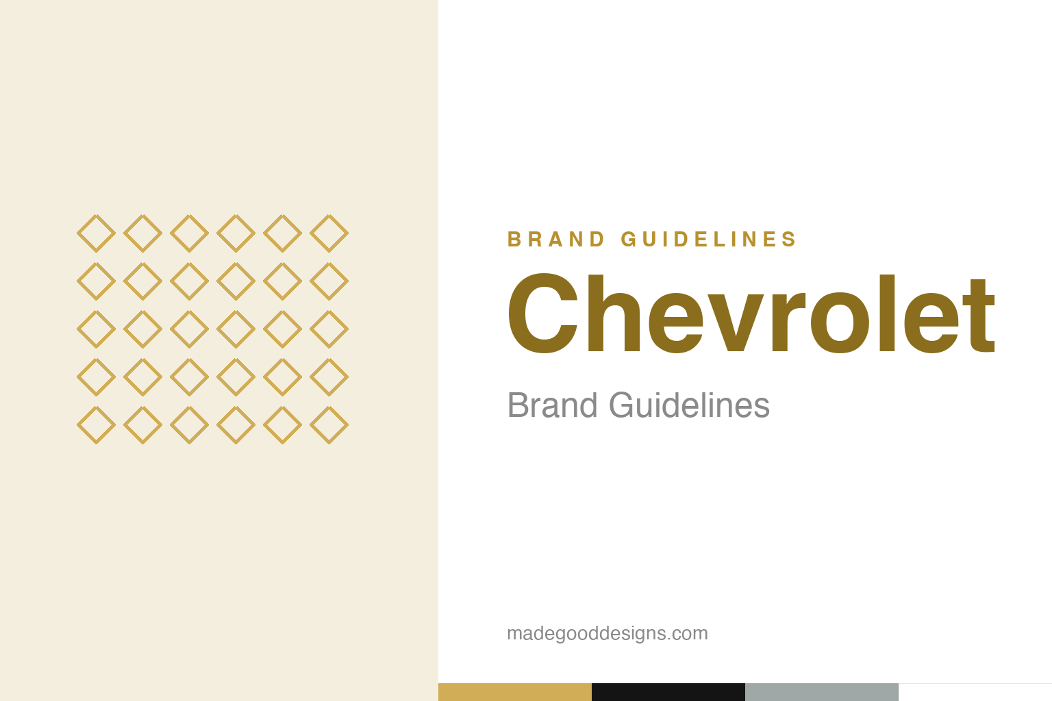
An abstract diamond wallpaper — a nod to the Paris-hotel origin tale, not the bowtie. Deliberately not the Chevrolet mark.
The most famous logo nobody can explain
Chevrolet’s bowtie has at least four origin stories.
The Chevrolet “bowtie” is one of the most recognised emblems on the planet — and its origin is a genuine, unsolved mystery, with several competing accounts. The most-repeated is co-founder William Durant‘s own: that he saw the shape on the wallpaper of a Paris hotel around 1908 and tore off a piece. But his widow, Catherine, gave different tellings — that he was inspired by a newspaper ad for “Coalettes” coal, or by an ad seen in a Hot Springs, Virginia hotel. And his daughter Margery wrote that he sketched it at the dinner table. There’s even a “stylised Swiss cross” theory. No account is proven, which makes the bowtie a fascinating case: a globally famous mark whose birth is lost to conflicting family memories. Our homage winks at the wallpaper story with an abstract diamond pattern.
Why the mystery is a gift
The uncertainty has become part of the brand’s lore.
Far from a problem, the bowtie’s murky origin is a branding asset. The mystery gives the logo a rich, romantic story to tell — multiple stories, in fact — and provides endless material for the kind of “did you know?” trivia that keeps a mark alive in conversation. People love a puzzle, and a century-old design whose true source nobody can pin down is exactly the sort of thing that gets written about, argued over and shared. It also reinforces the emblem’s age and heritage: this is a logo old enough that its beginnings have passed into legend. Where most companies would kill for a tidy, documented origin story, Chevrolet ended up with something arguably better — a genuine historical enigma attached to one of the simplest, most reproducible shapes in design.
A simple shape that scales forever
The bowtie endures because it’s almost nothing.
Whatever its origin, the bowtie’s simplicity is why it works. It’s an elemental geometric form — essentially an elongated, angled cross or a horizontal parallelogram — that is instantly recognisable, endlessly reproducible and effectively timeless. It reads clearly on a grille, a wheel-cap, a billboard or a tiny app icon; it can be rendered in flat gold, chrome, black or outline without losing its identity. That flexibility has let Chevrolet redraw and refinish it for over a century — gold, bowtie-in-chrome, various eras — while keeping the same unmistakable form. It’s the same lesson the strongest marks in this series keep teaching: an idea reduced to its essence stops needing improvement. The bowtie is about as reduced as a logo can get, which is precisely its strength.
An American icon, from a Swiss racer
The name and the mark carry a century of American motoring.
The company behind the bowtie was founded in 1911 in Detroit by William C. Durant (the founder of General Motors) and Louis Chevrolet, a Swiss-born racing driver and engineer whose dashing name Durant wanted on the cars. Chevrolet went on to become one of the great mass-market American car brands — “an American icon” — and the gold bowtie became shorthand for accessible, everyday American motoring, from the Corvette to the pickup truck.
The through-line of Chevrolet’s identity is heritage carried by a single, simple, mysterious symbol. For over a hundred years the bowtie has represented the brand across wildly different cars and eras, its meaning accumulating with every generation of drivers even as its literal origin stays unknowable. That’s a rare and enviable position: a logo so simple it can’t date, so old its beginnings are legend, and so consistent it has become a genuine piece of Americana. The best thing Chevrolet can do with it — and has done — is keep it recognisably itself, and let the mystery of where it came from remain part of the fun. A famous shape, an unsolved story, a century of loyalty: the bowtie proves you don’t need to know where a great symbol came from to know exactly what it means.
Type & the wordmark
Bold, confident, all-American lettering.
Chevrolet’s wordmark is bold and confident — sturdy lettering that reads as dependable and American. The specimen below stands in with a strong sans.
Find new roads
Bold, confident, American — type as dependable as a Chevy pickup. (Specimen set in Archivo, a neutral stand-in.)
Gold & black
The classic gold bowtie, with black. Click a swatch to copy the hex.
Chevrolet’s classic bowtie is a metallic gold #D1AD57 with black and silver #9FA8A7. As gold is a metallic finish, exact values vary; lead with the gold below.
Explore & save
Keep the bowtie mystery on hand — save the wallpaper homage and the gold to a board.
Chevrolet identity set
Pin the wallpaper homage, the gold-and-black palette and the origin-mystery story to your own board.