KitKat Brand Guidelines
A red wrapper, four fingers of chocolate, and one of the greatest slogans ever written — a whole brand built on a pause.
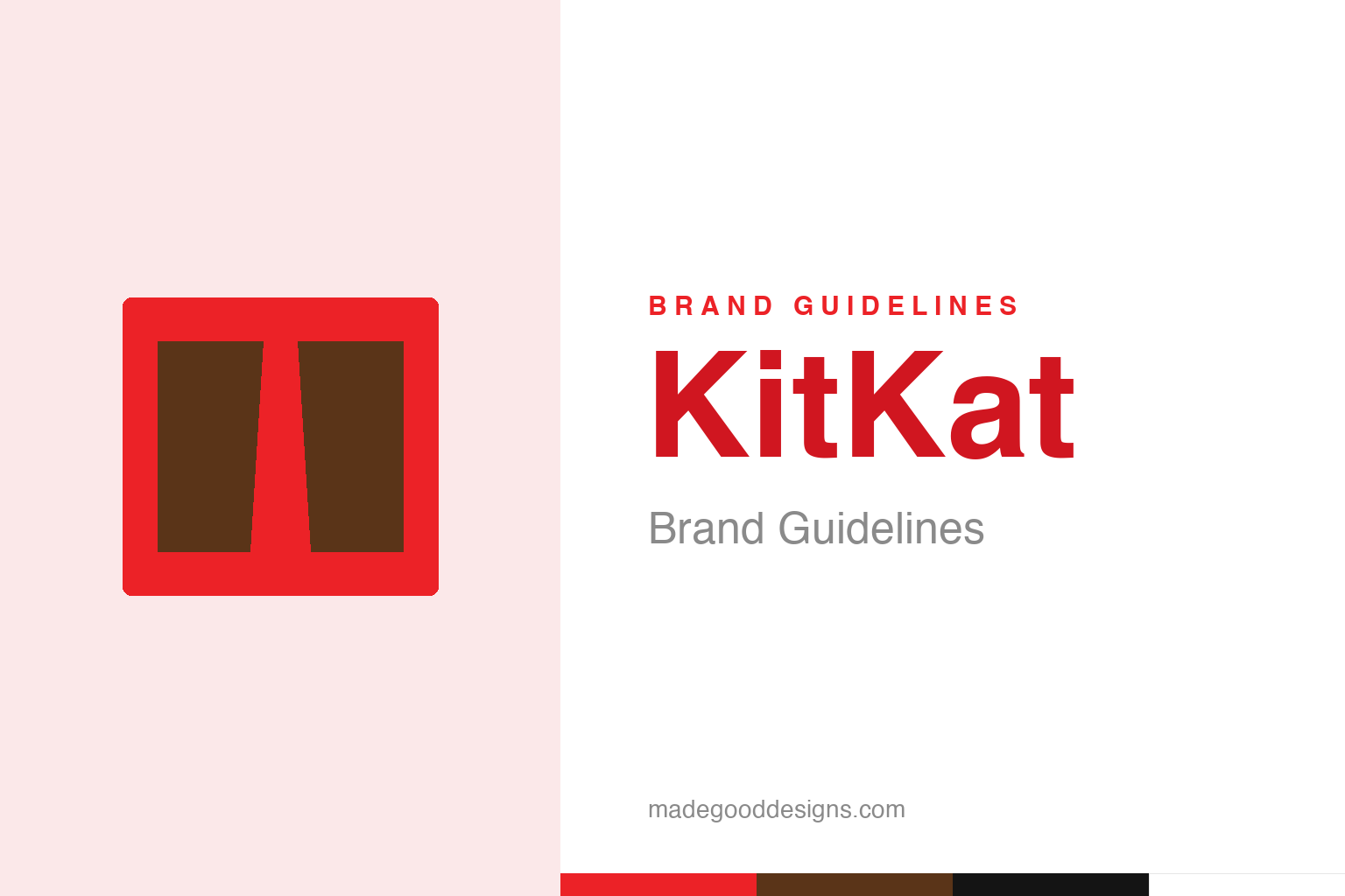
An abstract chocolate bar breaking — the ‘break’ idea, not the mark. Deliberately not the KitKat bar.
A brand built on a pause
KitKat’s genius is turning a break into a product.
KitKat’s identity is inseparable from one of the most brilliant slogans in advertising history: “Have a Break, Have a KitKat,” introduced in 1957 (coined by Donald Gilks at JWT London). That line is the whole brand. It doesn’t sell chocolate on taste or ingredients — it ties the product to a universal human moment: the break. The pause at work, the rest between tasks, the little reward you give yourself. By owning the concept of “the break,” KitKat attached itself to a feeling everyone has every single day, which is far more powerful and durable than any product claim. It’s a masterclass in emotional, occasion-based branding: sell the moment, and the chocolate comes with it. Our homage plays on that with a bar mid-break.
The four fingers
KitKat’s product form is a ritual.
The physical design of the bar — the “four fingers” of wafer coated in chocolate — is central to the identity, because it makes the “break” literal and tactile. You snap off a finger, and that satisfying snap is part of the ritual — a small physical act of taking a pause. The shape reinforces the slogan perfectly: the product doesn’t just represent a break, you physically break it. That fusion of a verbal idea (“have a break”) with a physical action (snapping a finger) is what makes the brand so cohesive and memorable. Few products align their name, slogan and form so neatly — the bar is engineered to act out the very word at the heart of the brand.
The shape it couldn’t own
KitKat lost a long battle to trademark its four fingers.
KitKat’s four-finger shape is so distinctive that Nestlé tried to trademark the shape itself across the EU — and, in a long-running saga, lost. In July 2018, the European Court of Justice effectively upheld that the four-finger shape could not be registered as an EU-wide trademark, because it wasn’t proven to be distinctive across all member states (in some countries similar bars, like Norway’s Kvikk Lunsj, long predated it). It was a 16-year legal fight against rival Mondelez. The case is a fascinating companion to Cadbury’s failed purple trademark: another instance of a famous brand trying to legally own a fundamental asset — here a shape — and being told by the courts that it couldn’t. A reminder that even iconic, obviously-distinctive brand features aren’t always ownable in law.
Red, a snap, and a moment
KitKat’s whole system reinforces one simple idea.
Everything about KitKat — the bold, appetising red wrapper, the clean logo, the four-finger bar, the satisfying snap, the “have a break” message — works together to reinforce a single, simple, universal idea: take a moment for yourself, and enjoy it. The bar launched by Rowntree in 1935 (as “Chocolate Crisp,” renamed KitKat by 1937/1949, now made by Nestlé, and by Hershey in the US) has kept that message astonishingly consistent for decades.
The deep lesson of KitKat is the power of occasion-based branding. Rather than fighting on taste or price in a brutally competitive chocolate market, KitKat claimed ownership of a moment — the break — and then made sure every element of the brand, right down to the snappable shape of the product, embodied that moment. That gives it a kind of emotional real estate no competitor can easily take, because it’s tied to a feeling people have constantly. When you want a pause, KitKat has spent nearly seventy years making sure its name is the one that comes to mind. A red wrapper and four fingers of chocolate, sold not as a snack but as permission to rest: it’s one of the most quietly clever positionings in all of branding.
Ultimately, KitKat’s identity is a reminder that great branding is an exercise in clarity and restraint. Decide the one idea that matters, find the simplest form that expresses it, strip away everything that doesn’t, and then resist the urge to keep fiddling. The discipline to leave a good mark alone — refining rather than replacing, evolving rather than abandoning — is rarer and more valuable than the ability to design something new. That is how a symbol earns a permanent place in people’s memory, and how a brand turns recognition into lasting trust.
Type & the wordmark
A bold white logo on that famous red.
The KitKat wordmark is a bold, friendly logotype in white on the signature red — clean and instantly recognisable. The specimen below stands in with a bold sans.
Have a break
Bold, friendly, appetising — type as inviting as a pause in the day. (Specimen set in Archivo, a neutral stand-in.)
KitKat red
One bold, appetising red. Click a swatch to copy the hex.
KitKat’s identity is anchored by a bold red #EC2227, with chocolate brown and white. Lead with the red below.
Explore & save
Keep the break idea on hand — save the breaking-bar homage and KitKat red to a board.
KitKat identity set
Pin the breaking-bar homage, KitKat red and the occasion-branding lesson to your own board.