Ryanair Brand Guidelines
Ireland’s national harp, restyled into a flying figure — the badge of Europe’s cheapest, boldest airline.
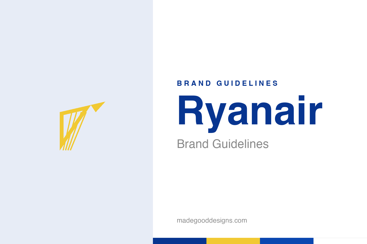
An abstract winged harp — the Irish emblem, not the exact mark. Deliberately not the Ryanair logo.
Ireland’s harp, taking flight
Ryanair’s symbol is a national emblem, restyled.
Ryanair’s golden symbol is often described as an angel or a flying figure — but at its root it’s the Irish harp, the national emblem of Ireland, redrawn so that it reads as an upward, winged figure in flight. That dual reading is the key to it: it’s a harp first (proudly rooting the airline in its Irish identity), stylised into something that suggests wings and flight (fitting for an airline). Calling it purely an angel is a bit of a myth; calling it purely a harp misses the modern redesign. The gold mark sits alongside a bold blue-and-yellow wordmark. It’s a smart emblem — national pride and the idea of flight in a single golden figure. Our homage keeps an abstract winged harp.
Bold, blue-and-yellow, and cheap
Ryanair’s identity is loud and unmistakable.
Ryanair’s visual identity is deliberately bold, bright and unmissable: vivid blue and yellow, splashed across its aircraft, website and everything else. The colours are cheerful, high-energy and instantly recognisable — you can spot a Ryanair plane on the tarmac from a distance. That loud, no-nonsense palette perfectly suits the brand’s positioning as Europe’s ultra-low-cost, high-volume carrier: it’s not trying to look refined or premium, it’s trying to look cheap, cheerful and impossible to miss. The identity is functional and unpretentious, exactly matching a service that strips away frills to offer the lowest possible fares. Ryanair knows precisely what it is — a budget airline — and its bright, blunt branding never pretends otherwise.
A brand built on being blunt
Ryanair’s personality is famously unfiltered.
What really sets Ryanair apart as a brand is its attitude. Founded in 1984 in Ireland (by Tony Ryan, Christy Ryan and Liam Lonergan), it grew, under the famously combative Michael O’Leary, into a brand with an unmistakably blunt, cheeky, provocative personality. Ryanair is upfront — often gleefully so — about being a bare-bones, pay-for-everything, no-frills airline, and its marketing and social media are notoriously irreverent, self-aware and unafraid to poke fun (at itself, at rivals, at complaining customers). Rather than hide its cheapness, it leans into it, turning “you get what you pay for” into a personality. That distinctive, honest, in-your-face voice — matched by the loud blue-and-yellow look — makes Ryanair one of the most recognisable and talked-about brands in aviation, love it or loathe it.
Owning exactly who you are
Ryanair’s identity is radically honest positioning.
Ryanair is a strong lesson in clear, honest, committed brand positioning. It never pretends to be a luxury or full-service airline; it is proudly, unambiguously the cheapest way to fly, and every part of its identity — the bold blue-and-yellow, the blunt tone, the no-frills everything — reinforces that single promise. Customers know exactly what to expect: rock-bottom fares, minimal extras, pay for anything beyond a seat. That clarity is a genuine strength; there’s no confusion about what the brand offers.
The broader lesson is the power of knowing your value proposition and committing to it completely, without apology. Ryanair could have tried to soften its image or pretend to be more premium; instead it embraced its low-cost identity wholeheartedly and built a bold, cheeky, unmistakable brand around it. That authenticity — being unapologetically, transparently itself — is exactly why it works, and why its irreverent voice cuts through. The Irish harp taking flight roots it in national pride; the loud colours and blunt attitude root it in honesty about what it is. A brand that knows precisely what it stands for, expresses it boldly, and never pretends to be something else will always be clearer — and more memorable — than one trying to be everything. Ryanair flies millions of people on that principle every year.
It’s worth restating the throughline, because it reaches far beyond Ryanair: the marks that endure are the ones built on a single clear idea, drawn with restraint, and repeated faithfully long enough to mean something. Fashions fade and technologies change, but a distinctive, well-chosen symbol backed by real substance only grows more valuable with time. The lesson for anyone building an identity is not to be the loudest or the newest, but to be the most consistent and the most authentic — and then to hold that line for as long as it takes.
Type & the wordmark
A bold, blunt, high-visibility sans.
Ryanair’s wordmark is a bold, blunt sans in blue and yellow — loud and functional. The specimen below stands in with a heavy sans.
Low fares
Bold, blunt, unmissable — type as no-nonsense as the fares. (Specimen set in Archivo, a neutral stand-in.)
Blue & yellow
Loud, unmissable colours. Click a swatch to copy the hex.
Ryanair’s palette is a deep navy blue #073590 and a bright yellow #F1C933 (third-party approximations; no official public brand guide). Lead with blue and yellow below.
Explore & save
Keep the winged-harp idea on hand — save the homage and the blue-and-yellow to a board.
Ryanair identity set
Pin the winged-harp homage, the blue-and-yellow palette and the honest-positioning lesson to your own board.


