LG Brand Guidelines
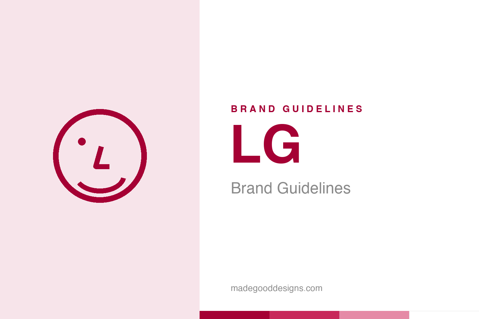
Look closely at the circle: an eye, a nose and a smile. LG hid a winking face in its own initials.
An abstract winking face — the idea, not the L/G mark. Deliberately not the LG logo.
A face hidden in two letters
LG’s logo is a clever piece of visual wit.
LG’s logo is a lovely piece of design cleverness. At first glance it’s a stylised “L” and “G” inside a circle — but look again and it forms a smiling, winking human face. The circle (with a small dot) reads as the head and a winking eye, the “L” forms the nose, and the “G” traces the outline of the face and a little smile. It’s warm, friendly, human and memorable — a logo that turns a company’s initials into an approachable, cheerful character. (A quick myth-buster: some claim it hides Pac-Man — that’s folklore; the official meaning is the smiling face.) That friendly face perfectly supports LG’s slogan, “Life’s Good.” Our homage keeps an abstract winking face, not the L/G letters.
From Lucky-Goldstar to ‘Life’s Good’
LG’s 1995 rebrand redefined the company.
The identity dates to a pivotal 1995 rebrand. The company had been “Lucky-Goldstar” (formed from the merger of the Lucky and GoldStar companies), and in 1995 it shortened this to the snappier “LG,” introduced the smiling-face logo, and adopted the memorable slogan “Life’s Good.” It was a smart, coherent modernisation: a shorter, more international name; a friendly, meaningful symbol; and a positive, human brand promise, all launched together. The whole system reinforces the same idea — that LG’s technology and products are here to make everyday life good, pleasant and human. It transformed a somewhat generic industrial-sounding name into a warm, approachable global consumer brand, and gave LG a clear, optimistic personality to compete on.
Human warmth in consumer tech
LG’s friendly face sets a tone in a serious category.
LG’s friendly, human identity is a real asset in the often cold, spec-driven world of consumer electronics and appliances. The winking-face logo and “Life’s Good” slogan give LG an approachable, optimistic, people-focused character that stands apart from rivals who lead with raw technology and specifications. Where much of the category feels clinical, LG’s branding suggests warmth, positivity and a focus on how products improve daily life — smiling at you, quite literally, from the logo. That emotional, human tone helps LG connect with everyday consumers on a feeling rather than a feature sheet. The distinctive red adds energy and confidence, and keeps the mark bold and recognisable across everything from TVs and phones to fridges and washing machines. It’s a brand that wants to feel like a friendly presence in your home.
Cleverness and warmth, combined
LG shows how much a witty, human logo can carry.
LG’s identity is a strong lesson in the value of a clever, meaningful, human logo. By hiding a friendly winking face inside its own initials, LG created a mark that is witty, memorable and emotionally warm all at once — it makes people smile when they notice it, and it gives an electronics giant a genuinely likeable, human face. That kind of dual-meaning cleverness (initials and a face) is exactly what makes a logo stick in the mind and earn affection.
The broader lesson is the power of designing warmth and optimism into a brand, especially in a category that tends toward the cold and technical. LG paired its clever logo with a positive, human slogan (“Life’s Good”) and a bold, confident colour, and launched the whole coherent system at once in 1995 — transforming a generic industrial name into an approachable global consumer brand. The result is an identity that feels friendly, optimistic and people-focused, connecting on emotion in a market obsessed with specs. A smiling face made from two letters, a cheerful promise that life is good, and a confident red: it’s proof that a little wit and a lot of warmth can make even a vast electronics company feel human. Look closely at the circle, and it’s still smiling back.
Read across the whole arc, LG’s story lands on a familiar but essential truth: distinctiveness plus consistency equals value. It is not enough to be different once; a brand must be recognisably, reliably itself across decades, contexts and formats. That reliability is what lets meaning accumulate, until a shape or a colour or a name can summon an entire set of associations in a single instant. Every strong identity arrives at the same place by a different road — a clear idea, expressed simply, and then defended patiently for as long as the brand endures.
Type & the wordmark
A clean, confident, friendly wordmark.
LG sets its initials in a clean, confident form beside the smiling-face circle. The specimen below stands in with a neutral sans.
Life’s Good
Clean, confident, warm — type as friendly as the face. (Specimen set in Archivo, a neutral stand-in.)
LG heritage red
One bold, confident red. Click a swatch to copy the hex.
LG’s identity is anchored by “LG Heritage Red” #A50034 (a deep crimson/magenta-red, ~PMS 207 C), with white and greys. Lead with the red below.
Explore & save
Keep the winking-face idea on hand — save the homage and LG red to a board.
LG identity set
Pin the winking-face homage, LG heritage red and the clever-logo lesson to your own board.