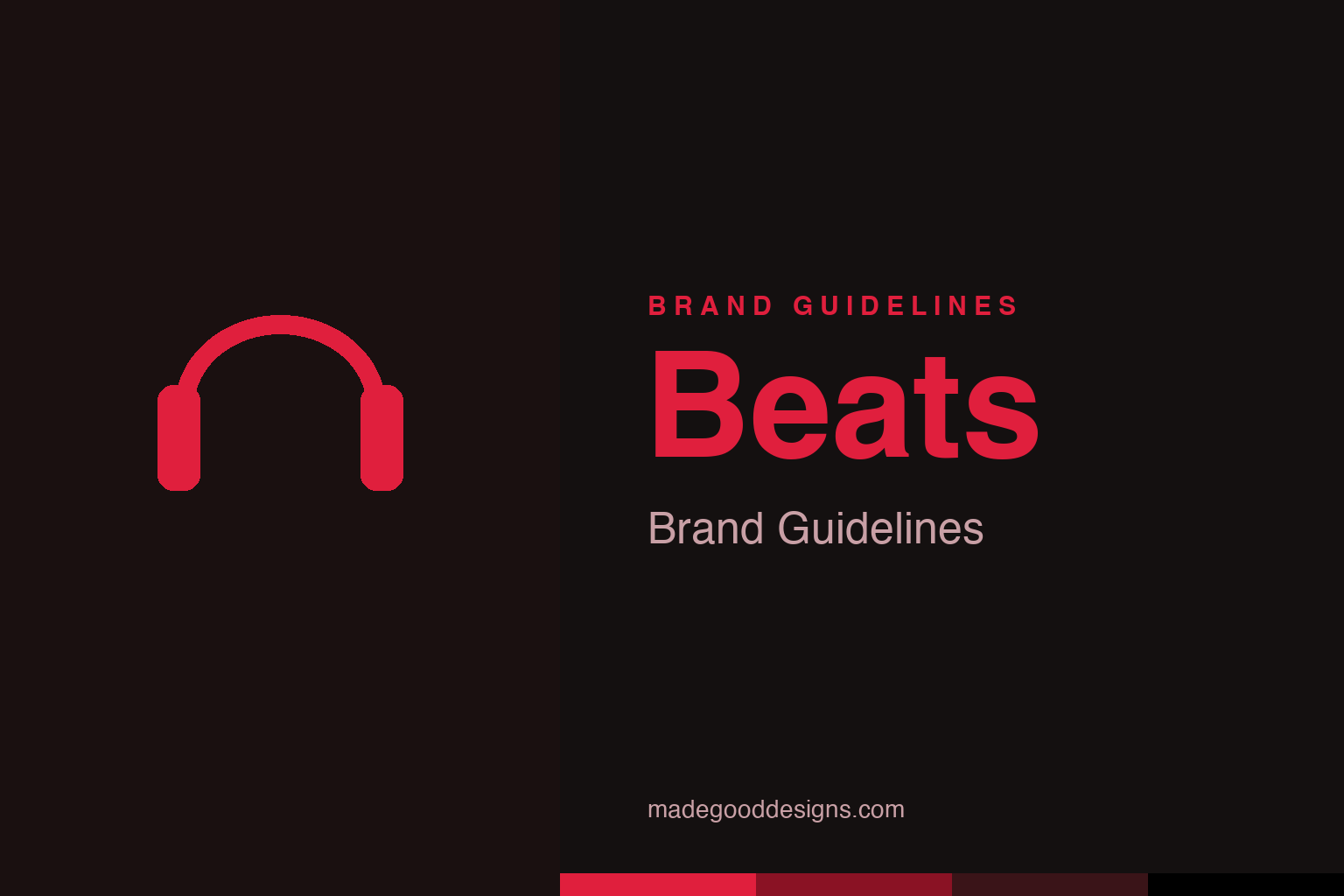
Beats Brand Guidelines
A lowercase ‘b’ in a red circle — and, hidden in plain sight, a head wearing headphones.
Abstract headphones — the idea, not the b-in-a-circle. Deliberately not the Beats mark.
A head wearing headphones
Beats’ logo hides a person inside a letter.
The Beats by Dre logo is a small stroke of genius: a lowercase “b” set inside a red circle. Look at it as a whole and the circle becomes a side-profile human head, while the “b” becomes the headphone earcup worn on that head. So the mark works on two levels at once — it’s clearly the letter “b” for Beats, and it’s a person wearing Beats headphones. That dual meaning is clever, simple and memorable, and it directly shows the product in use. It’s bold, clean and instantly recognisable — a logo that puts the customer (head in headphones) right inside the brand mark. Our homage nods to headphones directly, rather than the b-in-a-circle.
Headphones as fashion
Beats redefined what headphones meant.
Beats’ real revolution was cultural. Founded in 2008 by hip-hop legend Dr. Dre and music-industry titan Jimmy Iovine, Beats transformed headphones from a purely functional, audiophile-spec product into a fashion statement and status symbol. The bold, minimalist design, the prominent glowing “b” logo, the striking colours and the relentless placement on celebrities, athletes and musicians made Beats headphones a must-have accessory, especially for young people. Beats sold on image, lifestyle and cool far more than on technical audio specifications — and it worked spectacularly, capturing a huge share of the premium headphone market. It was a brilliant reframing: headphones weren’t just for listening, they were something you wore to say something about yourself.
Celebrity, culture and Apple
Beats built a brand on people, then joined Apple.
Beats mastered the modern playbook of celebrity and cultural marketing. Its deep roots in music and hip-hop culture (via Dre and Iovine) gave it instant authenticity and cool, and its ubiquity on famous artists and athletes made the headphones aspirational. The brand became a genuine cultural phenomenon — the visible red “b” on someone’s head was a status signal. That success culminated in Apple acquiring Beats in 2014 for around $3 billion — at the time Apple’s largest-ever acquisition — folding Beats’ brand, headphones and streaming service into the Apple ecosystem (Beats Music helped seed Apple Music). The acquisition validated just how valuable Beats’ brand was: Apple wasn’t only buying technology, it was buying one of the most culturally powerful names in audio, and the marketing machine behind it.
Selling identity, not specs
Beats shows the power of lifestyle branding.
Beats is a landmark case study in lifestyle and image-driven branding. It proved that in consumer products, brand image and cultural cachet can matter more than technical specifications. Beats didn’t win by having the best measured sound — audiophiles often criticised it — it won by being the coolest, most desirable, most visible headphones, backed by music-industry credibility and relentless celebrity presence. For a huge market, that image was the value.
The lessons are clear and powerful. First, lifestyle branding works: associate your product with the right culture, people and aspirations, and you can command premium prices and fierce loyalty on image alone. Second, a clever, meaningful logo helps — the b-in-a-circle that doubles as a head in headphones is memorable, shows the product in use, and reinforces the brand every time it’s seen on someone’s head. Third, a strong brand is a genuine asset: Beats’ cultural power is exactly what made it worth ~$3 billion to Apple. Beats understood that it was selling identity and belonging, not just audio — that wearing its headphones said something about who you were. Build a brand people want to be seen with, wrap it in a smart mark, and you can turn a pair of headphones into a cultural icon. Beats did exactly that.
Ultimately, Beats’s identity is a reminder that great branding is an exercise in clarity and restraint. Decide the one idea that matters, find the simplest form that expresses it, strip away everything that doesn’t, and then resist the urge to keep fiddling. The discipline to leave a good mark alone — refining rather than replacing, evolving rather than abandoning — is rarer and more valuable than the ability to design something new. That is how a symbol earns a permanent place in people’s memory, and how a brand turns recognition into lasting trust.
Type & the wordmark
Bold, minimal, confident lettering.
Beats pairs the b-in-a-circle with a bold, minimal wordmark. The specimen below stands in with a heavy sans.
Hear what you want
Bold, minimal, confident — type with cultural swagger. (Specimen set in Archivo, a neutral stand-in.)
Beats red
One bold, cultural red. Click a swatch to copy the hex.
Beats’ identity is anchored by a bold red #E01F3D on black and white (an alternate #ED1C24 / PMS 485 C also circulates). Lead with the red below.
Explore & save
Keep the head-in-headphones idea on hand — save the homage and Beats red to a board.
Beats identity set
Pin the headphones homage, Beats red and the lifestyle-branding lesson to your own board.


