Louis Vuitton Brand Guidelines
A monogram invented to defeat counterfeiters — and now the most counterfeited pattern on earth.
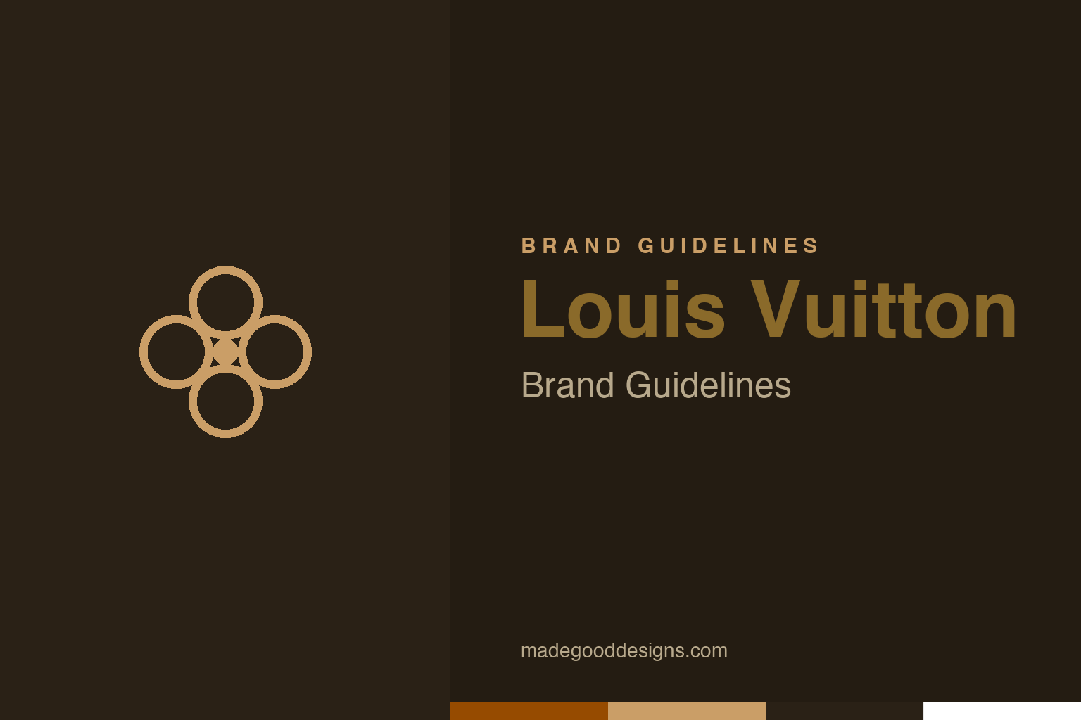
An abstract quatrefoil flower — the pattern’s motif, not the monogram. Deliberately not the LV mark.
A pattern against forgers
The LV Monogram was born to stop fakes.
The Louis Vuitton Monogram canvas — the famous brown pattern of interlocking “LV” initials combined with quatrefoils, flowers and diamonds — was created in 1896 by Georges Vuitton, son of founder Louis Vuitton. Its original purpose is delicious in hindsight: it was designed partly to combat counterfeiting. Louis Vuitton’s plain trunks were being widely copied, so Georges devised a distinctive, hard-to-fake proprietary pattern to mark genuine goods. The irony, of course, is that the Monogram went on to become one of the most counterfeited designs in the world — an unwitting testament to just how desirable and iconic it became. Our homage nods to the pattern’s floral quatrefoil motif, not the LV monogram itself.
Japonisme in a luggage pattern
The Monogram’s motifs have an artistic source.
The Monogram’s decorative flowers and quatrefoils weren’t random ornament — they reflect the Japonisme aesthetic (plus Neo-Gothic ornamentation) that was hugely fashionable in late-19th-century Paris, when Japanese art and design were sweeping through European taste. The stylised four-petal flowers and star-flowers echo Japanese mon (family crests) and decorative motifs, giving the pattern an elegant, exotic, of-the-moment sophistication. That artistic grounding is part of why the Monogram has aged so gracefully: it wasn’t just a security device but a genuinely beautiful, culturally-informed piece of pattern design. Over 125 years later, those same little flowers and interlocking initials remain instantly recognisable and endlessly desirable — a rare case of an anti-counterfeiting measure that also happened to be a small masterpiece of decorative art.
Heritage as luxury
Louis Vuitton sells craftsmanship and history.
Louis Vuitton was founded in 1854 in Paris as a maker of fine trunks and luggage — Louis Vuitton himself was a master malletier (trunk-maker) to the elite — and that heritage of craftsmanship and travel is central to the brand’s identity. Today part of the LVMH luxury group, Louis Vuitton trades on history, savoir-faire and exclusivity: the story of the artisan trunk-maker, the innovations (flat-topped stackable trunks, the picklock-proof lock), the association with glamorous travel. The Monogram ties directly to that story — it’s not just a pretty pattern but a mark of authenticity and heritage, the visible sign of a 170-year lineage of craft. In luxury, that provenance is the product: customers pay for the history, the craftsmanship and the status the Monogram signals, as much as for the bag itself.
A proprietary pattern as an asset
Louis Vuitton shows the power of an ownable motif.
Louis Vuitton offers a powerful lesson in the value of a distinctive, proprietary pattern. By creating the Monogram, Georges Vuitton gave the brand an instantly recognisable, ownable visual asset — one so strong it functions as the logo, the security mark, the status symbol and the decorative signature all at once. That single pattern does more brand work than most companies’ entire identity systems, and its consistency across more than a century has let its equity compound into something almost priceless.
The broader lessons are instructive. First, a unique, well-crafted pattern or motif can become one of a brand’s most valuable assets — distinctive enough to own, beautiful enough to desire, consistent enough to signal authenticity. Second, grounding that motif in genuine artistic and cultural ideas (here, Japonisme) gives it depth and longevity that arbitrary decoration never has. Third, in luxury especially, heritage and craftsmanship are the real product, and a strong visual mark like the Monogram is what makes that intangible history visible and portable. And there’s a final irony worth savouring: a pattern created to defeat counterfeiters became so iconic it’s now endlessly copied — proof of just how completely Louis Vuitton succeeded in making its Monogram the ultimate symbol of desirable, authentic luxury. Build a distinctive mark, ground it in real ideas, apply it with total consistency, and it can carry a brand for generations.
What lingers, in the end, is how much a single well-made mark can carry. Louis Vuitton demonstrates that an identity is not just a label on a product but a compressed story — of values, of heritage, of a promise to the people who encounter it. When that story is clear and the symbol that tells it is distinctive and consistent, the brand gains something durable: instant recognition, and the trust that travels with it. The craft lies in choosing the right idea in the first place, then having the patience to let it slowly become iconic.
Type & the wordmark
An elegant, refined serif wordmark.
Louis Vuitton pairs the Monogram with an elegant, refined wordmark (“LOUIS VUITTON” in a spaced serif). The specimen below stands in with a refined serif.
L’art du voyage
Refined, spaced, elegant — type as crafted as the trunks. (Specimen set in Newsreader, a neutral serif stand-in.)
Brown & gold
Rich, heritage tones. Click a swatch to copy the hex.
The Monogram runs a rich brown #964B00 with warm gold #CA9E67 — heritage and luxury. Lead with brown and gold below.
Explore & save
Keep the Monogram idea on hand — save the homage and the palette to a board.
Louis Vuitton identity set
Pin the quatrefoil homage, the brown-and-gold palette and the proprietary-pattern lesson to your own board.