Lyft Brand Guidelines
A giant fuzzy pink moustache on a car grille — and how a gimmick grew up into a serious brand colour.
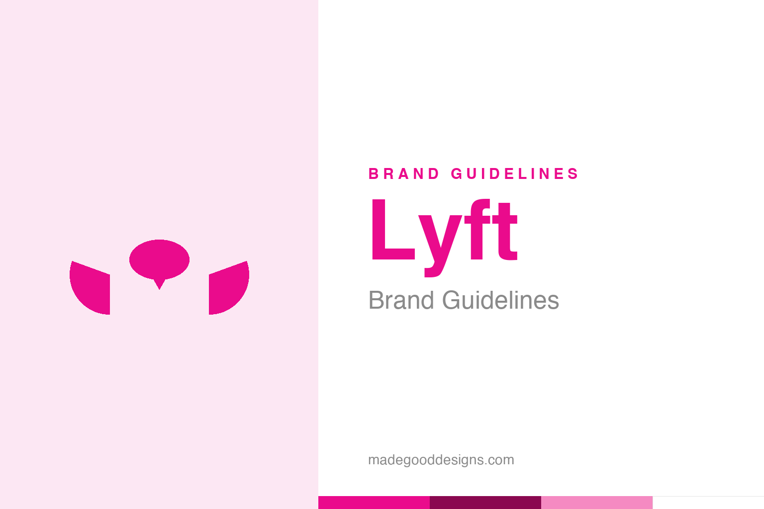
An abstract moustache in pink — the Carstache idea, not the wordmark. Deliberately not the Lyft logo.
The car with a moustache
Lyft’s first big branding idea was gloriously silly — and brilliant.
When Lyft launched, it did something no taxi company would dare: it stuck a giant, fuzzy pink moustache (the “Carstache”) on the front of its drivers’ cars. It was playful, friendly and completely disarming — the opposite of the anonymous black car. The moustache made Lyft instantly recognisable on the street, sparked conversation, and signalled the brand’s whole personality: ridesharing should be fun and human, not a cold transaction (early Lyft even encouraged riders to sit up front and fist-bump the driver). It was a genius piece of guerrilla branding for a startup with no budget: turn every car into a walking, driving advertisement that people actually smiled at. Our homage keeps a pink moustache, without the wordmark.
From Zimride to Lyft
Lyft grew out of an older carpooling idea.
Lyft’s roots go back to Zimride, a long-distance carpooling company founded in 2007 by Logan Green and John Zimmer (named partly after Zimbabwe, where Green had seen informal shared-ride systems work). Lyft launched in 2012 as a spin-off — on-demand, app-based, city rides — and the name plays simply and warmly on “lift,” as in giving someone a lift. That friendly, folksy positioning — a lift from a neighbour rather than a fare in a cab — was baked into the brand from the name up, and the pink moustache was its most visible expression. Everything about early Lyft was designed to feel more like a community than a taxi service.
Growing up: the 2015 rebrand
The moustache had to evolve as Lyft got serious.
As Lyft matured into a major company competing head-to-head with Uber, the literal fuzzy moustache started to feel too gimmicky for a serious, at-scale business. In the 2015 rebrand (with agency MetaDesign), Lyft modernised its identity: it retired the fuzzy grille moustache, refined the wordmark, and leaned into its now-signature pink/magenta as the primary brand asset. (A small glowing dashboard device called the “Amp” replaced the physical moustache in cars.) It’s a classic startup-growing-up story: keep the warmth and personality the gimmick established, but express it in a more grown-up, scalable way. The moustache had done its job — it made a nobody startup famous and likeable — and the brand carried that friendliness forward in cleaner form.
When pink becomes the brand
Lyft’s real inheritance from the moustache is a colour.
The through-line from the fuzzy moustache to today is pink. In a category dominated by black cars and Uber’s austere black-and-white, Lyft’s warm magenta pink is a powerful differentiator — it signals friendliness, approachability and a slightly more human, community-minded ride. That colour, first embodied by the silly moustache, has become the brand’s most valuable and consistent asset, unifying the app, the marketing and the physical touchpoints.
The wider lesson is about how a gimmick can seed a lasting brand. The Carstache was never going to last forever, but it did something crucial: it established Lyft’s personality — fun, warm, human — and its colour in people’s minds, fast and cheaply, at a moment when the company couldn’t afford a big brand campaign. When Lyft grew up, it didn’t throw that away; it distilled it. The playful moustache matured into a disciplined pink, the way a startup’s scrappy charm matures into a real brand. It’s a reminder that early-stage branding doesn’t have to be polished to be effective — it has to be distinctive and human, and it has to plant the seed of an identity the company can grow into. Lyft’s pink is that seed, still blooming.
The closing thought is simple, and it is the one Lyft keeps proving: build on something real. An identity anchored in genuine substance — authentic heritage, a true point of view, a product worth believing in — will always outlast one built on styling alone. The symbol is the visible part, but its power comes from what stands behind it. Choose an idea with real substance, give it a distinctive and honest form, and commit to it fully, and you create a mark that means something — and, year after year, keeps meaning it.
Type & the wordmark
A friendly, rounded sans in bright pink.
Lyft’s wordmark is a friendly, rounded sans in its signature pink — approachable and modern. The specimen below stands in with a neutral rounded sans.
Ride on
Rounded, friendly, warm — type as approachable as a lift from a neighbour. (Specimen set in Archivo, a neutral stand-in.)
Lyft pink
One warm magenta pink. Click a swatch to copy the hex.
Lyft’s identity is anchored by a warm magenta pink #EA0B8C, with black and white. Lead with the pink below.
Explore & save
Keep the pink idea on hand — save the moustache homage and Lyft pink to a board.
Lyft identity set
Pin the moustache homage, Lyft pink and the ‘gimmick-to-brand’ lesson to your own board.