Delta Air Lines Brand Guidelines
A red triangle called the ‘widget’ — the Greek letter delta, a swept wing, and a company that started dusting crops.
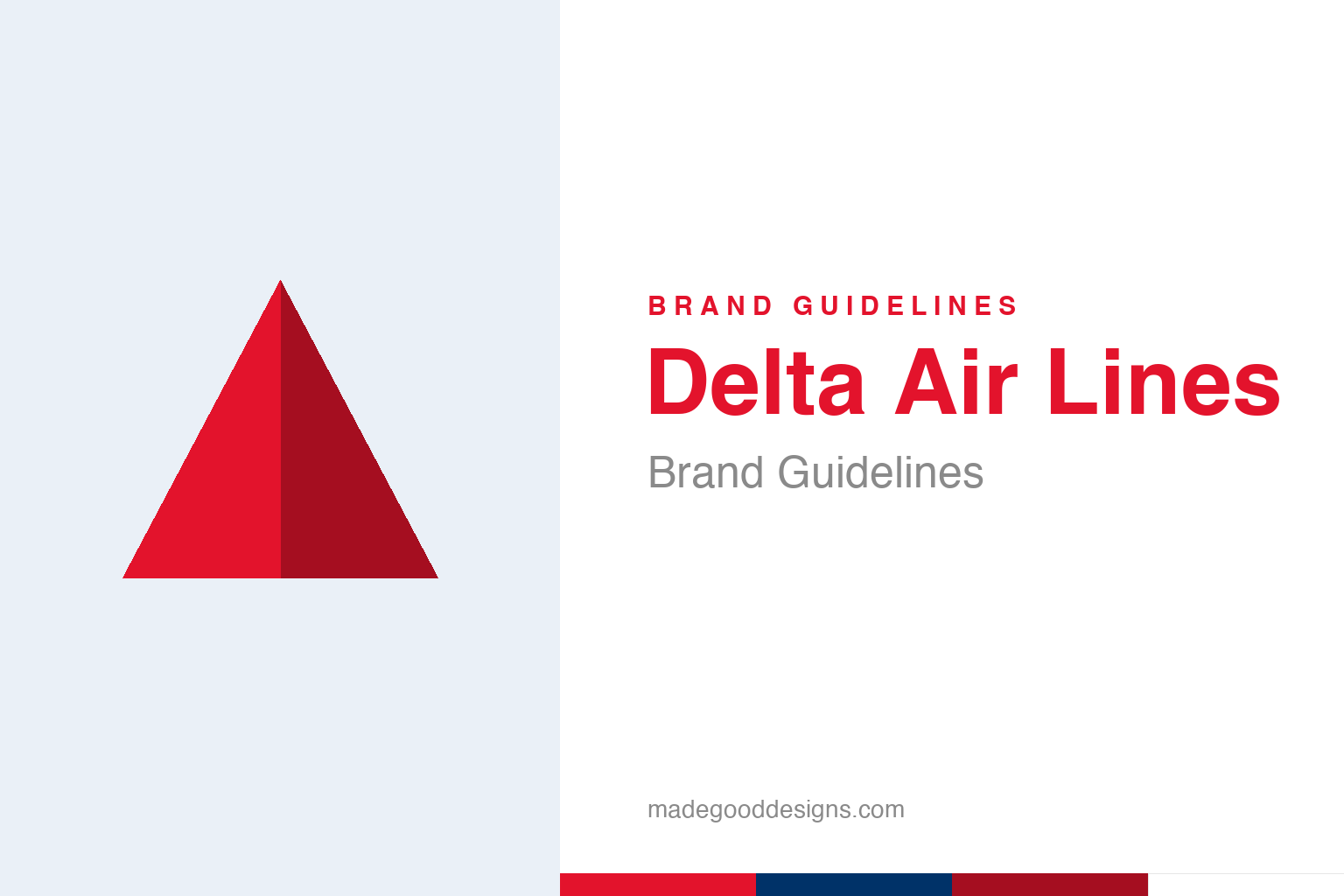
An abstract two-tone delta triangle — the delta idea, not the widget. Deliberately not the Delta widget.
The widget
Delta’s whole identity is one clever red triangle.
Delta Air Lines’ symbol is the “widget” — a triangle formed from two shades of red, evoking both the Greek letter delta (Δ), which gives the airline its name, and a swept-back aircraft wing. The current three-dimensional red widget was introduced in the 2007 rebrand by Lippincott (unveiled the day Delta exited bankruptcy). It’s an elegant piece of design: a single geometric mark that references the company’s name, its industry, and a sense of forward motion all at once. The two-tone folding suggests dimension and dynamism without being fussy. Our homage keeps an abstract two-tone delta triangle, distinct from the specific widget.
A name that is a shape
Delta’s logo and name point at the same letter.
The neatest thing about Delta’s identity is how logo and name reinforce each other. “Delta” is the fourth letter of the Greek alphabet, written as a triangle (Δ) — so the triangular widget is quite literally a picture of the airline’s name. That kind of tight loop between name and symbol is exactly what designers aim for: see the triangle, think “delta”; hear “Delta,” picture the triangle. On top of that, the triangle doubles as a swept wing, tying the mark to flight itself. Getting a single simple shape to carry the name and the industry is a small triumph of logo design — it means the mark never has to work hard to be understood.
From crop-dusters to a global airline
Delta’s origins are humbler and stranger than most.
Delta’s history is a great underdog story. It began in 1925 not as an airline at all but as Huff Daland Dusters, a crop-dusting operation — flying low over Southern fields spraying pesticide on cotton. It became Delta Air Service in 1928 and started carrying passengers in 1929, taking its name from the Mississippi Delta region it served. That’s a wonderful bit of brand archaeology: a company that now flies millions of people worldwide started by dusting crops, and its name honours a river delta — which happens to be a triangle, which happens to be a Greek letter, which became the logo. The strands of geography, agriculture, aviation and typography all knot together in that one red triangle.
A symbol built to endure
The widget’s clarity is what keeps it modern.
The widget has survived various refinements — flatter and more dimensional versions, tweaks to the reds — because it’s built on such a clear, sturdy idea. A triangle is one of the most fundamental, stable and recognisable shapes there is; grounding an airline’s identity in it gives the brand a timeless, geometric solidity. And because the triangle means so much at once (the name, a wing, forward motion, the delta region), it can be simplified or elaborated without ever losing its meaning.
That’s the recurring virtue of the best marks in this series: a symbol rooted in a real, specific idea — here, the literal shape of the company’s name — ages far more gracefully than an arbitrary graphic. Delta’s designers didn’t invent a random emblem and hope it would catch on; they found the shape that was already inside the name and made it the hero. The result is an identity that feels inevitable, the way the strongest logos do. A red triangle, two shades, a swept wing: it says “Delta,” says “flight,” and looks as current today as it will in twenty years — which is exactly the job a great airline mark is supposed to do.
The closing thought is simple, and it is the one Delta keeps proving: build on something real. An identity anchored in genuine substance — authentic heritage, a true point of view, a product worth believing in — will always outlast one built on styling alone. The symbol is the visible part, but its power comes from what stands behind it. Choose an idea with real substance, give it a distinctive and honest form, and commit to it fully, and you create a mark that means something — and, year after year, keeps meaning it.
Type & the wordmark
A clean, confident sans beside the widget.
Delta pairs the widget with clean, modern sans-serif lettering — steady and international. The specimen below stands in with a neutral sans.
Keep climbing
Even, modern, confident — type built to read calmly at gates worldwide. (Specimen set in Archivo, a neutral stand-in.)
Red & blue
Widget red and a deep Delta blue. Click a swatch to copy the hex.
Delta’s palette pairs a red #E3132C (the widget) with a deep blue #003268, over white. Lead with red and blue below.
Explore & save
Keep the delta idea on hand — save the triangle homage and the palette to a board.
Delta identity set
Pin the delta-triangle homage, the red-and-blue palette and the name-equals-shape lesson to your own board.