American Airlines Brand Guidelines
A logo so good its own designer begged the airline not to replace it — and the eagle he refused to draw.
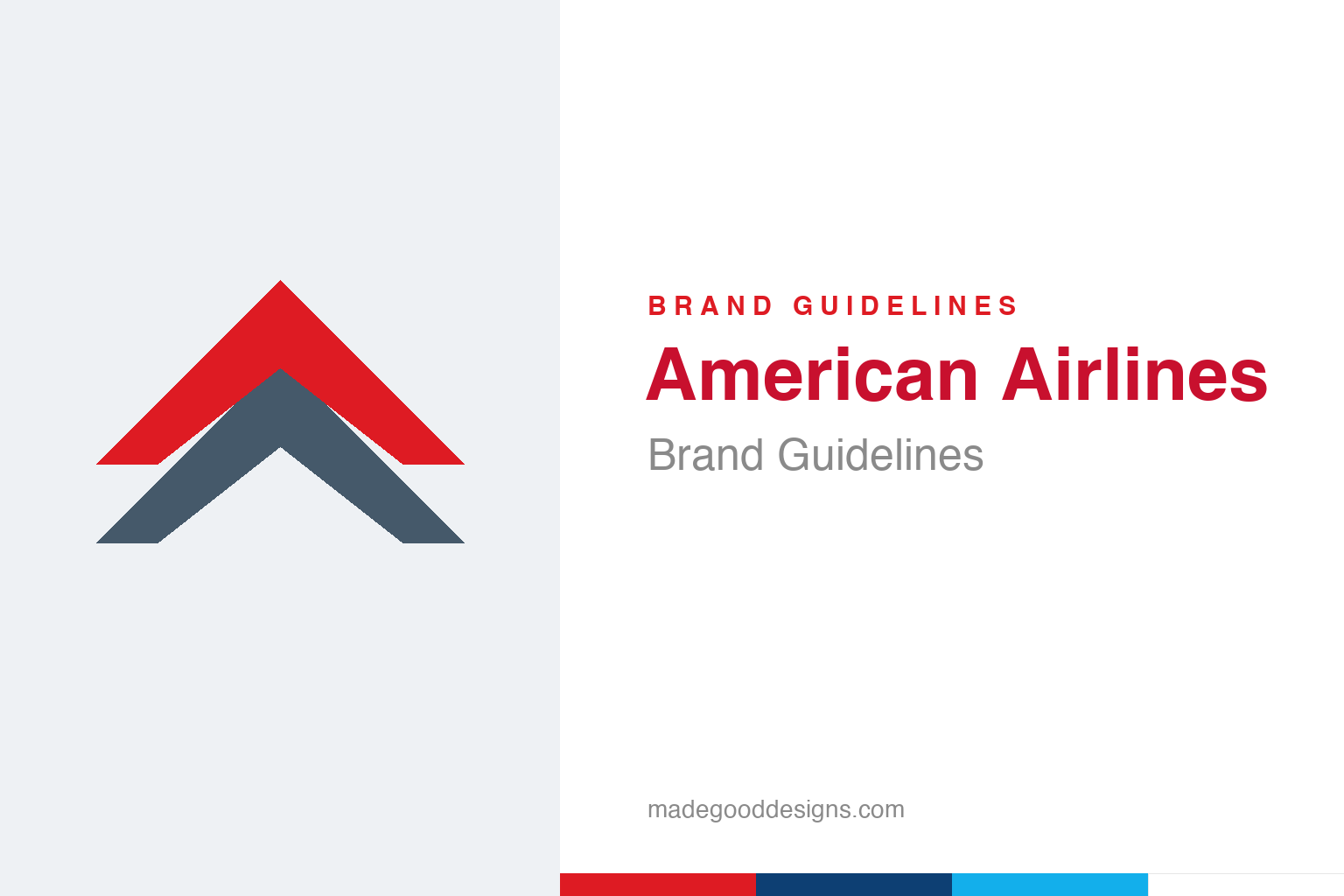
An abstract ascending double chevron in red and blue — flight, not the eagle. Deliberately not the AA marks.
Vignelli’s double-A
American’s classic identity is a Massimo Vignelli masterpiece from 1967.
For 46 years American Airlines wore one of the most disciplined logos in aviation: two red-and-blue “A”s flanking an eagle, designed in 1967 by Massimo Vignelli (with Heinz Waibl) at Unimark — the modernist behind the New York City Subway signage and Knoll’s identity. Vignelli’s wordmark was pure Swiss-modern rigor: clean Helvetica-era letterforms, red and blue split down the middle, timeless and system-ready. It aged astonishingly well precisely because it wasn’t trendy in the first place. Our homage keeps the ascending red-and-blue idea of flight while avoiding both the letters and the eagle.
The eagle he refused to draw
One of design’s great anecdotes lives inside this logo.
Here’s the detail designers love: Vignelli didn’t draw the eagle. A committed modernist, he had little interest in an illustrative bird and reportedly told the airline to have someone else “do it with the dignity of an eagle.” The eagle in the 1967 mark actually came from the office of Henry Dreyfuss, the legendary industrial designer. So the beloved AA logo is a quiet collaboration between two giants of American design — Vignelli’s typographic system and Dreyfuss’s eagle — a fact usually flattened into “Vignelli designed the AA logo.” The truth is more interesting, and more generous, than the myth.
2013: the Flight Symbol
The redesign that Vignelli himself publicly criticised.
In 2013, ahead of its merger with US Airways, American retired the Vignelli identity for a new look by FutureBrand: a silver “mica” livery, a fresh red-white-and-blue wordmark, and an abstract “Flight Symbol” blending an eagle, a star and the letter A. Reaction was sharply divided — and Vignelli himself criticised it, arguing his mark had a timelessness the new one lacked and that there was “no need to change.” It’s a rare case of a designer publicly grading the work that replaced his own. Whatever your verdict, the episode is a vivid lesson in the cost of retiring a genuinely great logo.
Red, white and blue by design
The palette isn’t decoration — it’s a flag.
Both the Vignelli mark and the 2013 identity are built on red, white and blue — a deliberate wrap in the American flag that suits a carrier literally named American. The eagle, too, is the US national bird. It’s about as on-the-nose as national branding gets, and it works because it’s earned: the airline’s name, colours and symbol all reinforce a single idea of American-ness. That coherence is why the identity survives redesigns — the specific drawing changes, but the red-white-blue promise underneath stays put. Our homage keeps the patriotic palette and the upward motion of flight, and nothing else.
The American Airlines saga is really a debate about permanence that every brand eventually faces. Vignelli’s position — that a truly timeless mark should be defended, not refreshed — is the purist’s creed, and there’s a strong case that his 1967 identity would still look current today. The counter-argument is practical: a merger, a new fleet livery, and the shift to screens gave the airline real reasons to modernise. Neither side is simply wrong. What the episode proves is that retiring a great logo is never a neutral, cosmetic act — it spends decades of accumulated recognition, and the bill comes due whether or not the replacement is any good.
It’s worth restating the throughline, because it reaches far beyond American Airlines: the marks that endure are the ones built on a single clear idea, drawn with restraint, and repeated faithfully long enough to mean something. Fashions fade and technologies change, but a distinctive, well-chosen symbol backed by real substance only grows more valuable with time. The lesson for anyone building an identity is not to be the loudest or the newest, but to be the most consistent and the most authentic — and then to hold that line for as long as it takes.
Type & the wordmark
From Helvetica-era rigor to a bespoke modern sans.
Vignelli’s original wordmark was rooted in the clean Helvetica-era sans of its day; the 2013 identity introduced a more bespoke, contemporary sans for “American Airlines.” Either way the type stays disciplined and modern. The specimen below stands in with a neutral sans.
Going for great
Clean, modern, disciplined — lettering with the calm confidence of a flag. (Specimen set in Archivo, a neutral stand-in.)
Flag palette
Red, blue and a bright sky accent. Click a swatch to copy the hex.
American’s palette runs on red #DE1B23 and blue (a deep navy around #0D3F73 / #45596A), with a bright sky-blue #13AFEB accent from the 2013 system, over white. Lead with the red and blue below.
Explore & save
Keep the flight-and-flag idea on hand — save the chevron homage and the palette to a board.
American Airlines identity set
Pin the ascending-chevron homage, the red-white-blue palette and the modern wordmark to your own board.