Gap Brand Guidelines
The logo that lasted six days — a masterclass, in reverse, on how much people care about a plain blue box.
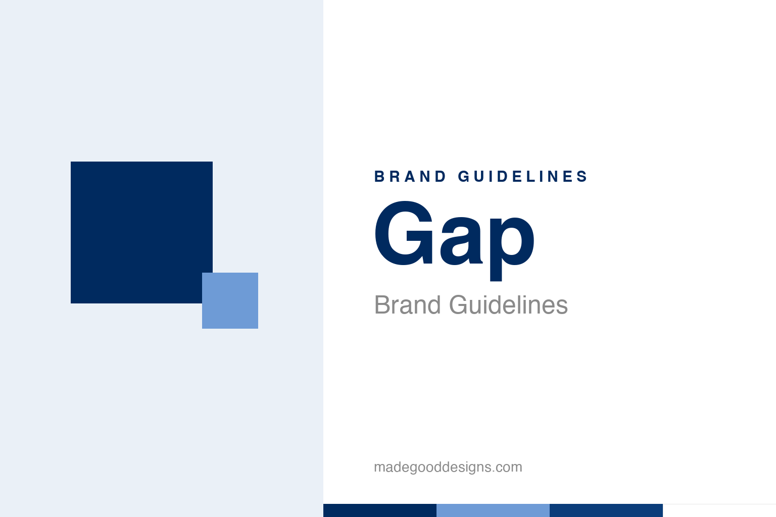
An abstract navy box with a small gradient square — the ‘box’ idea, not the wordmark. Deliberately not the Gap logo.
A six-day logo
Gap’s 2010 rebrand is famous for how fast it died.
In October 2010, Gap quietly swapped its classic logo — the tall, elegant serif “GAP” in a deep-blue box — for something completely different: the word “Gap” set in Helvetica, with a small blue gradient square tucked behind the “p.” The reaction was instant and ferocious. Customers and designers hated it; parody accounts and mock “design your own” generators sprang up overnight; the internet piled on. Within about six days, Gap surrendered and restored the original blue box. It is one of the shortest-lived major logos in corporate history — and one of the most instructive. Our homage keeps the abstract “blue box” idea without the wordmark.
A solution to no problem
The redesign’s original sin was that nobody asked for it.
Part of what made the backlash so intense was that the old logo wasn’t broken. The blue box, dating to 1986, was clean, distinctive, quietly premium and beloved — a genuine piece of American retail iconography. Replacing it with a generic Helvetica wordmark and a gimmicky little gradient square felt like change for its own sake, a downgrade dressed as a modernisation. When a redesign visibly makes a strong brand worse, audiences don’t just dislike it — they feel that something they valued has been carelessly thrown away. Gap learned, in real time, that a logo with real equity is public property in the eyes of loyal customers, and they will fight to keep it.
The internet as focus group
Gap accidentally ran the first great social-media logo revolt.
The Gap saga was one of the first times a corporate rebrand was litigated live on social media — and lost. This was 2010, when Twitter and Facebook had reached the scale to turn a design decision into a national pile-on within hours. Gap even briefly floated “crowdsourcing” a new logo, which only made things worse (professional designers were appalled at the suggestion of free spec work). The episode became a landmark in how the internet changed branding: a company could no longer roll out an identity slowly and control the narrative. The crowd now had a megaphone, an opinion, and a very short fuse — and it would grade your homework in public, immediately.
Why the reversal was the right call
Retreating fast turned a fiasco into a lesson.
Gap’s decision to revert within a week is easy to mock but was genuinely wise. Digging in — defending the new logo to prove a point — would have prolonged the damage and turned a design story into a story about a company ignoring its customers. By backing down quickly, Gap contained the harm and even earned a little grudging respect for listening.
The lasting lesson is about knowing what a rebrand is for. Change a logo to solve a real problem — a mark that doesn’t scale, that’s dated, that no longer fits the business — and audiences will usually come along. Change it for novelty, and replace something distinctive with something generic, and you invite exactly the revolt Gap suffered. The blue box survived because it was good and because people loved it; the Helvetica version died because it was neither necessary nor better. Fifteen years on, “remember the Gap logo” is still shorthand, in design circles, for the whole idea that you should think very hard before touching a mark people already cherish.
It’s worth restating the throughline, because it reaches far beyond Gap: the marks that endure are the ones built on a single clear idea, drawn with restraint, and repeated faithfully long enough to mean something. Fashions fade and technologies change, but a distinctive, well-chosen symbol backed by real substance only grows more valuable with time. The lesson for anyone building an identity is not to be the loudest or the newest, but to be the most consistent and the most authentic — and then to hold that line for as long as it takes.
Type & the wordmark
The classic mark’s power was in the box, not just the letters.
The enduring Gap logo pairs a tall, refined serif wordmark with the deep-blue box; the 2010 version’s switch to plain Helvetica stripped away the distinctiveness. The specimen below stands in with a neutral serif in the classic spirit.
Classic, kept
Tall, refined, confident — a wordmark whose quiet elegance the 2010 redesign failed to beat. (Specimen set in Newsreader, a neutral stand-in.)
The blue box
One deep navy, and white. Click a swatch to copy the hex.
Gap’s identity is anchored by a deep navy #002A5F (variants #00255F / #002868 circulate) with white letters — the “blue box.” Lead with the navy below.
Explore & save
Keep the blue-box lesson on hand — save the homage and the navy to a board.
Gap identity set
Pin the blue-box homage, Gap navy and the ‘don’t fix what isn’t broken’ lesson to your own board.