Unilever Brand Guidelines
A single blue ‘U’ built from 25 tiny drawings — each one a promise about what the company does.
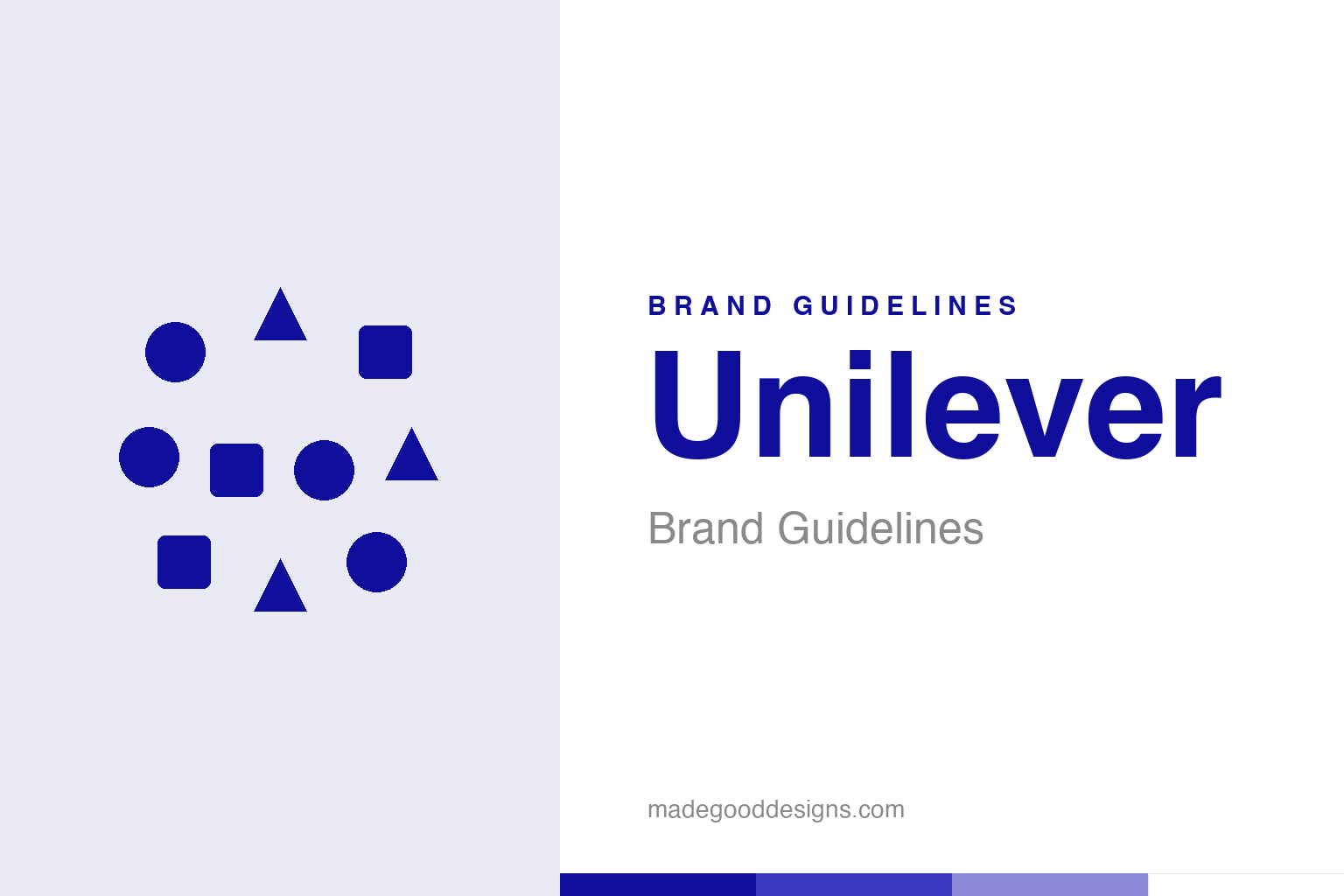
An abstract cluster of small icons — the many-icons idea, not the U. Deliberately not the Unilever mark.
A letter made of meaning
Look closely at Unilever’s ‘U’ and it dissolves into 25 little pictures.
From across a room, the Unilever logo is a simple blue letter “U”. Up close, it fractures into 25 tiny icons — a sun, a heart, a bird, a hand, a strand of DNA, a spoon, a wave, a flower, a recycling loop — each nestled into the shape of the letter. Designed by Wolff Olins in 2004 as part of Unilever’s “Vitality” identity, it’s one of the cleverest corporate marks of the century: a logo that is simultaneously abstract and richly literal, readable at a glance yet rewarding a second look. For a company that owns hundreds of everyday brands — soaps, teas, ice creams, detergents — a mark made of many small parts is exactly right. Our homage keeps the many-icons idea as a loose cluster, without assembling it into the letter.
Every icon tells you something
The 25 pieces aren’t decoration — they’re a mission statement.
Each of the icons carries a specific meaning tied to Unilever’s business and values. The sun stands for vitality and energy; the heart for love and care; a hand for sensitivity and skin; the DNA helix for the science of life; a bird for freedom; a spoon for nutrition; a wave for cleanliness and freshness; a recycling swirl for sustainability. Assembled together, they turn a plain letter into a compact manifesto: this is a company about health, hygiene, nourishment and everyday wellbeing. (Sources sometimes count 24 versus 25; 25 is the standard figure.) It’s a rare logo you can actually read like a sentence — and that legibility of intent is why designers still hold it up as a benchmark for meaningful identity.
Two companies, one 1929 handshake
Unilever is a merger written into its very name.
Unilever exists because of one of the most famous mergers in business history. In 1929, Britain’s Lever Brothers — the soap empire behind Sunlight and Lifebuoy — joined with the Dutch Margarine Unie to form a single Anglo-Dutch giant. The name is literally the two halves fused: Uni(lever). It’s a piece of corporate archaeology hiding in plain sight, and it explains the company’s unusual dual-nationality character. That heritage of combination suits the 2004 logo perfectly: a brand born from bringing two things together, represented a lifetime later by a mark that brings twenty-five things together. The idea of many-into-one runs right through Unilever’s DNA — which, fittingly, is one of the icons.
The house behind the brands
Unilever’s logo does an unusual, deliberate job: it stays hidden.
Most people use Unilever products daily without ever thinking about Unilever. Its power is a portfolio of hundreds of consumer brands — Dove, Lipton, Hellmann’s, Ben & Jerry’s, Persil, and on and on — each with its own identity, while the corporate “U” sits quietly on the back of the pack. That’s a strategic choice: the master brand exists to reassure investors, partners and increasingly ethically-minded shoppers that a coherent, values-led company stands behind the shelf.
It makes the 25-icon design even smarter. A masterbrand that mostly appears small, on the reverse of packaging, needs to say a great deal in a tiny footprint — and a “U” packed with meaning does exactly that. In a centimetre of print it can telegraph energy, care, nutrition and sustainability all at once. The logo is engineered for the exact role it plays: not a shout on a billboard, but a dense, reassuring signature that rewards anyone who bothers to look closely — which, increasingly, is the point.
Read across the whole arc, Unilever’s story lands on a familiar but essential truth: distinctiveness plus consistency equals value. It is not enough to be different once; a brand must be recognisably, reliably itself across decades, contexts and formats. That reliability is what lets meaning accumulate, until a shape or a colour or a name can summon an entire set of associations in a single instant. Every strong identity arrives at the same place by a different road — a clear idea, expressed simply, and then defended patiently for as long as the brand endures.
Type & the wordmark
A clean humanist sans, so the icons can do the talking.
Unilever pairs the intricate “U” with a clean, humanist sans-serif wordmark — deliberately simple, so all the visual interest stays in the icon-filled letter. The specimen below stands in with a neutral sans.
Everyday, everywhere
Even, humanist, calm — lettering that yields the spotlight to a very busy U. (Specimen set in Archivo, a neutral stand-in.)
Unilever blue
One deep, serious blue. Click a swatch to copy the hex.
The Unilever “U” is rendered in a single deep blue #0F0E9A (Unilever’s self-reported value; aggregators cite a near-identical #0D009D). Avoid the lighter #1D6FA0 sometimes listed. Lead with the deep blue below.
Explore & save
Keep the 25-icon idea on hand — save the cluster homage and the blue to a board.
Unilever identity set
Pin the icon-cluster homage, Unilever blue and the humanist wordmark to your own board.


