Nestlé Brand Guidelines
A logo that is literally the founder’s surname — ‘little nest’ — drawn from his own family coat of arms.
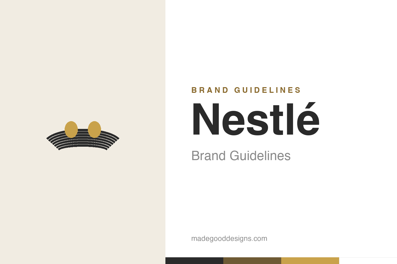
An abstract nest with two eggs — the nest idea, not the birds. Deliberately not the Nestlé mark.
A name you can draw
Nestlé’s logo is the rarest kind: the founder’s surname made visible.
Almost no company gets a logo this literal. “Nestlé” is close to the German for “little nest,” and founder Henri Nestlé simply drew a bird’s nest as his mark — adapting it directly from his own family coat of arms. The result is a symbol that says the company’s name without a word: a nest, birds, nurture, care. For a business that began by making infant food, the imagery of a mother bird feeding her young in a nest is almost too on-the-nose — and that’s precisely why it works. It fuses the founder’s identity, the product’s purpose and a universally warm image into one small drawing. Our homage keeps the nest and its eggs while leaving the birds out.
From crest to global seal
The original nest had a whole family of birds in it.
Henri Nestlé’s early mark, adopted around 1868, expanded the single bird of the family crest into a fuller scene: a mother bird feeding chicks in a nest. Over the following century it was simplified repeatedly for legibility as it travelled onto products in more and more markets — from a detailed illustration toward a cleaner, more graphic emblem. This is the normal life-cycle of a great heritage mark: the idea stays fixed (a nest, nurture) while the drawing is steadily distilled so it reproduces crisply at any size, from a chocolate wrapper to a factory sign. The nest that began as a personal heraldic device became, over 150 years, one of the most widely seen food symbols on earth.
The myth of the shrinking family
A famous story about the 1988 redraw is charming — and wrong.
In 1988, Nestlé simplified the nest and reduced the number of baby birds from three chicks to two. A widely-repeated story claims the company did this to reflect the shrinking size of the average family — a lovely, quotable anecdote that appears all over the internet. It is almost certainly a myth. The documented rationale was ordinary design modernisation: a cleaner, better-balanced mark that reproduced more reliably across a growing global product range. It’s a useful reminder for a citation-grade page — the most shareable explanation for a design change is often a retrofitted story, not the real reason. We flag it here rather than repeat it as fact.
Older and bigger than one man
The Nestlé you know is a merger — and mostly monochrome.
It’s worth untangling the founding, because the dates get muddled. Henri Nestlé launched his infant food (farine lactée) in Vevey, Switzerland around 1866–67; the modern Nestlé group, though, dates to a 1905 merger of Henri Nestlé’s firm with the Anglo-Swiss Condensed Milk Company — so “1866” belongs partly to Anglo-Swiss, not solely to Henri Nestlé. Through all of it, the nest endured.
Visually, the identity is essentially monochrome — the nest and wordmark live in black and white, with no fixed corporate accent colour — which is exactly why the mark sits so comfortably on thousands of different products, from coffee to pet food to bottled water, each with its own bright packaging. The nest doesn’t compete; it endorses. That restraint is the whole strategy: a single, calm, monochrome seal of provenance stamped onto an enormous and colourful portfolio, quietly saying the same thing on every one — made with care.
It’s worth restating the throughline, because it reaches far beyond Nestlé: the marks that endure are the ones built on a single clear idea, drawn with restraint, and repeated faithfully long enough to mean something. Fashions fade and technologies change, but a distinctive, well-chosen symbol backed by real substance only grows more valuable with time. The lesson for anyone building an identity is not to be the loudest or the newest, but to be the most consistent and the most authentic — and then to hold that line for as long as it takes.
Type & the wordmark
A calm, classic wordmark beneath the nest.
Nestlé’s wordmark is a clean, classic letterform — understated and legible, letting the nest carry the emotion. The accent on the final “é” is a small, precise piece of the identity. The specimen below stands in with a neutral sans.
Good food, good life
Calm, classic, legible — type content to sit quietly under a warm symbol. (Specimen set in Archivo, a neutral stand-in.)
Monochrome nest
Black on white, warmed by a nest-gold. Click a swatch to copy the hex.
Nestlé’s corporate mark is fundamentally monochrome — black #000000/#2A2A2A on white — with no official brand accent colour; that neutrality lets it endorse a vast, colourful product range. The nest-golds below are illustrative warmth, not an official spec.
Explore & save
Keep the nest idea on hand — save the homage and the monochrome ethos to a board.
Nestlé identity set
Pin the nest-and-eggs homage, the monochrome palette and the classic wordmark to your own board.


