Verizon Brand Guidelines
A giant telecom brand reduced to a plain black word and one small red tick — and it works.
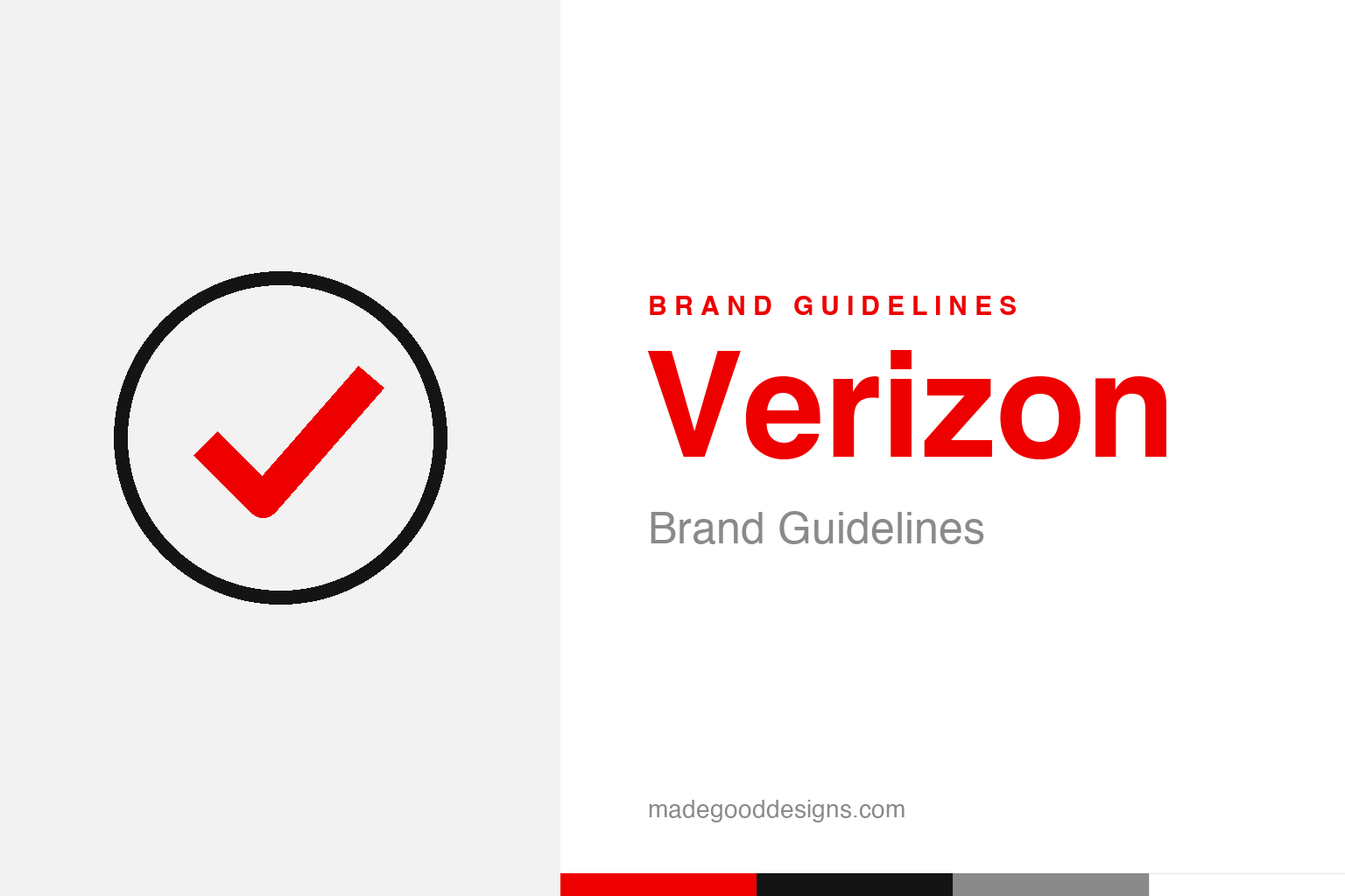
An abstract confirmation check in a ring — the ‘done’ idea, not the mark. Deliberately not the Verizon check.
Radical plainness
Verizon’s logo is almost aggressively simple — on purpose.
In 2015, Verizon threw out its fussy old logo — a lowercase wordmark with a big swooshing red “Z” check — and replaced it with something startlingly plain: the word “verizon” in a simple black sans, with a single small red check mark tucked at the end. Designed by Pentagram (partner Michael Bierut), it was a deliberate rejection of telecom-logo excess. At a moment when the brand needed to feel modern, mobile-first and confident, the answer was to remove almost everything: no gradient, no glow, no dramatic swoosh — just a name and a tick. It’s a bet that in a crowded market, restraint reads as strength. Our homage keeps the “confirmation” idea as a generic checked badge, not the Verizon tick.
The little red check
The one flourish it kept carries all the meaning.
The single red check mark is the whole personality of the logo, and it’s doing two jobs at once. First, it’s a nod to continuity: a check had lived in Verizon’s original 2000 logo, so keeping one preserves a thread of brand memory through a radical redesign. Second, and more importantly, a check universally means “done,” “yes,” “confirmed,” “it works” — exactly the reassurance you want from the company that runs your network. (Pentagram framed it around that sense of affirmation; the popular reading that it stands for the “V” in Verizon is a softer, interpretive claim.) One tiny red mark turns a plain word into a promise of reliability — a lot of meaning packed into a very small stroke.
Truth and horizon
Even the name is a small piece of design.
“Verizon” is a portmanteau, coined for the company’s 2000 launch: veritas, Latin for truth, plus horizon, the sense of looking forward. It’s a manufactured word engineered to sound trustworthy and future-facing at the same time — corporate naming as its own design discipline. The company itself was formed on 30 June 2000 from Bell Atlantic and GTE (with Bell Atlantic the surviving entity, renamed). So Verizon is barely older than the century, which partly explains its appetite for a clean, modern, un-nostalgic identity: unlike a Shell or a GE, it has no Victorian heritage to honour, so it can afford to look relentlessly contemporary. The plain 2015 logo fits a company built to feel new.
A system, not just a logo
The 2015 work was really about making a giant brand behave online.
The value of the Pentagram redesign wasn’t only the mark — it was flexibility. The old glossy logo was a nightmare across the thousands of contexts a modern telecom lives in: tiny app icons, store signage, TV bugs, sponsorship boards, dark mode and light. A plain black wordmark set in a clean grotesk (Neue Haas Grotesk), with one red accent, works everywhere and scales to anything.
That’s the quiet sophistication behind the “boring” logo. Designing for a company of Verizon’s size is really a systems problem, not a drawing problem: the identity has to survive being stamped on millions of surfaces by thousands of people who will never read the brand guidelines. Radical simplicity is the most robust answer to that challenge — there’s almost nothing to get wrong. What can look like a lack of ideas is often the opposite: a hard-won decision to strip the brand down to the few elements that can’t break. The little red check is the one piece of warmth they allowed themselves to keep.
What lingers, in the end, is how much a single well-made mark can carry. Verizon demonstrates that an identity is not just a label on a product but a compressed story — of values, of heritage, of a promise to the people who encounter it. When that story is clear and the symbol that tells it is distinctive and consistent, the brand gains something durable: instant recognition, and the trust that travels with it. The craft lies in choosing the right idea in the first place, then having the patience to let it slowly become iconic.
Type & the wordmark
A clean grotesk doing nearly all the work.
The 2015 wordmark is set in Neue Haas Grotesk (Christian Schwartz’s revival of the original Helvetica), lowercase and unadorned — the type is the logo, with only the red check added. The specimen below stands in with a neutral grotesk.
It’s how we connect
Even, lowercase, grotesk — type confident enough to be the entire logo. (Specimen set in Archivo, standing in for Neue Haas Grotesk.)
Verizon red
Black, white, and one decisive red. Click a swatch to copy the hex.
Verizon’s palette is austere: black #141414 and white, with a single red #EE0000 for the check. Variants like #CD040B circulate, but #EE0000 is the best-supported brand red. Lead with it below.
Explore & save
Keep the radical-simplicity idea on hand — save the check homage and the red to a board.
Verizon identity set
Pin the checked-badge homage, Verizon red and the grotesk wordmark to your own board.