United Airlines Brand Guidelines
Saul Bass’s ‘tulip’ flew for 36 years — then a merger swapped one great logo for another.
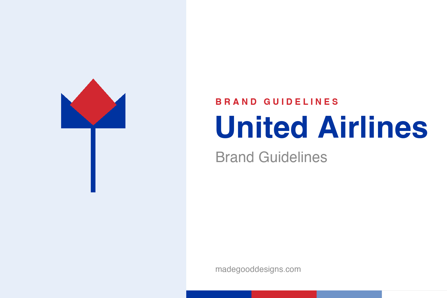
An abstract tulip — the flower idea, not the Bass mark. Deliberately not the United tulip or globe.
Saul Bass’s tulip
United’s classic mark is a Saul Bass system built on a single elegant curve.
For 36 years United Airlines flew under a Saul Bass design: the “tulip,” a red-and-blue mark of two interlocking “U” shapes that read as a stylised flower. Bass created it in 1974 as part of one of his signature total identity systems — reportedly specifying well over a thousand applications, from tickets to tailfins to timetables. The tulip was warm, distinctive and beautifully simple, and it aged gracefully precisely because it wasn’t tied to any fashion. It’s a classic example of Bass’s gift for reducing a company to one confident, memorable form. Our homage nods to the tulip flower idea rather than reproducing the interlocking-U mark.
A merger of logos
When United and Continental combined, the tulip lost its seat.
In 2010, United merged with Continental Airlines — and made a striking branding choice: it kept the United name but adopted Continental’s globe logo (a blue-and-gold striped globe originally designed by Lippincott for Continental’s 1991 identity). So Saul Bass’s tulip was retired, replaced by another well-regarded mark from a different lineage. It’s an unusual and instructive case: a merger where the surviving name and the surviving logo came from different companies. Both were strong designs, which made the decision genuinely hard — and the retirement of a beloved Bass mark drew real mourning from designers, echoing the debates around UPS and American Airlines elsewhere in this series.
The globe, refreshed
In 2019 United modernised the mark it had inherited.
In 2019, United worked with Pentagram to refresh the globe: it dropped the gold and the gradient shading in favour of a cleaner, flatter mark and a deeper, more confident blue. It was a sensible modernisation for the screen age — simplifying an inherited 3D logo into something crisper and more flexible, without throwing away the recognition the globe had built. The result kept the “global reach” symbolism while feeling contemporary. It’s a good example of the quieter kind of rebrand: not a dramatic reinvention, but a careful tune-up that respects existing equity and simply brings it up to date.
Two great marks, one airline
United’s design story is a study in hard choices.
United’s identity history is unusually rich because it involves two genuinely excellent logos — Bass’s tulip and Continental’s globe — and a corporate event that forced a choice between them. There’s no clean “right answer” in that situation, which is exactly what makes it a great teaching case. Keeping the globe preserved the recognition of the merged operation and avoided the cost of designing something new; but it also meant retiring a Saul Bass original, a real loss to the canon.
The episode underlines a theme that runs through every rebrand story: a logo is accumulated equity, and mergers force companies to decide whose equity to keep. United chose continuity of the operating brand over sentiment for the tulip — a defensible, unromantic decision. For designers, the lasting value is in the comparison: two masterful approaches to the same problem (how do you say “an airline that takes you everywhere”?), one answered with an elegant abstract flower, the other with a literal striped globe. Studying why each works is a small education in identity itself — and United is the rare brand that carried both. It’s also a reminder that in the airline business, where fleets and routes look increasingly interchangeable, the logo does an outsized share of the differentiating — which is exactly why the choice of which great mark to keep was worth agonising over. United ended up with a globe that says “everywhere”; the tulip that said “United” now belongs to design history.
It’s worth restating the throughline, because it reaches far beyond United Airlines: the marks that endure are the ones built on a single clear idea, drawn with restraint, and repeated faithfully long enough to mean something. Fashions fade and technologies change, but a distinctive, well-chosen symbol backed by real substance only grows more valuable with time. The lesson for anyone building an identity is not to be the loudest or the newest, but to be the most consistent and the most authentic — and then to hold that line for as long as it takes.
Type & the wordmark
A clean, modern sans beside the globe.
United’s wordmark is a clean, contemporary sans — steady and international — paired with the blue globe. The specimen below stands in with a neutral sans.
Good leads the way
Even, modern, international — type built to read calmly at any gate in the world. (Specimen set in Archivo, a neutral stand-in.)
United blue
One deep, confident blue. Click a swatch to copy the hex.
United’s current identity centres on a deep blue #0033A0 (the 2019 refresh), with white; a lighter #005DAA is the legacy value. The classic Bass tulip paired red and blue. Lead with the deep blue below.
Explore & save
Keep the tulip idea on hand — save the homage and United blue to a board.
United identity set
Pin the tulip homage, United blue and the modern wordmark to your own board.