Under Armour Brand Guidelines
A logo like a suit of body armour, born in a grandmother’s basement — a challenger brand that looked like the future.
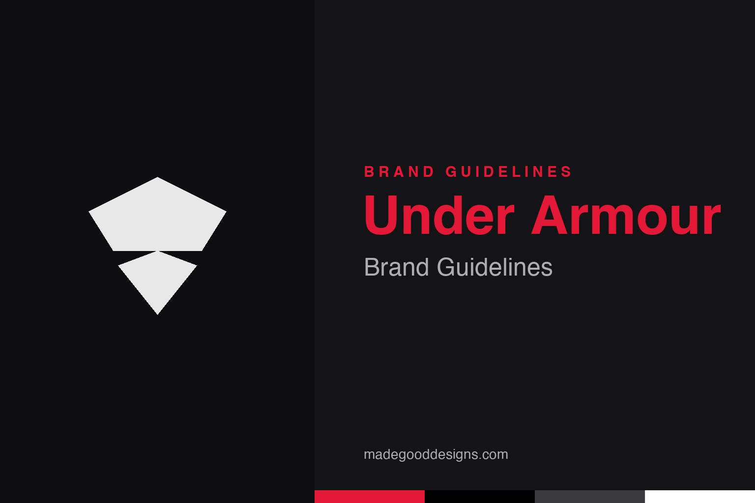
An abstract armour plate — the body-armour idea, not the UA. Deliberately not the Under Armour mark.
A logo that looks like armour
Under Armour’s UA is built to look protective and strong.
Under Armour’s mark is the interlocking “UA” — a “U” sitting over an “A,” formed from bold, mirrored arcs that together resemble a chest plate or a piece of body armour. That’s a perfect, on-the-nose match for the brand name and mission: the logo looks like armour, reinforcing an identity built around strength, protection, toughness and performance. It’s aggressive, symmetrical and strong, projecting exactly the qualities a hardcore athletic-performance brand wants. The mark reads instantly at any size — on a compression shirt, a cleat, a gym banner — and its symmetry gives it a logo-mark clarity that works without the wordmark. Our homage keeps an abstract armour-plate shape, not the UA.
Born in a basement
Under Armour is a classic underdog founding story.
The brand has a quintessential entrepreneurial origin. Under Armour was founded in 1996 by Kevin Plank, a former University of Maryland football player, who was tired of the heavy, sweat-soaked cotton T-shirts athletes wore under their pads. He developed a moisture-wicking synthetic compression shirt that stayed light and dry — and started the company from his grandmother’s basement in Washington, D.C., selling out of his car in the early days. That scrappy, athlete-founded, problem-solving origin is central to the brand’s identity: Under Armour presents itself as by athletes, for athletes, born from a real performance need rather than a marketing plan. The armour-like logo and the “protect this house” ethos both grow from that authentic, gritty beginning.
Challenging the giants in black
Under Armour’s look set it apart from the incumbents.
As a young challenger taking on entrenched giants, Under Armour needed to look different, tougher and more modern — and its identity delivered. The heavy use of black (with red and grey accents) gave the brand a serious, high-performance, almost military feel, distinct from the colourful, established looks of its rivals. Combined with the armour-plate logo and an intense, motivational tone (“We Must Protect This House!”), it positioned Under Armour as the gritty, no-excuses, next-generation performance brand — the choice for serious athletes who wanted an edge. That aggressive, monochrome, tech-forward aesthetic was a deliberate contrast to the incumbents, and it helped a basement start-up rapidly build a distinctive, recognisable presence in a fiercely competitive market dominated by household names.
When name, logo and story align
Under Armour is a lesson in perfect coherence.
Under Armour’s branding works because every element points in the same direction. The name (Under Armour — protective gear worn under your kit) describes the original product and the brand’s protective ethos. The logo literally looks like armour. The founding story is an athlete solving an athlete’s problem. The colour palette (tough black) and tone (intense, defiant) reinforce strength and performance. It’s an unusually coherent, mutually-reinforcing identity, where the name, the symbol, the origin and the aesthetic all tell one consistent story.
That coherence is the deep lesson. A brand is most powerful when its every component — name, logo, colours, tone, origin story — supports a single, clear idea; here, that idea is protective strength and hardcore athletic performance. When they align that tightly, the brand feels authentic and unmistakable, and it can punch far above its weight — which is exactly how a company started in a grandmother’s basement in 1996 grew, remarkably quickly, into a major global rival to sportswear’s biggest names. The armour logo isn’t a decorative flourish; it’s the visual keystone of a completely consistent story about toughness, protection and performance. Get that alignment right, and even a basement start-up can look like the future.
It’s worth restating the throughline, because it reaches far beyond Under Armour: the marks that endure are the ones built on a single clear idea, drawn with restraint, and repeated faithfully long enough to mean something. Fashions fade and technologies change, but a distinctive, well-chosen symbol backed by real substance only grows more valuable with time. The lesson for anyone building an identity is not to be the loudest or the newest, but to be the most consistent and the most authentic — and then to hold that line for as long as it takes.
Type & the wordmark
Bold, hard, performance lettering.
Under Armour’s wordmark is bold and hard-edged — strong, condensed lettering that matches the armour logo. The specimen below stands in with a heavy sans.
Protect this house
Bold, hard, intense — type with the edge of body armour. (Specimen set in Archivo, a neutral stand-in.)
Black & red
A tough black, with a red edge. Click a swatch to copy the hex.
Under Armour’s core is black #000000 with a red #E21836 accent, plus grey and white. Lead with black and red below.
Explore & save
Keep the armour idea on hand — save the plate homage and the black-and-red to a board.
Under Armour identity set
Pin the armour-plate homage, the black-and-red palette and the coherent-identity lesson to your own board.