Burberry Brand Guidelines
A knight, a check, and a rebrand round-trip — Burberry dropped its heritage in 2018 and brought it back by 2023.
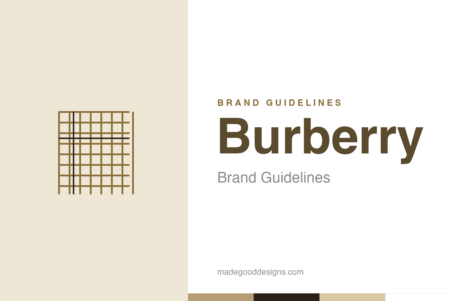
An abstract check pattern — the idea, not the Burberry check. Deliberately not the Burberry mark.
A knight riding forwards
Burberry’s heritage logo is a mounted knight.
Burberry’s historic emblem is the “Equestrian Knight” — an armoured knight on horseback carrying a lance with a flag reading “Prorsum,” Latin for “forwards.” Adopted around 1901 (via a public design competition), it conveys heritage, protection, chivalry and forward progress — the knight in armour symbolising the protective quality of Burberry’s weatherproof clothing, and “Prorsum” signalling innovation and moving ahead. It’s a distinctive, storied mark that roots the brand firmly in British tradition and craftsmanship. Founded in 1856 by Thomas Burberry (inventor of the breathable, weatherproof gabardine fabric), the company built its reputation on protective outerwear — trench coats above all — making the armoured knight a genuinely fitting emblem. Our homage nods to the famous check rather than the knight.
The check that became the brand
Burberry’s tartan is a signature in its own right.
Burberry’s other, even more recognisable signature is the Burberry Check — the distinctive tan, black, white and red tartan pattern introduced in the 1920s, originally as the lining of its trench coats. Over time that lining became one of the most iconic patterns in fashion, so strongly associated with Burberry that the check alone signals the brand instantly, no logo required. Like Louis Vuitton’s Monogram, it’s a proprietary pattern that functions as a brand asset in its own right — recognisable, ownable and heavily protected (and, as a mark of its fame, heavily counterfeited). The camel-and-black check embodies Burberry’s British heritage and its trench-coat legacy, and has been endlessly reinterpreted across scarves, bags and clothing. It’s a perfect example of a functional detail — a coat lining — becoming a defining piece of brand identity.
The rebrand round-trip
Burberry dropped its heritage, then reclaimed it.
Burberry’s recent history is a fascinating case study in the risks of rebranding. In 2018, under creative director Riccardo Tisci and designer Peter Saville, Burberry dropped the equestrian knight and adopted a bold, flat, modern sans-serif wordmark (plus a new “TB” monogram) — part of a wider trend of luxury houses switching to minimalist sans-serif logos. It was contemporary and clean, but critics argued it stripped away Burberry’s distinctive heritage, making it look generic. Then, around 2023, new creative director Daniel Lee reversed course, bringing back a serif wordmark and reinstating the equestrian knight. It’s a rare, public round-trip: a storied brand abandoning its heritage emblem for a trendy minimalist look, then returning to it a few years later — a vivid lesson in the enduring value of distinctive heritage assets.
Don’t discard your heritage
Burberry’s U-turn is a branding lesson in itself.
Burberry’s rebrand round-trip offers one of the clearest recent lessons in brand strategy: be careful about discarding distinctive heritage assets. The 2018 switch to a generic sans-serif wordmark was on-trend, but by dropping the equestrian knight Burberry sacrificed exactly the kind of unique, storied, ownable identity that sets a heritage luxury brand apart — and risked looking like everyone else. The 2023 reversal, bringing back the knight and a serif wordmark, was effectively an admission that those heritage elements were too valuable to abandon.
The takeaways are pointed. First, distinctive heritage is an asset, not a liability: a unique, meaningful emblem like the knight (or a proprietary pattern like the check) is precisely what makes a brand recognisable and defensible; trading it for a fashionable but generic look can erase hard-won equity. Second, trends are dangerous to chase: the wave of minimalist sans-serif luxury logos made many brands look interchangeable, and Burberry’s return to its serif-and-knight identity was part of a broader pushback. Third, consistency compounds — the knight and the check are powerful because of a century of use, and that value is squandered when abruptly discarded. Burberry’s very public U-turn is a gift to anyone thinking about a rebrand: before you throw out a distinctive heritage mark for something more modern, be very sure you’re not discarding the most valuable thing you own. Sometimes the boldest, smartest move is to keep — and reinvest in — the icon you already have.
Type & the wordmark
A heritage serif, restored.
Burberry’s wordmark returned to a heritage serif in 2023 (after the 2018 sans-serif era), alongside the knight. The specimen below stands in with a serif.
Prorsum
Serif, heritage, British — type as storied as the trench. (Specimen set in Newsreader, a neutral serif stand-in.)
The check colours
Camel, black and cream. Click a swatch to copy the hex.
Burberry’s palette centres on the check’s camel/beige #B79D74 with black #2A2016 and cream — heritage and British. Lead with camel below.
Explore & save
Keep the check idea on hand — save the homage and the palette to a board.
Burberry identity set
Pin the check homage, the camel palette and the don’t-discard-your-heritage lesson to your own board.


