Patagonia Brand Guidelines
A mountain skyline at sunset — and the brand that told you not to buy its jacket, then gave itself to the Earth.
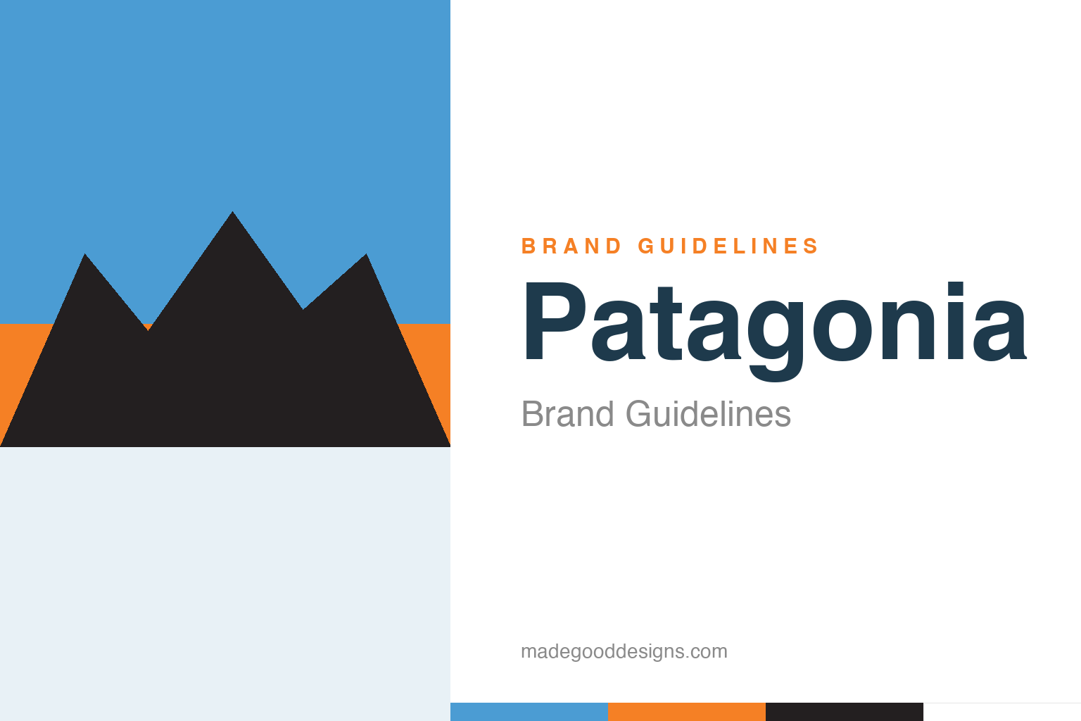
An abstract mountain range at sunset — the skyline idea, not Fitz Roy. Deliberately not the Patagonia logo.
A real mountain on the label
Patagonia’s logo is a specific, dramatic skyline.
Patagonia’s logo is a silhouette of a real place: the jagged skyline of Mount Fitz Roy (Cerro Chaltén), one of the most dramatic and difficult peaks in the Patagonia region on the Argentina–Chile border, set against a multi-colour sunset sky. The original was created around 1973 (attributed to artist Jocelyn Slack). It’s a beautiful choice for an outdoor-apparel company: rather than an abstract symbol, the brand wears an actual, awe-inspiring mountain range, instantly signalling wildness, adventure and the natural world it exists to protect. The gradient sky gives it warmth and romance. Our homage keeps an abstract mountain range at sunset, not the specific Fitz Roy outline.
A climber’s company
Patagonia’s authenticity comes from a genuine outdoorsman.
Patagonia was founded in 1973 by Yvon Chouinard, a legendary rock climber who started out making and selling his own climbing gear (Chouinard Equipment) before moving into clothing. That origin is the root of the brand’s enormous credibility: Patagonia isn’t a marketing company that discovered the outdoors, it’s an outdoors company founded by someone who genuinely lived it. Chouinard’s values — craftsmanship, durability, environmentalism, a deep suspicion of consumerism — are baked into the brand at a level most companies can only fake. The Fitz Roy logo carries all of that: it’s not aspirational scenery bolted onto a product, it’s the world its founder actually climbed. Authenticity like that can’t be bought; it has to be lived first.
‘Don’t Buy This Jacket’
Patagonia ran the most counter-intuitive ad in retail.
On Black Friday in 2011 — the busiest shopping day of the year — Patagonia ran a full-page ad in The New York Times with a photo of one of its jackets and the headline “Don’t Buy This Jacket.” The copy urged people to buy less, to repair and reuse, and to consider the environmental cost of consumption. It was a stunning act of brand confidence: a company actively telling customers not to over-consume its own products. And it worked precisely because it was true to the brand’s values — it deepened trust and loyalty rather than hurting sales. It remains one of the most studied pieces of marketing ever, a proof that a brand with genuine convictions can do the opposite of what marketing “should” do and win because of it.
Giving the company to the planet
Patagonia’s boldest move made the mission literal.
In 2022, Chouinard did something almost unheard of: he gave the company away. Ownership was transferred to a specially created trust and a non-profit (the Patagonia Purpose Trust and the Holdfast Collective), structured so that Patagonia’s profits — beyond what’s reinvested — go to fighting the environmental crisis. Chouinard’s line said it all: “Earth is now our only shareholder.” It was the ultimate expression of a brand aligning its structure with its stated values.
That’s what makes Patagonia such a profound branding case: the identity, the mission and the ownership structure all say the same thing. Most companies talk about purpose; Patagonia rebuilt its cap table around it. The Fitz Roy logo, the “Don’t Buy This Jacket” ad and the give-away are all one coherent statement, and that coherence is the source of the brand’s near-unmatched trust. The lesson is the deepest one in this whole series: a brand is not a logo or a colour, it’s the total, consistent expression of what a company actually is — and when the values are real all the way down, even the mountains on the label mean more.
Type & the wordmark
A sturdy, no-nonsense wordmark under the mountains.
The Patagonia wordmark is a sturdy, slightly condensed sans in bold caps — practical and rugged, like the gear. The specimen below stands in with a strong sans.
Save our home planet
Sturdy, rugged, honest — type as practical and unpretentious as a well-made jacket. (Specimen set in Archivo, a neutral stand-in.)
A sunset sky
Sky blue, sunset orange, dark peaks. Click a swatch to copy the hex.
The Patagonia logo uses a sunset gradient — sky blue, warm orange, dark peaks — and there’s no single fixed brand hex, so the values below (sky #4B9CD3, orange #F58025, peak #231F20) are faithful illustrative reconstructions. Treat them as a guide, not a spec.
Explore & save
Keep the skyline idea on hand — save the mountain homage and the sunset palette to a board.
Patagonia identity set
Pin the mountain-range homage, the sunset palette and the values-first lesson to your own board.


