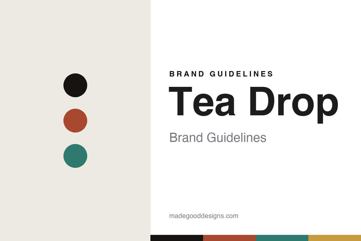
Tea Drop Brand Guidelines
The colourful tin.
Aa
Two constants: a colourful named-tin palette and a café sans register. Abstract homage — not the Tea Drop packaging.
The colourful tin
Tea Drop brought café-culture seriousness to tea.
Tea Drop is a lesson in café culture as identity. Founded in 2004 in Melbourne by Ashok Dias, it began by supplying tea to eateries and hotels — hospitality first — and grew up alongside Melbourne’s specialty-coffee wave, bringing that coffee-culture seriousness to tea. A brew bar at South Melbourne Market followed in 2014.
Its identity is the colourful named tin: a modern, accessible “gateway to tea” sold from a system of bright storage tins with named colourways (like Combat Green and Chantilly White), photographed cleanly and simply. The colour comes from the range of tins rather than one corporate hue. The teas span bags and loose leaf across black, green, herbal, fruit, white and oolong, plus chai, matcha and a Wellness collection, with plain descriptive names (English Breakfast, French Earl Grey, Malabar Chai), sold both to cafés and direct to drinkers.
(Honest notes: it’s “Tea Drop,” two words, and it’s an independent, founder-led business — not a large corporation. It was born from Melbourne’s coffee scene but it is a tea brand. Don’t confuse it with T-Totaler, a separate Sydney company. And there’s no official brand hex, so these tones are an unofficial interpretation.)
Colour
Tea Drop lives in a colourful named-tin palette. Click a swatch to copy the hex.
Tea Drop’s identity is colourful, modern and accessible — a brew coral, an ink, a café teal, a mustard, and a cream. The palette gathers a coral, a teal and a mustard — the register of a shelf of colourful named tins. It signals approachability and café energy rather than ceremony. The honest caveat: with no published brand hex, these tones are an original, unofficial interpretation, not first-party values.
The lesson is a set of bright named colourways signals accessible café tea. Tea Drop’s world is a colourful tin on a café shelf. For designers, it is a reminder that a multi-colour, named-tin system reads as friendly and modern — right for a brand that makes tea approachable. The takeaways: give each tin a colourway and a name; keep the photography clean; let the colour come from the range; and — because a bright coral fails as small text — keep type dark and let the colour live in the tins, palette and band; treat any single hex as unofficial.
Typography
The register is a café sans — modern, friendly, accessible.
Tea Drop’s identity carries a modern, friendly, accessible spirit — a colourful tin and a café shelf. A clean café sans captures the mood: it is contemporary and approachable, the register of a specialty café. Set in a colourful palette, the café sans feels modern and friendly — exactly the personality Tea Drop carries. It is accessible rather than formal, mirroring a bright named tin. (Tea Drop’s real packaging is work we describe but do not reproduce, and the exact typeface is not ours to use.) Because it is not ours to use, the honest description is “a café sans spirit,” shown here in a stand-in. The type behaves like the brand: modern, friendly and accessible.
Aa
A café sans spirit — modern and friendly. (Specimen set in Albert Sans, a clean contemporary sans STAND-IN; NOT the Tea Drop packaging.)
Café culture as identity
Tea Drop stands for tea, taken as seriously as coffee.
Tea Drop is a lesson in making café culture the identity. A colourful named-tin palette, a café sans and a hospitality-first story make approachability the whole brand — modern, friendly, accessible. The café energy is the differentiator. The differentiator is a colourful, café-culture identity.
For designers and brand-builders, Tea Drop offers a clear takeaway: bring one category’s seriousness to another. The lessons: treat tea with coffee-culture care; build a colourful named-tin system; keep the register modern and friendly; and be honest about the story. It is also a reminder to stay accurate: it’s “Tea Drop” (two words), independent and from 2004, unrelated to T-Totaler, and the palette here is an unofficial interpretation. Tea Drop made café culture the brand — proof that borrowed seriousness can be the difference.
Explore & save
Keep Tea Drop’s identity on hand — save it to a board in the Made Good inspiration library.
Tea Drop identity set
Pin the colourful named-tin palette and the café-sans register to your own board.


