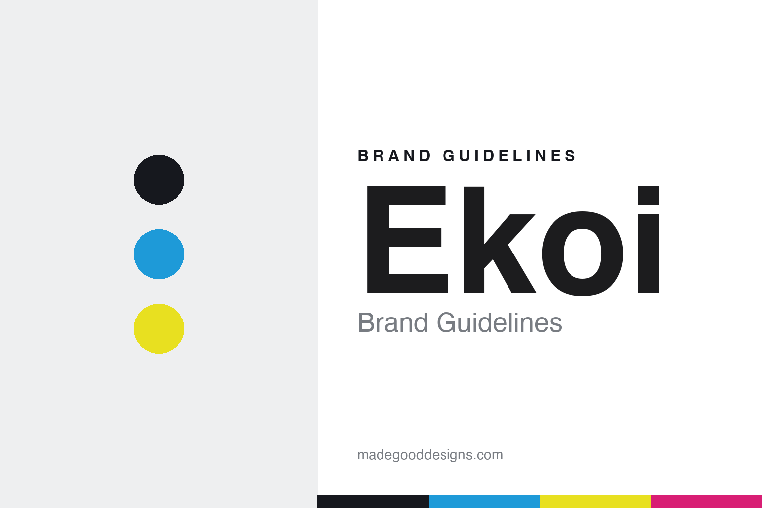
Ekoi Brand Guidelines
Pro gear, direct.
Aa
Two constants: a bold, high-vis palette and a bold display register. Abstract homage — not the Ekoi wordmark or logo.
Pro gear, direct
Ekoi sells pro-level kit straight to riders.
Ekoi is a lesson in the direct-to-consumer model. Founded in 2001 by Jean-Christophe Rattel — a cycling-industry veteran (ex-MBK, Vetta) — in Fréjus, on the French Riviera (Var), the brand makes helmets, apparel, shoes and eyewear and sells almost entirely through its own website, keeping pro-grade gear at accessible prices.
Its brand identity is bold, pro-visible and direct — high-visibility kit “developed in France” with sponsored pros, heavy on rider customisation, and a strong presence in the peloton (equipping teams such as Israel–Premier Tech and, through 2025, Cofidis).
(Honest notes: Ekoi is founder-led but not fully independent — the private-equity firm Trocadero Capital Partners has held roughly a 25% stake since 2021. Its kit is “developed in France,” not made in France. And there’s no official brand hex, so the colours here are an unofficial interpretation.)
Colour
Ekoi lives in a bold, high-vis palette. Click a swatch to copy the hex.
Ekoi’s identity is bold, high-vis and pro-facing — an ink, a cyan, a hi-vis yellow, a magenta, and a snow. The palette leans on bold, high-visibility colour — cyan, hi-vis yellow — the register of a brand built to be seen in the WorldTour bunch. It signals speed, visibility and accessibility rather than quiet luxury. The honest caveat: with no published brand hex, these colours are an original, unofficial interpretation, not first-party values.
The lesson is bold, high-vis colour signals a pro-facing, direct brand. Ekoi’s world is a peloton at speed. For designers, it is a reminder that high-visibility colour reads as fast and pro — right for a brand that lives on being seen in races. The takeaways: use bold, high-vis colour; keep the type bold to match; and treat any single hex as unofficial — using ink for small text so the colours stay bold.
Typography
The register is a bold display — loud and pro-facing.
Ekoi’s identity carries a bold, high-vis, pro-facing spirit — the peloton and direct-to-rider value. A bold display face captures the mood: it is loud and assertive, the register of a brand seen at race speed. Set in a high-vis palette, the bold display feels loud and pro-facing — exactly the personality Ekoi carries. It is assertive rather than quiet, mirroring high-visibility kit. (Ekoi’s real wordmark — written “Ekoï” with a diaeresis in French — is a trademark we describe but do not reproduce, and the exact brand typeface is not ours to use.) Because the mark is not ours to use, the honest description is “a bold display spirit,” shown here in a stand-in. The type behaves like the brand: bold, high-vis and pro-facing.
Aa
A bold display spirit — loud and pro-facing. (Specimen set in Unbounded, a bold display STAND-IN; NOT the Ekoi wordmark, which is a trademark.)
Direct as identity
Ekoi stands for pro gear, sold direct.
Ekoi is a lesson in making the sales model the identity. A bold, high-vis palette, a full pro-grade range and a direct-to-consumer model make accessible pro gear the whole brand — bold, visible, direct. The model is the differentiator. The differentiator is a bold, pro-facing, direct-to-consumer identity.
For designers and brand-builders, Ekoi offers a clear takeaway: a distribution model can be a brand. The lessons: sell direct (skip the middlemen); prove it in the peloton (sponsored pros and teams); and keep the look bold. It is also a reminder to stay accurate: it’s founder-led with a ~25% private-equity stake, its kit is developed (not made) in France, and the palette here is an unofficial interpretation. Ekoi made the direct model the brand — proof that how you sell can be the difference.
Explore & save
Keep Ekoi’s identity on hand — save it to a board in the Made Good inspiration library.
Ekoi identity set
Pin the bold high-vis palette and the bold-display register to your own board.


