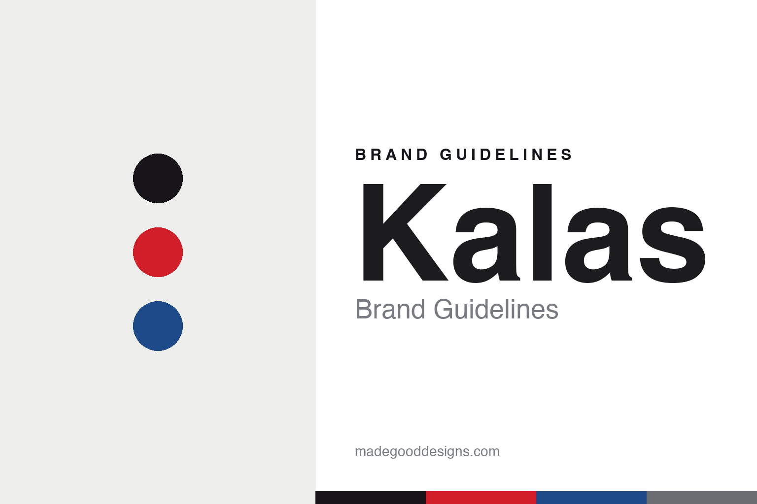
Kalas Brand Guidelines
Made in Bohemia.
Aa
Two constants: a red-and-blue palette and a condensed sans register. Abstract homage — not the Kalas wordmark or logo.
Made in Bohemia
Kalas is a Czech family maker of national-team kit.
Kalas is a lesson in family manufacturing at a national level. Founded in 1991 by Čestmír Kalaš — a Czech cyclist and coach who started a small workshop around 1990 — and based in Tábor, in South Bohemia, Czech Republic, the family company makes kit in its own factory using Italian and Swiss fabrics.
Its brand identity is Czech, family-made and national-team-proven — it has supplied the Czech national team since 1990, today kits the WorldTour team Alpecin–Premier Tech and the Dutch federation, and in a nice piece of history, made the Great Britain Olympic cycling kit across two Games (Tokyo 2020 and Paris 2024).
(Honest notes: the Great Britain deal is in the past — from 2025, British Cycling switched to Alé. In another neat link, Čestmír Kalaš met Assos founder Toni Maier in 1991 and Kalas produced kit for Assos in its early years. And there’s no official brand hex, so the tones here are an unofficial interpretation.)
Colour
Kalas lives in a red-and-blue palette. Click a swatch to copy the hex.
Kalas’ identity is national, family-made and Czech — an ink, a Czech red, a royal blue, a steel, and a snow. The palette pairs a Czech red with a royal blue — the register of national-team kit and Central-European racing. It signals heritage, craft and national pride rather than lifestyle. The honest caveat: with no published brand hex, these tones are an original, unofficial interpretation, not first-party values.
The lesson is red and blue signal national-team heritage. Kalas’ world is an Olympic start line. For designers, it is a reminder that a red with a royal blue reads as national and race-credible — right for a brand that has dressed national squads for decades. The takeaways: anchor with ink; pair a red with a blue; and treat any single hex as unofficial — using ink for small text so the palette stays national.
Typography
The register is a condensed sans — athletic and national.
Kalas’ identity carries a national, athletic, family-made spirit — Olympic squads and Czech craft. A condensed sans captures the mood: it is athletic and assertive, the register of a race number and a national jersey. Set in a red-and-blue palette, the condensed sans feels athletic and national — exactly the personality Kalas carries. It is assertive rather than soft, mirroring race kit. (Kalas’ real wordmark is a trademark we describe but do not reproduce, and the exact brand typeface is not ours to use.) Because the mark is not ours to use, the honest description is “a condensed sans spirit,” shown here in a stand-in. The type behaves like the brand: national, athletic and family-made.
Aa
A condensed sans spirit — athletic and national. (Specimen set in Teko, a condensed sans STAND-IN; NOT the Kalas wordmark, which is a trademark.)
National craft as identity
Kalas stands for family-made national kit.
Kalas is a lesson in making national-team craft the identity. A red-and-blue palette, a family factory in Tábor and decades of national-team kit make national craft the whole brand — proven, family-made, Czech. The craft is the differentiator. The differentiator is a national, family-made, made-in-Bohemia identity.
For designers and brand-builders, Kalas offers a clear takeaway: a manufacturing family can be a brand. The lessons: build real capability (own factory); earn credibility (national teams, Olympics); and stay rooted (Tábor since 1991). It is also a reminder to stay accurate: the Team GB deal ended in 2024 (now Alé), it dates to 1991 (not the 1930s), and the palette here is an unofficial interpretation. Kalas made national craft the brand — proof that manufacturing can be the difference.
Explore & save
Keep Kalas’s identity on hand — save it to a board in the Made Good inspiration library.
Kalas identity set
Pin the red-and-blue palette and the condensed-sans register to your own board.


