Food Truck Design: Wraps and Branding
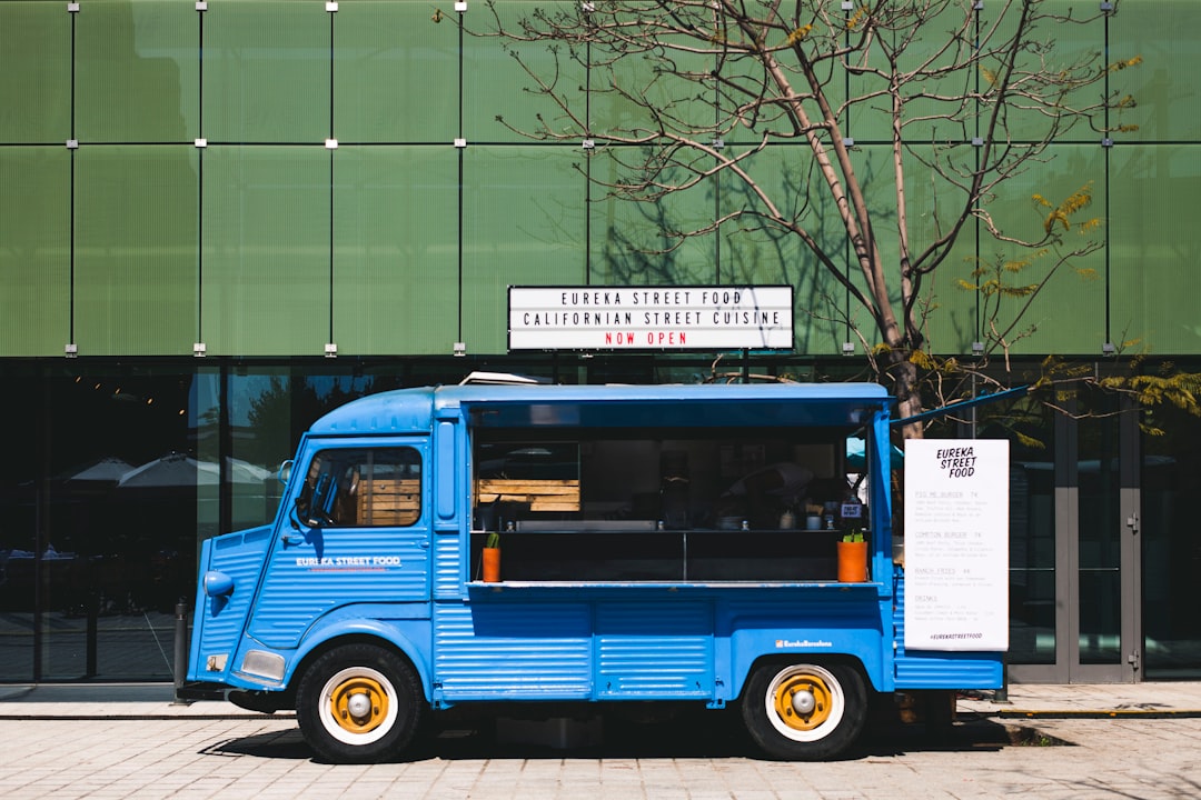
Food truck design has a constraint no brick-and-mortar shares: the whole brand is a moving billboard that has to be read from across a parking lot, at a glance, often while it is driving by. Get the wrap bold and legible and the truck sells itself before anyone reaches the window; get it busy or low-contrast and a great kitchen sits idle. This guide covers the branding and the production reality — vinyl wraps, sizing, and legibility at distance.
A truck is still a hospitality brand, so start with the system in our restaurant branding guide, then use this article for the vehicle-specific decisions that make or break a wrap.
The Food Truck Brand: Bold and Legible at Distance
The governing principle of food truck design is legibility at distance and speed. Customers decide whether to walk over from far away, so the name and the one-thing-you-sell (tacos, lobster rolls, coffee) must be readable at 50-plus feet and at a glance. That pushes the whole identity toward bold: heavy display type, high contrast, saturated color, and a ruthless hierarchy where the name and category dominate and everything else gets smaller. Subtle, delicate branding that works on a printed menu disappears on a moving truck.
Hierarchy: What Gets Read First
Design the wrap as a strict priority list, biggest to smallest, because a passerby reads it in that order:
- Name — largest element, readable from across the lot.
- What you sell — a category descriptor right under the name (“wood-fired pizza”).
- The hook — a signature dish image or one short line.
- Find/order info — social handle, website, QR for the menu, kept small and clean.
Resist the urge to put the full menu on the truck. The wrap’s job is to stop people; the menu board at the window does the ordering. A cluttered truck covered in text reads as noise from a distance.
Color and Type for Maximum Read
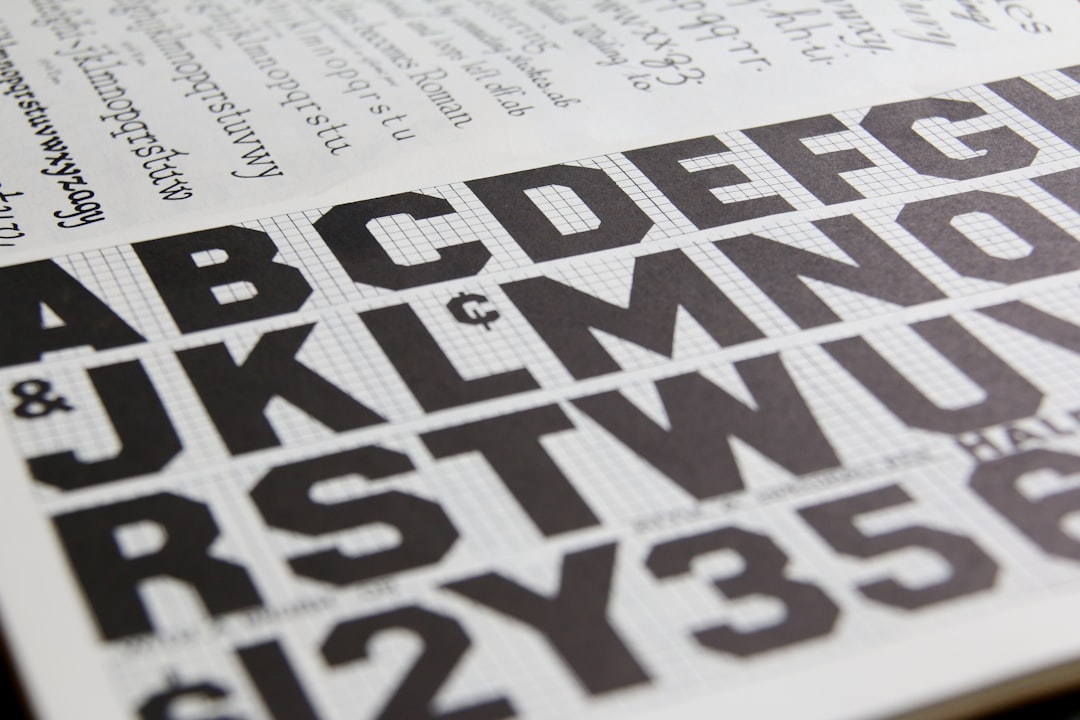
Use high-contrast color combinations so the name pops against the background at a distance — a saturated brand color with a strong dark or light counterpart beats a tonal, low-contrast palette every time. For type, reach for bold or condensed display faces with open, sturdy letterforms; thin, scripty, or highly detailed type vanishes at speed. Keep the palette tight — two or three colors — so the truck reads as one confident brand, not a sticker bomb. Specify Pantone references so the wrap printer matches your colors exactly. For choosing a strong, legible mark, see our food logo design guide; for pairing a bold display face with a workhorse, the font pairing guide.
Vinyl Wraps: How Production Actually Works
Most food truck graphics are produced as a vinyl wrap — large-format adhesive vinyl printed on a wide-format printer, laminated for UV and weather protection, then applied panel by panel over the vehicle’s body. Understanding the production changes how you design:
- It is large-format printing: artwork is built at scale (often quarter- or half-size at high resolution) and must be true vector or very high-res raster — a logo that looks fine on screen can pixelate at 3 feet tall.
- Full wrap vs. partial: a full wrap covers the whole body for maximum impact and cost; a partial wrap or large decals on a painted base is cheaper and often plenty.
- Lamination matters: a UV laminate keeps colors from fading in months of sun — non-negotiable for a vehicle that lives outside.
- Material and finish: cast vinyl conforms to curves and rivets better than cheaper calendared vinyl and lasts longer.
Measure the Truck First
You cannot design a wrap without the vehicle’s real dimensions and a panel template. Before any artwork, measure every printable surface — side panels, rear, serving-window side, and the awning area — and account for the obstacles the design has to flow around: the service window, doors, wheel wells, handles, vents, and any equipment. Many wrap shops provide a template for common truck and trailer models; if not, photograph and measure each side flat. Designing without measurements is the most common food truck wrap mistake, and it shows up as a logo bisected by a door seam or a name swallowed by the service window.
| Surface | Primary role | Watch out for |
|---|---|---|
| Service-window side | Main customer-facing pitch | The window cuts a big hole — design around it |
| Opposite (driver) side | Big clean canvas for name + dish | Doors and fuel cap seams |
| Rear | Read in traffic; social/web info | Bumper, lights, license plate clearance |
| Front / hood | Branding for head-on views | Grille, lights, curvature |
The Service Window and Menu Board
The service window is the conversion point, so the area around it deserves design attention: a clear menu board legible from the queue, your prices, and any specials, all in the brand type. Keep the board high-contrast and uncluttered — people read it standing in line, sometimes in sun glare. For full menu layout and pricing, see our menu design guide.
Tools and Files the Wrap Shop Needs
Build the wrap in vector in Adobe Illustrator sized to the panel template, and use Adobe Photoshop for any high-resolution photography placed on the design. Most wrap shops want production-ready vector or high-res files with fonts outlined, colors specified (including Pantone), and a small bleed beyond each panel edge. Confirm the shop’s file specs before you start — resolution, color profile, and bleed requirements vary — so the print matches what you designed.
Beyond the Truck
The brand extends past the vehicle: branded cups and wrappers, a tip jar, social handles on everything, a pop-up banner for festivals, and consistent photography online. A food truck is a close sibling to cafes and other quick-service concepts, so if you also run or plan a fixed location, our cafe branding guide covers carrying the identity into a permanent space.
Frequently Asked Questions
What makes a good food truck design?
Legibility at distance. The name and what you sell must read from across a lot in a glance, which means bold display type, high-contrast color, a strict hierarchy, and a tight palette. The wrap’s job is to stop people; the menu board at the window handles ordering, so keep the truck itself uncluttered.
How much does a food truck wrap cost?
It depends on coverage and material. A full wrap in cast vinyl with UV lamination costs more than a partial wrap or large decals over a painted base, and larger trucks cost more than trailers. Design, printing, and professional installation are usually quoted together — get the wrap shop’s quote against your exact vehicle.
Do I need a full wrap or just decals?
A full wrap gives maximum impact and a clean, all-over brand, but a partial wrap or large decals on a solid painted base is far cheaper and often reads just as well from a distance if the name and hierarchy are bold. Start with strong, large key graphics before paying for total coverage.
What files does a wrap shop need?
Production-ready vector files built in Illustrator at the panel template size, with fonts outlined, colors specified including Pantone, high-resolution images for any photography, and a small bleed past each panel edge. Always confirm the shop’s exact resolution, color profile, and bleed specs before designing, since requirements vary by printer.
How do I keep type legible on a moving truck?
Use bold or condensed display faces with open, sturdy letterforms, pair them with high-contrast color, and keep the name far larger than everything else. Avoid thin, scripty, or highly detailed type, which disappears at speed and distance. Test your design at small scale to simulate how it reads from across a lot.