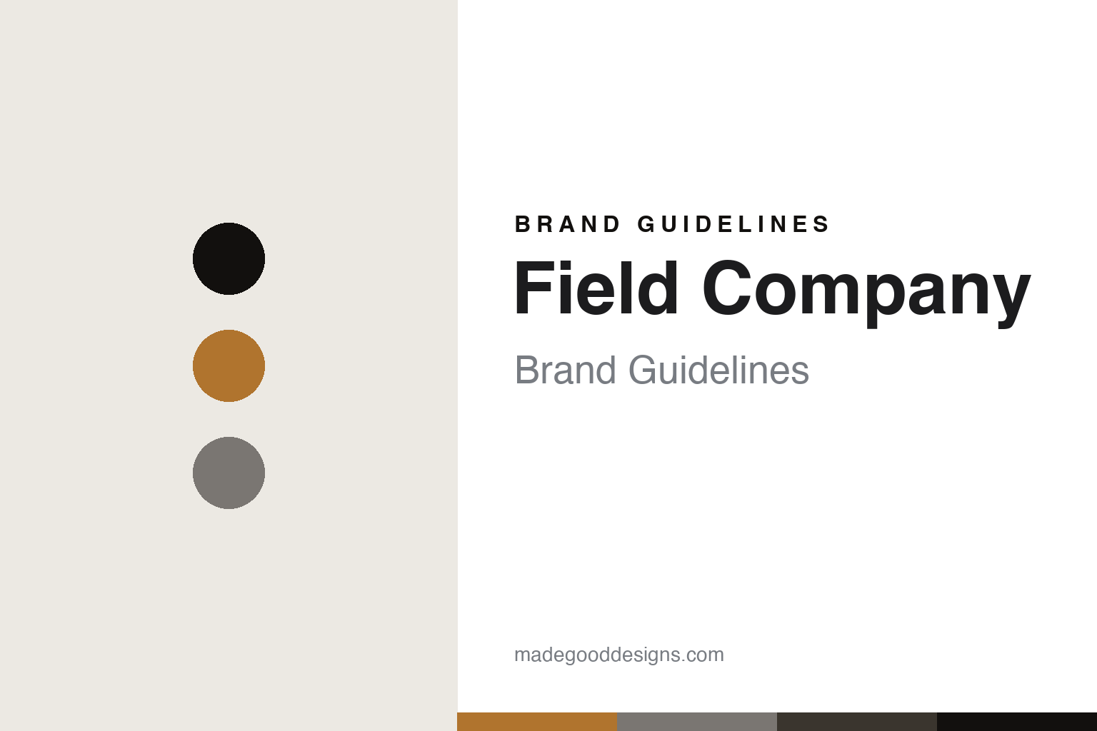
Field Company Brand Guidelines
The light cast-iron pan.
Aa
Two constants: a vintage-amber palette and a modern-sans register. Abstract homage — not a Field Company pan, surface or wordmark.
The light cast-iron pan
Field Company is an American brand reviving lighter, smoother cast iron, cast in the USA.
Field Company is a lesson in reviving an old cast iron as the identity. Founded by two brothers, it makes cast-iron skillets that are lighter and smoother than most modern ones — an attempt to recover the feel of the vintage American cast iron of the early twentieth century. Its answer to how a pan is made is a restorative one: cast iron, but thinner and machined smoother, the way the old Wagner and Griswold pans were, so a cast-iron pan can be a joy to lift and cook on. A cast-iron pan that remembers how good it used to be.
Its identity is the metal and the surface, cast light and smooth. Field Company’s lighter cast iron, its smooth surface and its US casting are the work it is known for. A revival, made a signature. A brand that fixed what modern cast iron forgot.
(Honest notes, so the story stays precise. Field Company was founded around 2015 by the brothers Stephen and Chris Muscarella — the name comes from their grandmother, and the pans were inspired by inherited 1930s Wagner cast iron. It is independent, and its cookware is cast in the USA: the company says its cast iron is made in the USA, with production across facilities in the Midwest, so we say cast in the USA rather than name a single foundry. Its design story is a lighter, smoother cast-iron skillet — thinner and polished to recover the feel of vintage American ware, in contrast to the heavier, rougher modern norm. Its designs and marks are its IP, described but never reproduced, and there is no official brand hex — these tones are an unofficial interpretation. This is design commentary and does not promote any product.)
Colour
Field Company lives in a vintage-amber palette. Click a swatch to copy the hex.
Field Company’s identity is warm, modern and American — a vintage amber, an ink, a cast iron, a char, and a chalk. The palette leans vintage amber and iron: the register of a seasoned skillet and a warm, remembered kitchen. It signals revival and craft over novelty. The honest caveat: with no published brand hex, these values are an original, unofficial interpretation, not first-party colours.
The lesson is a vintage-amber palette signals a revival, cast-in-USA identity. Field Company’s world is a lighter, smoother, cast-in-America object. For designers, it is a reminder that a warm amber and a cast-iron grey can carry a brand built on reviving an old standard — the amber of a seasoned pan and the grey of cast iron. Because these tones can fail as small text, keep type dark and let the colour live in the accents, palette and band. The takeaways: revive the old feel; cast it at home; be honest about where; and treat any single hex as unofficial.
Typography
The register is a modern sans — clean, warm, contemporary.
Field Company’s identity carries a clean, warm, contemporary spirit — a modern brand reviving an old object, not a heritage relic. A modern sans captures the mood: even, friendly and current, the register of a contemporary American maker. Set in a vintage-amber palette, the modern sans feels clean and warm — exactly the personality Field Company carries. It is contemporary rather than antique, mirroring an old idea made new. (Field Company’s real designs and marks are things we describe but do not reproduce, and the exact typeface is not ours to use.) Because it is not ours to use, the honest description is “a modern-sans spirit,” shown here in a stand-in. The type behaves like the maker: clean, warm and contemporary.
Aa
A modern-sans spirit — clean and warm. (Specimen set in Sora, a modern-sans STAND-IN; NOT the Field Company wordmark or any pan design.)
How a pan is made
Field Company stands for reviving lighter cast iron.
Field Company is a lesson in making a revival the identity. A vintage-amber palette, a modern sans and a light cast-iron surface make one thing — a cast-iron pan lighter and smoother than the modern norm — the whole maker: warm, modern and American. The revival is the differentiator. The differentiator is looking back to move forward: casting iron the way the old American makers did — thinner, polished — to recover a feel that mass-market cast iron lost.
Put to work, the identity is revival as design. A maker building in this spirit would study what an older generation did better, bring that quality back with modern making, and cast it at home. It would treat the contrast with heavy, rough modern cast iron as its whole argument. A brand learning from it would see that improving a familiar object by remembering its best past is a strong, honest position — not nostalgia for its own sake, but a specific, testable claim that a pan can be lighter and smoother. It would say plainly its cast iron is made in the USA. A brand learning from it would see that the most convincing kind of innovation is sometimes recovery — proving that an everyday object was once made better, and then making it that way again — because a claim you can feel in the hand beats any novelty. It would let a customer lift the pan and understand the whole argument in a second. The lesson Field Company teaches is that a revival can build a brand: the lighter casting gives it a real advantage, and the American making gives it substance. The revival is the personality, and the smooth, light pan is the proof.
For designers and brand-builders, Field Company closes this round about how a pan is made on the revival pole: recover what an object used to do well, and make it again at home. The lessons: revive the best of the past; cast it domestically; be honest about where; and never reproduce a protected design. It is also a reminder to stay precise: Field Company is an independent American brand founded around 2015 by the Muscarella brothers, casting lighter, smoother cast iron in the USA — with the palette here an unofficial interpretation. Field Company made the revival the maker — proof that the surface can be the difference.
Explore & save
Keep Field Company’s identity on hand — save it to a board in the Made Good inspiration library.
Field Company identity set
Pin the vintage-amber palette and the modern-sans register to your own board.


