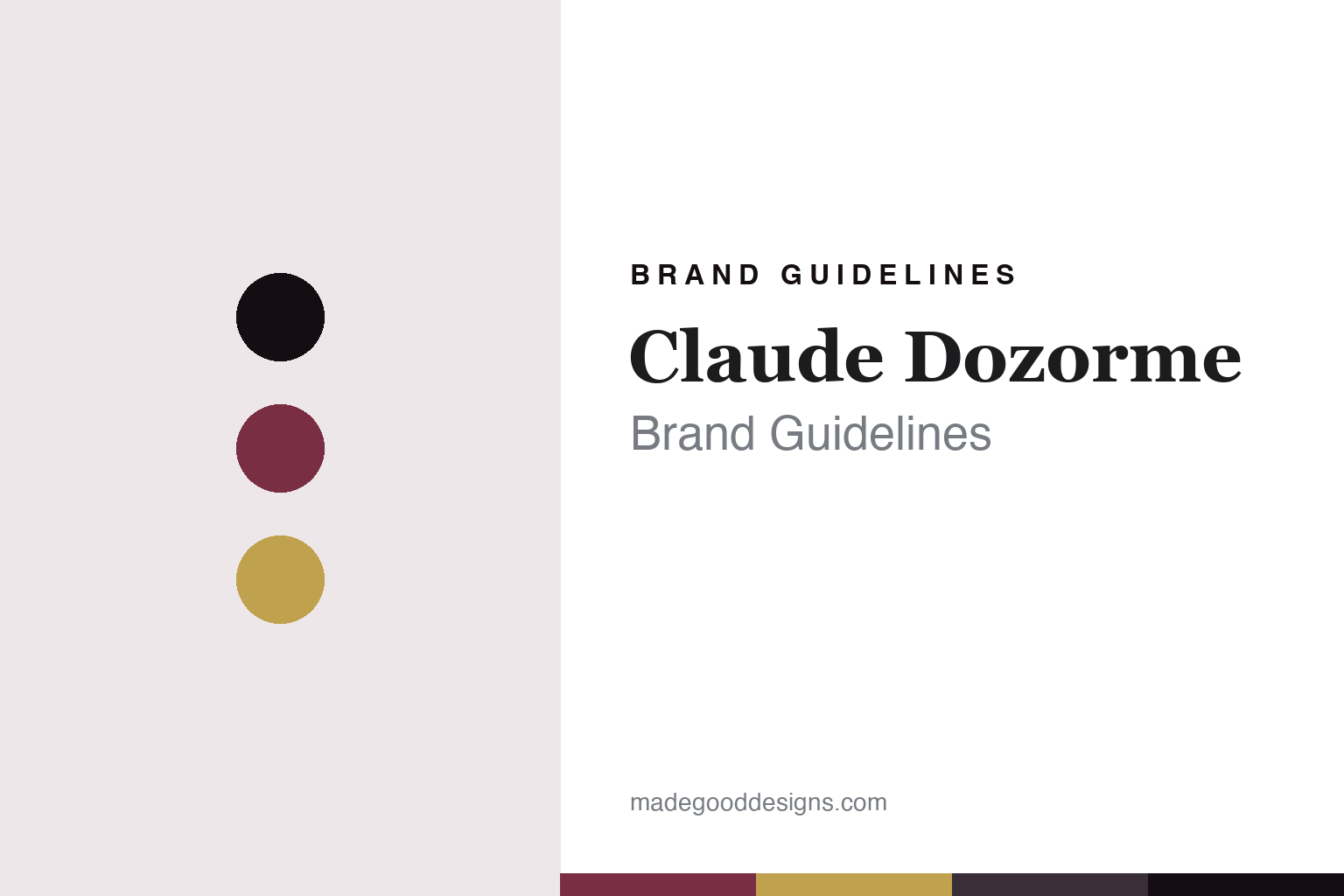
Claude Dozorme Brand Guidelines
The Thiers family house.
Aa
Two constants: a bordeaux palette and a French-serif register. Abstract homage — not a Claude Dozorme knife, mark or wordmark.
The Thiers family house
Claude Dozorme is a four-generation Thiers cutlery house, made in France, now under a new owner.
Claude Dozorme is a lesson in a family house passed on as the identity. From La Monnerie, near Thiers — France’s knife capital — it grew from a small 1902 subcontracting workshop into a design-led manufacture over four family generations, and then, when the family line ran out, was handed to a new owner who kept the name and the made-in-France craft. Its answer to how an old house keeps going is succession: build a family firm, and pass it on rather than let it die. A house that outlived its family, on purpose.
Its identity is the old house that was passed on. Claude Dozorme’s four generations, its Thiers making and its design-led range are the work it is known for. A lineage, made a signature. A maker that changed hands without losing itself.
(Honest notes, so the story stays precise. The workshop was founded in 1902 at La Monnerie, near Thiers, by Blaise Dozorme, and passed through four generations of the family — Blaise, Valentin, Claude and Claudine — with the eponymous Claude Dozorme brand emerging in the early 1980s, alongside a pioneering non-folding table Laguiole. It holds the French state’s Entreprise du Patrimoine Vivant label, awarded in 2009, and its knives are entirely made in-house near Thiers. One important, honest note: in 2022 Claudine Dozorme sold the company to a new owner, Didier Perret, who is not a family member — so we describe it as a four-generation family house, from 1902 to 2022, now continued by its new owner, rather than as still family-run. Its Le Thiers and Laguiole are generic, non-exclusive names, and its Berlingot line is its own. Its designs and marks are its IP, described but never reproduced, and there is no official brand hex — these tones are an unofficial interpretation. This is design commentary and does not promote any product.)
Colour
Claude Dozorme lives in a bordeaux palette. Click a swatch to copy the hex.
Claude Dozorme’s identity is refined, French and design-led — a bordeaux, an ink, a gold, an aubergine, and a cream. The palette leans bordeaux and gold: the register of a French table and a fine, decorated handle. It signals craft and design over plainness. The honest caveat: with no published brand hex, these values are an original, unofficial interpretation, not first-party colours.
The lesson is a bordeaux palette signals a refined, made-in-France identity. Claude Dozorme’s world is a design-led, hand-finished, made-in-Thiers object. For designers, it is a reminder that a deep bordeaux and a gold can carry a brand built on French craft — the wine of a table setting and the gold of a fine handle. Because these tones can fail as small text, keep type dark and let the colour live in the accents, palette and band. The takeaways: design it well; keep the making in Thiers; be honest about the ownership change; and treat any single hex as unofficial.
Typography
The register is a French serif — elegant, refined, warm.
Claude Dozorme’s identity carries an elegant, refined, warm spirit — a design-led object, not a plain one. A French serif captures the mood: graceful, high-contrast and cultivated, the register of a Thiers manufacture. Set in a bordeaux palette, the French serif feels elegant and refined — exactly the personality Claude Dozorme carries. It is warm rather than austere, mirroring a finely finished French knife. (Claude Dozorme’s real designs and marks are things we describe but do not reproduce, and the exact typeface is not ours to use.) Because it is not ours to use, the honest description is “a French-serif spirit,” shown here in a stand-in. The type behaves like the maker: elegant, refined and warm.
Aa
A French-serif spirit — elegant and warm. (Specimen set in Cormorant Garamond, a French-serif STAND-IN; NOT the Claude Dozorme wordmark or any knife design.)
The old houses
Claude Dozorme stands for the house passed on.
Claude Dozorme is a lesson in making succession the identity. A bordeaux palette, a French serif and a design-led blade make one thing — a family house carried across four generations and then handed on — the whole maker: refined, French and design-led. The succession is the differentiator. The differentiator is continuity beyond the family: a house that, rather than closing when the family line ended, was passed to a new owner who kept its name, its Thiers workshop and its made-in-France craft.
Put to work, the identity is continuity as design. A maker building in this spirit would build something worth passing on, keep the making in the place that defines the craft, and be honest when the hands at the top change. It would treat the name and the workshop as a trust to be handed forward intact. A brand learning from it would see that a heritage house survives by planning its own succession, and that changing owners is not the same as losing an identity — if the new steward keeps the craft. It would say plainly it is made in France, and that the family sold to a new owner in 2022, since hiding a change of hands only erodes the trust the name took a century to build. The lesson Claude Dozorme teaches is that succession can keep a brand alive: the four generations give it depth, and the Thiers making gives it substance. The continuity is the personality, and the made-in-France craft is the proof.
For designers and brand-builders, Claude Dozorme holds the succession pole in this round about the old houses: build something worth passing on, and hand it forward intact. The lessons: make it worth inheriting; keep the craft in place; be honest about ownership; and never reproduce a protected design. It is also a reminder to stay precise: Claude Dozorme is a four-generation Thiers house founded in 1902, made in France, passed in 2022 from Claudine Dozorme to a new owner who keeps the name — with the palette here an unofficial interpretation. Claude Dozorme made succession the maker — proof that a house passed on can be the difference.
Explore & save
Keep Claude Dozorme’s identity on hand — save it to a board in the Made Good inspiration library.
Claude Dozorme identity set
Pin the bordeaux palette and the French-serif register to your own board.


