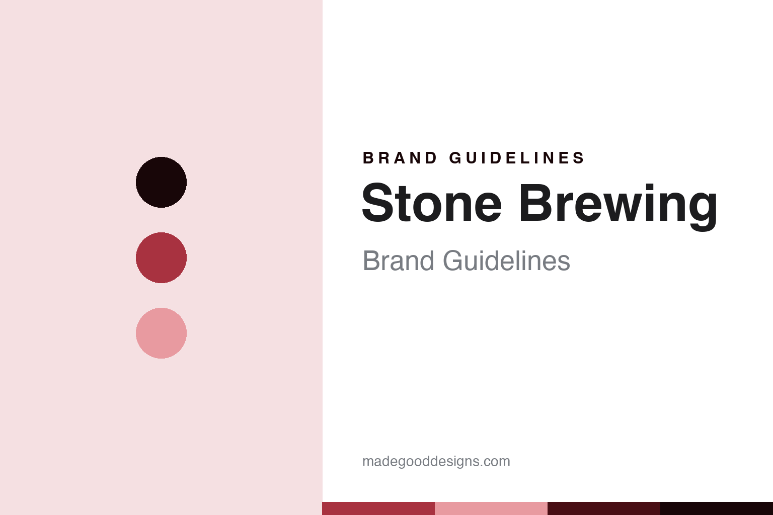
Stone Brewing Brand Guidelines
The bold west-coast icon.
Aa
Two constants: a bold-crimson palette and a bold-sans register. Abstract homage — not a Stone Brewing product or mark.
The bold west-coast icon
Stone Brewing is the San Diego brewery of bold branding and big IPAs — through a turbulent ownership arc.
Stone Brewing brings the round its attitude — the San Diego brewery whose confrontational, gargoyle-guarded branding and aggressive west-coast IPAs made bold the brand, and whose ownership has since taken a turbulent path. Stone makes craft beer, and its answer to a round about the craft beer icons is a voice: loud, proud and combative, on beers like Arrogant Bastard Ale and Stone IPA. A beer, that talks back.
Its identity is the bold west-coast icon. Stone’s bold branding, its gargoyle and its turbulent ownership are the story here. A beer, unafraid. The bold west-coast icon.
(Honest notes, so the story stays precise. Stone Brewing, at stonebrewing.com, was founded in 1996 in San Diego County, California by Greg Koch and Steve Wagner, and built a brand on bold, confrontational branding, gargoyle iconography and aggressive west-coast beers, from Arrogant Bastard Ale to Stone IPA. On ownership — the theme this round makes central — Stone’s arc is the most turbulent here: founded independent, it was acquired by the Japanese brewer Sapporo in 2022; Sapporo later booked a large impairment on the deal; and in 2026 Stone transitioned out of Sapporo, reported as now owned by Duvel Moortgat USA and managed alongside Firestone Walker, so we do not describe it as a Sapporo brand and we hedge the 2026 mechanics as reported. On where it is made, Stone brews in the US, though production is reported to be consolidating under its new operator in 2026, so we do not assert specific current sites. Its gargoyle and Arrogant Bastard marks are IP we describe but do not reproduce. There is no official brand hex here; these tones are an unofficial interpretation. This is design commentary, not a promotion — please enjoy responsibly.)
Colour
Stone Brewing lives in a bold crimson. Click a swatch to copy the hex.
Stone’s identity is bold, confrontational and west-coast — a bold crimson, an ink, a blush, a deep crimson, and a paper. The palette leans bold crimson and blush: a strong, assertive register that nods to a confrontational brand and a big IPA rather than a gentle palette. It signals a bold, unafraid brewery. The honest caveat: with no published brand hex, these values are an original, unofficial interpretation, not first-party colours.
The lesson is a bold crimson signals a confrontational, west-coast identity. Stone’s world is a bold, brewed object. For designers, it is a reminder that a strong crimson and a soft blush can carry a beer brand — the tone of attitude. Because these tones can fail as small text, keep type dark and let the colour live in the accents, palette and band. The takeaways: make attitude the brand; be unafraid; be honest about a turbulent ownership; and treat any single hex as unofficial.
Typography
The register is a bold sans — confrontational, strong, plain.
Stone’s identity carries a confrontational, strong, plain spirit — a bold brewery, not a gentle one. A bold sans captures the mood: assertive, direct and a little aggressive, the register of a beer that talks back. Set in a bold-crimson palette, the bold sans feels confrontational and strong — exactly the personality Stone carries. It is attitude rather than a logo, mirroring malt and metal. (Stone’s real wordmark and gargoyle are things we describe but do not reproduce, and the exact typeface is not ours to use.) Because it is not ours to use, the honest description is “a bold-sans spirit,” shown here in a stand-in. The type behaves like the beer: confrontational, strong and plain.
Aa
A bold-sans spirit — confrontational and strong. (Specimen set in Space Grotesk, a bold-sans STAND-IN; NOT the Stone Brewing logo.)
The craft beer icons
Stone Brewing stands for the bold west-coast icon.
Stone Brewing brings the round its attitude. A bold-crimson palette, a bold sans and a confrontational voice make one thing — the bold west-coast icon — the whole identity: bold, confrontational and west-coast. The bold branding is the differentiator, and the turbulent ownership is the meaning. The point is a San Diego brewery that made attitude its brand, and whose ownership travelled from independent to a global giant and out again.
Put to work, the identity is bold attitude told straight, as design. A maker in this spirit would make attitude the brand, stay unafraid, and be honest about a turbulent ownership. A reader in this spirit would keep the facts right: Stone was founded in 1996 in San Diego County by Greg Koch and Steve Wagner; its bold branding, gargoyle and Arrogant Bastard Ale define it; and its ownership went from independent to Sapporo in 2022, then out of Sapporo in 2026 to Duvel Moortgat USA, managed alongside Firestone Walker, with production consolidating under the new operator. Stone anchors the round’s who-owns-craft thread as the most turbulent case, the far end from Sierra Nevada’s steady independence, and it sits in the 90s-craft-boom cohort with Dogfish Head. The honest editorial moves are to date the founding to 1996, to trace the ownership arc without claiming Sapporo now, to hedge the 2026 mechanics as reported, and to reproduce no marks. The lesson Stone teaches is that a bold voice can be a whole identity, and honesty about the turbulent ownership keeps the boldness credible.
For designers and brand-builders, Stone continues the craft beer icons: make attitude the brand — and tell the ownership arc straight. The lessons: commit to a bold voice; build an iconography; trace an ownership history honestly rather than freezing it; keep a responsible tone with alcohol; and never reproduce a logo. It is also a reminder to stay precise: Stone Brewing is the San Diego brewery of bold branding and big IPAs, through a turbulent ownership arc — with the palette here an unofficial interpretation, and the piece a design commentary, not a promotion. Read that way, Stone is less a beer than a voice: a confrontational brand that has outlasted several owners. The lesson for a brand is that a bold voice and honest ownership history reinforce each other, and tracing the arc keeps the boldness earned. Stone made the-bold-west-coast-icon the identity — proof that attitude can define a beer.
Explore & save
Keep Stone Brewing’s identity on hand — save it to a board in the Made Good inspiration library.
Stone Brewing identity set
Pin the bold-crimson palette and the bold-sans register to your own board.


