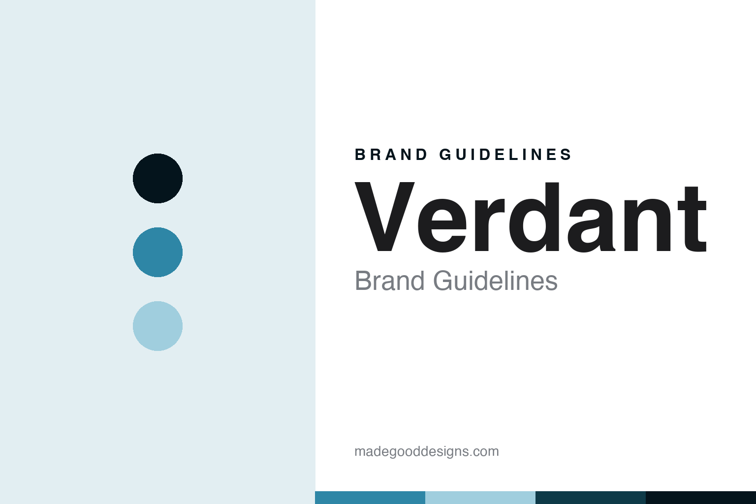
Verdant Brand Guidelines
The whimsical Cornish hazy brewery.
Aa
Two constants: a Cornish-cyan palette and an illustrated-sans register. Abstract homage — not a Verdant product or mark.
The whimsical Cornish hazy brewery
Verdant is the Cornwall hazy brewery whose whimsical, colourful illustrated cans built a cult following.
Verdant brings the round its whimsy — the Cornish brewery, born from a five-a-side football conversation and a shed on the coast, whose whimsical, colourful illustrated cans and cult hazy pales built a devoted following. Verdant makes Cornish hazy IPA, and its answer to a round about the hazy wave is illustration with character: playful, colourful can art on a best-selling pale, from an independent brewery in Cornwall. A beer, gladly illustrated.
Its identity is the whimsical Cornish hazy brewery. Verdant’s illustrated cans, its cult pales and its Cornwall roots are the story here. A beer, whimsical. The whimsical Cornish hazy brewery.
(Honest notes, so the story stays precise. Verdant Brewing Co. — at verdantbrewing.co, listed as active on the UK register with a clean record — makes Cornish craft beer, hazy pales and IPAs, its best-selling pale ale Lightbulb, alongside Headband and Pulp. It was founded in 2014, in an origin story of an autumn five-a-side football conversation and a first brew in a shed on the Cornish coast, and its founding directors are James Heffron and Adam Robertson; a sometimes-cited Rob Golding is not a listed officer, so we do not name him as a co-founder. On where it is made — a theme of this round — it brews in the UK, in Penryn, Cornwall, having moved from a small Falmouth site to the Penryn brewery in 2020, funded by crowdfunding. On ownership, it is independent and founder-directed, with a clean company record. Its signature is whimsical, colourful, illustrative can artwork, a genuine design story, which is IP we describe but do not reproduce; there is no official brand hex; these tones are an unofficial interpretation. This is design commentary, not a promotion — please enjoy responsibly.)
Colour
Verdant lives in a Cornish cyan. Click a swatch to copy the hex.
Verdant’s identity is whimsical, illustrated and independent — a Cornish cyan, an ink, a sky, a deep cyan, and a paper. The palette leans Cornish cyan and sky: a bright, playful register that nods to colourful illustrated cans and a coastal brewery rather than a quiet palette. It signals a whimsical, illustration-led maker. The honest caveat: with no published brand hex, these values are an original, unofficial interpretation, not first-party colours — and no borrow of the artwork is intended.
The lesson is a Cornish cyan signals a whimsical, illustrated identity. Verdant’s world is an illustrated, brewed object. For designers, it is a reminder that a bright cyan and a soft sky can carry a beer brand — the tone of playful illustration. Because these tones can fail as small text, keep type dark and let the colour live in the accents, palette and band. The takeaways: make illustration the identity; keep it whimsical; stay independent; and treat any single hex as unofficial.
Typography
The register is an illustrated sans — whimsical, colourful, plain.
Verdant’s identity carries a whimsical, colourful, plain spirit — an illustration-led brewery, not a conventional one. An illustrated sans captures the mood: playful, warm and characterful, the register of a colourful, whimsically illustrated can. Set in a Cornish-cyan palette, the illustrated sans feels whimsical and colourful — exactly the personality Verdant carries. It is illustration rather than a logo, mirroring bold ink and hazy beer. (Verdant’s real wordmark and can artwork are things we describe but do not reproduce, and the exact typeface is not ours to use.) Because it is not ours to use, the honest description is “an illustrated-sans spirit,” shown here in a stand-in. The type behaves like the can: whimsical, colourful and plain.
Aa
An illustrated-sans spirit — whimsical and colourful. (Specimen set in Mulish, an illustrated-sans STAND-IN; NOT the Verdant logo.)
The hazy wave
Verdant stands for the whimsical Cornish hazy brewery.
Verdant brings the round its whimsy. A Cornish-cyan palette, an illustrated sans and a colourful can make one thing — the whimsical Cornish hazy brewery — the whole identity: whimsical, illustrated and independent. The illustrated cans are the differentiator, and the playful character is the meaning. The point is a Cornwall brewery, born from a football conversation and a shed, whose whimsical can art and cult pales built a devoted following.
Put to work, the identity is whimsical illustration told straight, as design. A maker in this spirit would make illustration the identity, keep it whimsical, and stay independent. A reader in this spirit would keep the facts right: Verdant was founded in 2014 in Cornwall, its founders James Heffron and Adam Robertson, not the sometimes-cited Rob Golding; its best-selling pale is Lightbulb, with Headband and Pulp; it brews in Penryn, Cornwall, having moved from Falmouth in 2020; and it is independent and founder-directed with a clean record. Verdant sits in the round’s can-as-canvas thread at the whimsical-illustration end, distinct from Other Half’s type and Trillium’s botany, and pairs with Cloudwater as the UK brewers. The honest editorial moves are to date the founding to 2014, to name the correct founders and drop Rob Golding, to state the Penryn making, and to reproduce no artwork. The lesson Verdant teaches is that whimsical illustration can be a whole identity, and honesty about the founders keeps the design credible.
For designers and brand-builders, Verdant continues the hazy wave: make illustration the identity — and keep it whimsical. The lessons: build a brand on playful illustration; keep a consistent whimsical voice; stay independent; get the founders right; and never reproduce artwork or a logo. It is also a reminder to stay precise: Verdant is the Cornwall hazy brewery whose whimsical, colourful illustrated cans built a cult following — with the palette here an unofficial interpretation, and the piece a design commentary, not a promotion. Read that way, Verdant is less a beer than an illustration: a colourful, whimsical can from Cornwall. The lesson for a brand is that whimsical illustration and independence reinforce each other, and correcting the founders keeps the design earned. Read simply, Verdant’s argument is that character and colour, drawn with care, can carry a brewery as far as any spec sheet, and its clean company record keeps that argument honest. Verdant made the-whimsical-Cornish-hazy-brewery the identity — proof that illustration can define a brewery.
Explore & save
Keep Verdant’s identity on hand — save it to a board in the Made Good inspiration library.
Verdant identity set
Pin the Cornish-cyan palette and the illustrated-sans register to your own board.


