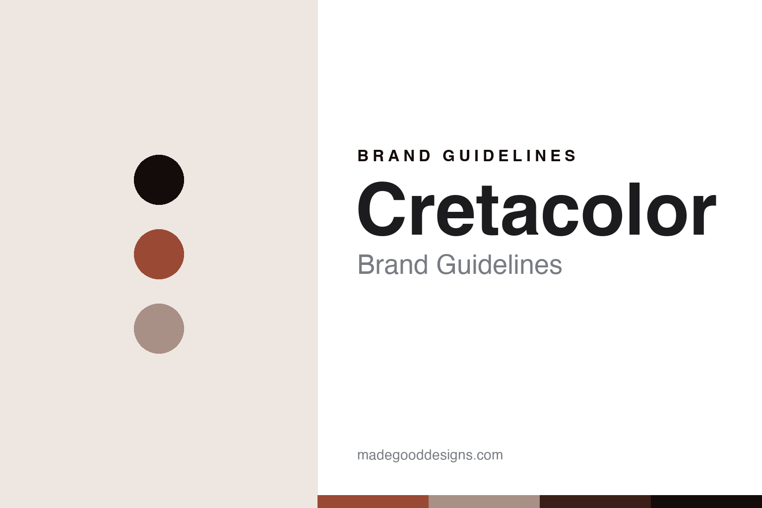
Cretacolor Brand Guidelines
The Austrian drawing house.
Aa
Two constants: a sanguine palette and a drawing-sans register. Abstract homage — not a Cretacolor colour, label or barrel.
The Austrian drawing house
Cretacolor is the only Austrian maker of artists’ materials, made in Hirm, tracing its heritage to the Hardtmuth pencil tradition.
Cretacolor is a lesson in how a colour core belongs to a drawing tradition. From Hirm, in the Austrian Burgenland, it makes professional drawing and colour materials — graphite, charcoal, sanguine, pastels and coloured pencils — for artists who draw. Its answer to how a colour is made a pencil is grounded in the fine-art studio: make cores for drawing as much as colouring, from woodless water-soluble sticks to oil-based artist pencils. A colour core made for the draughtsman.
Its identity is the Austrian drawing house. Cretacolor’s Aqua Monolith woodless colour, its Marino watercolour and its Karmina artist pencils are the work it is known for. A core, for drawing. The one Austrian maker of artists’ materials.
(Honest notes, so the story stays precise, because the heritage needs careful handling. Cretacolor makes its materials in Hirm, in Burgenland, Austria, and describes itself as the only Austrian manufacturer of artists’ materials — so it is Austrian, not German. It is a brand of the Brevillier-Urban & Sachs group (alongside JOLLY, SAX and BIBA). Its heritage traces to the Hardtmuth pencil tradition — the same Joseph Hardtmuth who developed the clay-and-graphite lead in the 1790s — but we do not say “founded 1792”: Cretacolor as a brand is much later, and it inherited its Hirm plant and tradition after the 1996 bankruptcy of Koh-I-Noor Hardtmuth. So we write that it “traces its heritage to” Hardtmuth, and note it is a separate company from today’s Czech Koh-I-Noor. Its coloured lines include Aqua Monolith (woodless, water-soluble), Marino (watercolour) and Karmina (an oil-based artist coloured pencil). Its name and line names are its IP, described but never reproduced, and there is no official brand hex — these tones are an unofficial interpretation. This is design commentary and does not promote any product.)
Colour
Cretacolor lives in a sanguine palette. Click a swatch to copy the hex.
Cretacolor’s identity is artistic, earthy and Austrian — a sanguine, an ink, a linen, an umber, and a paper. The palette leans sanguine and linen: the register of red drawing chalk and a fine-art studio. It signals drawing and craft over colouring-in. The honest caveat: with no published brand hex, these values are an original, unofficial interpretation, not first-party colours — an abstract nod to sanguine, not a sampled pencil.
The lesson is a sanguine palette signals a drawing-house, made-in-Austria identity. Cretacolor’s world is a fine-art, drawing-led, Austrian-made object. For designers, it is a reminder that a warm sanguine and a soft linen can carry a brand built on the draughtsman’s materials — the red-brown of drawing chalk and the linen of a sketchbook. Because these tones can fail as small text, keep type dark and let the colour live in the accents, palette and band. The takeaways: serve the draughtsman; keep it Austrian; trace the heritage honestly; and treat any single hex as unofficial.
Typography
The register is a drawing sans — plain, artistic, sure.
Cretacolor’s identity carries a plain, artistic, sure spirit — a fine-art drawing house, not a mass brand. A drawing sans captures the mood: clean, considered and studio-minded, the register of a maker of drawing materials. Set in a sanguine palette, the drawing sans feels plain and artistic — exactly the personality Cretacolor carries. It is sure rather than showy, mirroring a professional drawing core. (Cretacolor’s real labels and line names are things we describe but do not reproduce, and the exact typeface is not ours to use.) Because it is not ours to use, the honest description is “a drawing-sans spirit,” shown here in a stand-in. The type behaves like the house: plain, artistic and sure.
Aa
A drawing-sans spirit — plain and artistic. (Specimen set in Work Sans, a drawing-sans STAND-IN; NOT the Cretacolor wordmark or any label.)
The coloured-pencil houses
Cretacolor stands for the draughtsman’s colour, honestly traced.
Cretacolor is a lesson in how a colour core serves the person who draws. A sanguine palette, a drawing sans and a fine-art core make one thing — a colour made for the studio and the sketchbook — the whole house: artistic, earthy and Austrian. The drawing focus is the differentiator, and the honest heritage is the meaning. The point is the one Austrian maker of artists’ materials, whose lineage reaches the Hardtmuth pencil tradition but whose brand is its own — a separate company from today’s Czech Koh-I-Noor.
Put to work, the identity is a drawing focus as design. A colour house in this spirit would serve the draughtsman as much as the colourist, keep its manufacture local and Austrian, and trace a shared heritage carefully rather than claim it outright. It would say “traces its heritage to Hardtmuth,” not “founded 1792,” because the honest distinction between a lineage and a founding date matters. A brand learning from it would see that a clear specialism — drawing materials, for artists who draw — is a durable identity, and that being precise, Austrian not German, Brevillier-owned, heir to a Hardtmuth plant rather than the Hardtmuth company itself, keeps the heritage credible. A brand learning from it would also embrace an honest branch of a family tree: the same Hardtmuth root feeds both Cretacolor and Koh-I-Noor, and telling that split cleanly is more interesting than blurring it. The lesson Cretacolor teaches is that a focus can hold an identity: the drawing materials give it a purpose, and the honestly-traced heritage gives it depth. The specialism is the personality, and the draughtsman’s colour is the proof.
For designers and brand-builders, Cretacolor holds the drawing pole in this vein of the coloured-pencil houses, from Austria: serve a clear specialism, and trace a shared heritage honestly. The lessons: focus on the draughtsman; keep it local; distinguish a lineage from a founding; separate yourself from the sibling brand; and never reproduce a protected label. It is also a reminder to stay precise: Cretacolor is the only Austrian maker of artists’ materials, made in Hirm and tracing its heritage to the Hardtmuth pencil tradition — with the palette here an unofficial interpretation. Cretacolor made drawing the identity — proof that a clear specialism, honestly traced, can be the difference.
Explore & save
Keep Cretacolor’s identity on hand — save it to a board in the Made Good inspiration library.
Cretacolor identity set
Pin the sanguine palette and the drawing-sans register to your own board.


