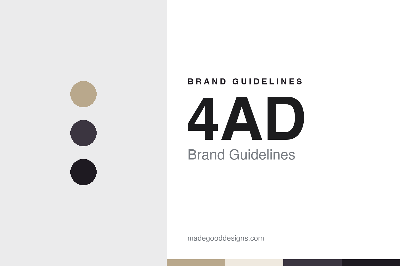
4AD Brand Guidelines
A name that meant nothing, and sleeves that meant a great deal.
Aa
Two constants: a sepia gold, dusk violet and night ink palette and a Display serif register. Abstract homage — not a 4AD asset or mark; no logo, sleeve or wordmark is reproduced.
From Axis to 4AD
Two shop assistants, four singles and a new name, 1979–1980.
4AD began behind a shop counter. The Guardian’s “Label love” column of 17 March 2010 said Ivo Watts-Russell and Peter Kent were working at the Beggars Banquet record shop in London, collecting demo tapes from new bands, when Martin Mills, the boss of the Beggars Banquet label, backed them to set up an imprint of their own. Wikipedia dates the founding of that imprint to 12 November 1979 and says it was run by the two of them as a property of Beggars.
The imprint was not called 4AD at the start. According to The Guardian, it was named Axis and was meant as a kind of test lab for its parent. Wikipedia says the name came from the Jimi Hendrix album Axis: Bold as Love, and that the idea was for successful acts to move up to Beggars Banquet after a year. In the opening week of 1980, The Guardian reported, Axis released four singles at once and immediately ran into trouble, because an American label held the rights to the name.
The replacement was worked out in a hurry. On the way to the printers for a second run, the 2010 article said, the pair played with typographical ideas, combining 1980AD, 4WD and the spectre of Orwell’s 1984 into 4AD. Wikipedia adds that the name was read as an abbreviation of the word “forward”. Watts-Russell himself told the writer Martin Aston, in a Guardian piece published on 10 October 2013, that what he loved about the name was that it meant nothing: “No ideology, no attitude. In other words, just music.”
Of the four opening singles, by The Fast Set, Shox, Bearz and Bauhaus, The Guardian said only the Bauhaus record, Dark Entries, was repressed. The Observer reported in August 2010 that 4AD released the Bauhaus album In the Flat Field later in 1980. Wikipedia says Bauhaus then moved to Beggars Banquet, the only band to follow the planned route.
The partnership itself was short. Aston’s 2013 article said Kent had been managing Beggars’ Earls Court branch when the label was founded, and that differences over the label’s direction led him to leave; Beggars funded his new label, Situation 2. Wikipedia says Watts-Russell and Kent bought the label from Beggars Banquet in 1980 and that Kent sold his share to Watts-Russell at the end of 1981. From then on, the name and the label’s look were in Watts-Russell’s hands.
Colour
A roster built in London, an office in Los Angeles and a return to Beggars.
The roster that followed is documented release by release. The Guardian said in 2010 that by 1982 the label had found the Scottish group Cocteau Twins, followed by the Wolfgang Press, Clan of Xymox, Xmal Deutschland and Dead Can Dance. Watts-Russell also assembled a studio project, This Mortal Coil, around singers from the label, including the Cocteau Twins’ Elizabeth Fraser; the same article listed its album It’ll End In Tears as a 1984 release.
The label then looked across the Atlantic. The Guardian said Watts-Russell signed the American band Throwing Muses and that the Boston band Pixies followed; it listed the Pixies’ debut, Come On Pilgrim, as a 1987 release, compiled from demo tapes. Wikipedia says the label set up an office in Los Angeles in the 1990s, signed a deal with Warner Bros. Records for the United States in 1992, and started a sub-label, Guernica, in 1993.
Ownership came full circle at the end of the decade. Aston wrote in The Guardian on 10 October 2013 that Watts-Russell ran the label from 1980 to 1999, and that in 1999 he sold his half to his business partner Martin Mills of Beggars Banquet. The 2010 “Label love” column said he retired that year to focus on photography and sold 4AD back to Beggars. Beggars Group has owned 4AD since 1999; Wikipedia describes 4AD today as a British record label owned by Beggars Group.
The label kept growing inside the group. Wikipedia says Simon Halliday took control at the end of 2007, and that in 2008 the Beggars Group realigned itself so that several labels, including Beggars Banquet, were folded into 4AD, bringing acts such as The National onto the roster. It lists Bon Iver’s For Emma, Forever Ago, catalogue number CAD 2809, and TV on the Radio’s Dear Science, CAD 2821, among the releases of that period, and St. Vincent’s Actor, CAD 2919, in 2009.
Those catalogue numbers carry part of the brand. The Observer reported on 29 August 2010 that the label’s 30th anniversary was marked only by a small “3X” at the end of every 4AD album catalogue number that year, and called minimalism the label’s style. Its new release that autumn was Halcyon Digest by the American band Deerhunter. The history of the label was later told by Aston in the book Facing the Other Way, published in 2013.
Typography
Spines, catalogue numbers and a house sleeve style.
A record label’s identity rarely lives in one place. It is spread across a series of small, repeated surfaces that a listener meets again and again: the logo printed on the centre label of a vinyl disc, the mark that sits at the top or bottom of a sleeve spine, the run of letters and numbers that make up a catalogue number, and the rule set that decides how a front cover is laid out. Seen one at a time these details are modest. Seen across a shelf of releases they become the brand.
Spines matter because records are usually stored edge-on. A consistent spine treatment — the same typeface, the same position for the logo, the same order for artist, title and catalogue number — lets a run of releases read as a set. Catalogue numbers do similar work: a prefix and a sequence turn a list of records into an archive that collectors can follow.
Some labels go further and give their sleeves a house style, built by a single designer or studio over many years. Others let each artist lead and keep the label’s presence to a small mark. Imprints, sub-labels, shops and mail-order operations extend the same identity into new places, from a carrier bag to a shop sign. In each guide below, the question is which of these surfaces a label has used, and how consistently.
Aa
A display serif — after the label’s long association with fine, layered typography on its sleeves. (Specimen set in Cormorant Garamond, a serif STAND-IN; NOT the 4AD logo or any 4AD typeface.)
4AD
Vaughan Oliver, Nigel Grierson, 23 Envelope and v23.
The visual side of 4AD is tied to one designer. Aston wrote in The Guardian in 2013 that Watts-Russell’s interest in art led him to hire a full-time designer, Vaughan Oliver, and that the label’s sleeves ranged from Oliver’s own image for the Breeders’ Pod to photographer Nigel Grierson’s paint-and-water abstractions for Cocteau Twins. The 2010 “Label love” column said Oliver’s designs sealed 4AD’s identity from the very early days.
The work had a studio name. Wikipedia says 23 Envelope was Oliver, on graphic design and typography, with Grierson on photography, and that together they made the artwork for almost all 4AD releases until 1987. After Grierson left in 1988, Oliver continued for the label under the name v23 with Chris Bigg, collaborating with photographers such as Simon Larbalestier. Dezeen reported on 30 December 2019 that Oliver had died, and said he created much of 4AD’s album artwork between 1982 and 1998 through those studios.
Dezeen listed covers including the Pixies’ Doolittle and Surfer Rosa, Scott Walker’s The Drift and the Cocteau Twins’ Treasure, and said his work drew on the Surrealist painter Salvador Dalí. The label’s statement, quoted in the same report, credited Oliver with giving 4AD and its musicians an identity. Wikipedia says Oliver aimed for “a sense of continuity” across each band’s catalogue while building individual identities for bands, so the house style worked as a family of sleeves rather than a single template.
The work also left the record shop. Wikipedia says an exhibition of Oliver’s 4AD designs opened at the Espace Graslin in Nantes in February 1990 and moved on to the Parc de la Villette in Paris, and that the design writer Rick Poynor published the monograph Vaughan Oliver: Visceral Pleasures with Booth-Clibborn Editions in 2000. A book drawn from his archive followed from Unit Editions in 2018.
For a design guide, 4AD shows how a label with a deliberately empty name can let a house sleeve style, a designer’s studio and a catalogue-number system carry its identity for decades. Compare Warp Records, whose sleeves are tied to a single design studio, and Sub Pop, another independent label with a strong visual voice. For this guide we use sepia gold, dusk violet and night ink with a serif, an unofficial interpretation; no product or logo is reproduced.
Explore & save
Keep 4AD’s identity on hand — save it to a board in the Made Good inspiration library.
4AD identity set
Pin the 4AD sepia gold, dusk violet and night ink palette and the Display serif register to your own board.


