Gestalten Brand Guidelines
A publisher named for the act of giving form.
Aa
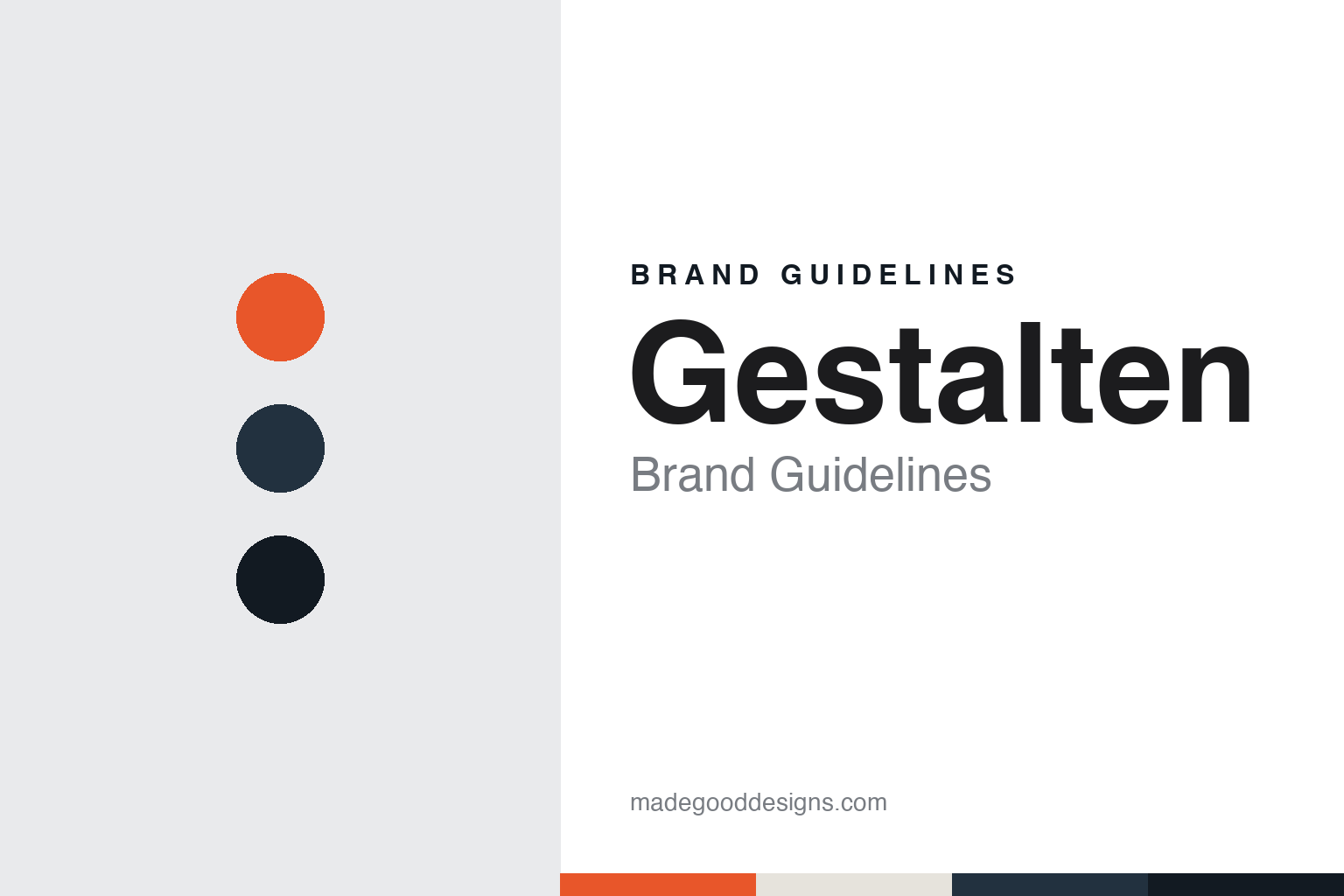
Two constants: a flyer orange, Berlin ink and concrete palette and a grotesque sans register. Abstract homage — not a gestalten asset or mark; no logo, wordmark or typeface is reproduced.
From techno flyers to a publishing house
Berlin in the early 1990s, to 1995.
Gestalten began in the Berlin club scene rather than in publishing. Wikipedia says the company was established by three friends, Robert Klanten, Markus Hollmann-Loges and Andreas Peyerl, who all moved to Berlin in the early 1990s, came into contact with the city’s techno and rave scene, and began by designing flyers, posters and record covers for music labels and for events such as the Love Parade.
A book followed from that work. Wikipedia says that in 1994 the three conceived a book about techno art, documenting the visual side of the culture. The Frankfurter Allgemeine Zeitung, in a profile by Julia Löhr dated 9 September 2014, told the story from Klanten’s side: when he moved to Berlin in the mid-1990s to become a publisher, he allowed himself a single attempt, a book called Technoart about the culture of the techno scene, which would decide whether the business continued after its opening title.
Both accounts describe the same test of demand. According to the FAZ, Klanten had order cards glued into music magazines; the cards came back within a few weeks, and he took them in a box to the local savings bank and received the loan he had hoped for. Wikipedia describes the cards as distributed through techno magazines and says the orders allowed the founders to obtain a loan for their debut book, The Localizer 1.0, which led to the foundation of the publishing house Die Gestalten Verlag in 1995. The trade journal Börsenblatt gave the same founding year in August 2016, and the company’s own website says it was founded in 1995.
Klanten has given his own version of the start. In an interview with the Hungarian design magazine Hype & Hyper, published on 18 May 2023, in which he is described as founder and chief executive, he said he had studied industrial design and that during his university years he and a colleague had built prototype design exhibitions for a consumer fair. The people they met there, he said, became the subject of the book, with contributors sending in their work; the founders had not set out to become a publishing house and simply wanted to get that one book done, but it attracted the attention of agencies, businesses and brands.
Colour
A name that is a verb, and a list printed in English.
The name is a piece of German wordplay. Klanten told Hype & Hyper in May 2023 that the house was originally called Die Gestalten, a play on German words meaning both “design” and “shape”. Because that form is a noun, he said, the company moved towards something more dynamic: gestalten as a verb, which he described as meaning to give form to something, to create — a deliberate action rather than a passive one. Wikipedia records the same change, saying the name was later shortened to gestalten and that the word means to shape or to create in German. The company now styles the imprint in lower case, while the publishing house itself still trades as Die Gestalten Verlag.
The subject matter moved with the founders. Wikipedia says the list shifted away from music towards books on graphic design in 1998, and later broadened to architecture, food culture, travel, motorbikes and bicycles. Börsenblatt described the house in August 2016 as publishing books on art, design, architecture and typography, and in April 2017 as covering current tendencies in architecture, design, lifestyle and motoring.
Language has been a constant. Klanten told Hype & Hyper that the company publishes in English because English lets it reach readers internationally, and Börsenblatt reported in April 2017 that the books appear primarily in English and are distributed internationally from Berlin through subsidiaries and a network of representatives, with a growing number of German-language titles alongside.
The house has also published for other organisations. Dezeen reported on 2 September 2016 that, besides its own-label books on architecture, design, art and photography, Gestalten published books and travel guides for Monocle magazine and ran a creative consulting wing. Wikipedia lists further partners including the architecture website ArchDaily, the magazine Kinfolk, the outdoor brand Parks Project and Marvel, and a book with the industrial designer Dieter Rams. Börsenblatt reported in 2017 that a children’s segment had been added under the name Little Gestalten.
Klanten described his editorial test to Hype & Hyper: a book, he said, has to work for at least the next two to four years, and topics are chosen mostly through research, with a smaller share of intuition. He also said that around 2006, before online video was widespread, the company was already making short films about creative people.
Typography
A publisher’s name, imprints and owners.
Colophons, credit lines and the catalogue as brand surfaces
For a publisher of illustrated books, the identity rarely lives in one big logo. It turns up in small, repeated places: the colophon on the title page, the device stamped at the foot of the spine, the imprint line on the copyright page. A reader may never notice any of these on their own, but a shelf of books from one house shows them all at once, and the spine mark is often the first thing a browser sees.
Series design does the heavier lifting. A shared grid, a fixed type family, a consistent cover format and a numbered sequence tell the buyer that one title belongs with the others. Good series work leaves room for each book’s own image while keeping the frame recognisable.
A picture agency works through different surfaces. Its name appears in the credit line printed beside or beneath a photograph, often in tiny type, and that line travels across newspapers, magazines, books and screens the agency does not control. Catalogues, archive websites, exhibition walls and print-sale pages then carry the fuller visual system, where typography, white space and image handling set the tone. In both trades, the brand is built less by declaration than by steady, quiet repetition.
Aa
A grotesque sans — after the clean, contemporary type that suits a design-led book list. (Specimen set in Archivo, a sans STAND-IN; NOT the gestalten logo or any gestalten typeface.)
Gestalten
A shop, a restructuring and a partner from 2017.
The founding trio did not stay together. Wikipedia says Gestalten has been led solely by Robert Klanten since his co-founders Markus Hollmann-Loges and Andreas Peyerl left in 2008. In its September 2014 profile, the FAZ described Klanten as owner and managing director of the Berlin house and noted that he had recently added a concept store in the city to the publishing business.
That store became the turning point of the following decade. Dezeen reported on 2 September 2016 that Gestalten had entered voluntary insolvency after problems with Space Berlin, its concept store on the top floor of the Bikini Berlin shopping complex, and that the arrangement was meant to let the company restructure and refocus on its core publishing business.
The ownership changed when the process ended. Börsenblatt reported on 27 April 2017 that Gestalten had completed the procedure and would enter a strategic partnership from 1 May 2017 with MairDumont, the travel publisher based in Ostfildern, which was taking a half share in the company. It said Klanten would remain publisher, creative director and managing director, that Markus Schneider of MairDumont would join as commercial managing director, and that the Gestalten brand, its editorial direction, staff and location would stay the same. MairDumont’s publisher Stephanie Mair-Huydts said her group’s strategic field was travel and lifestyle. Wikipedia describes MairDumont as the parent and says the investor and Klanten each hold half of the shares.
The company now describes itself as part of the MAIRDUMONT Group, a family-owned publisher with a tradition in travel and cartographic publishing. Its website says Die Gestalten Verlag brings together two imprints, gestalten and teNeues, the latter founded in 1931 and known for photography books, and that Little Gestalten publishes illustrated books for younger readers within the gestalten imprint. The company says each imprint keeps its own editorial perspective and visual language.
For a design guide, Gestalten shows how a publisher can take its identity from a single verb, carrying the language of club flyers into a list printed in English for an international audience. Compare Taschen and Thames & Hudson, two other illustrated-book publishers in this collection. For this guide we use flyer orange, Berlin ink and concrete with a sans, an unofficial interpretation; no product or logo is reproduced.
Explore & save
Keep Gestalten’s identity on hand — save it to a board in the Made Good inspiration library.
Gestalten identity set
Pin the Gestalten flyer orange, Berlin ink and concrete palette and the grotesque sans register to your own board.