Solo Brand Guidelines
The Chicago cup maker behind the red party cup.
Aa
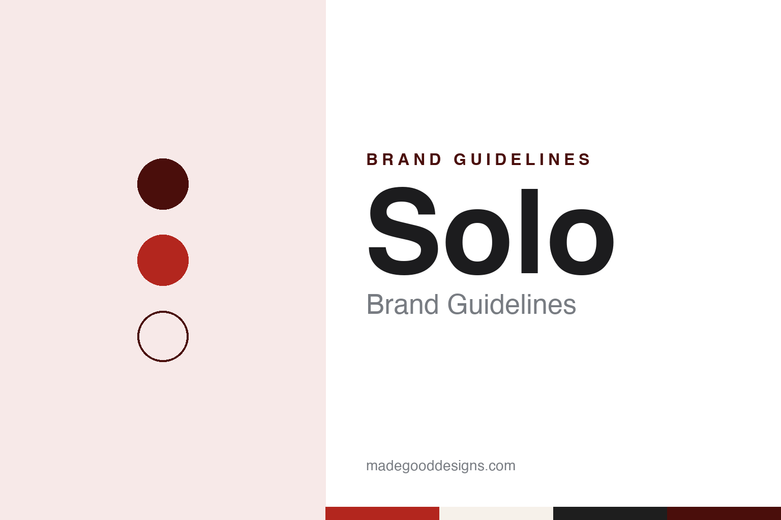
Two constants: a cup red, rim white and lid black palette and a sturdy grotesque sans register. Abstract homage — not a Solo product or mark; no cup, lid or logo is reproduced.
South Shore
A cup salesman goes into business for himself.
Solo began in Chicago in 1936. The brand’s own history page starts its story in that year, and so did Dart Container’s announcement of its purchase of the company in May 2012. The Chicago Tribune, in a long history of the red party cup by Christopher Borrelli published on 2 July 2018, said the business started in the city’s South Shore neighborhood, then moved north to Highland Park and later to Lake Forest.
The founder was Leo Hulseman. The Tribune described him as a South Dakota native who had worked as a salesman for Vortex, a Chicago maker of conical disposable cups, and who left that company in 1936 to start a cup business of his own. Solo says Hulseman began by producing and distributing small, disposable paper cones. English Wikipedia says the company was first called Paper Container Manufacturing and that its early plant was a former ice plant on the South Side.
Where the name came from is less settled. The Tribune, citing the writer Robert Loerzel, said Hulseman probably took it from a Czech immigrant who had invented a cup-making machine that gave the young business its footing. English Wikipedia names that inventor as George Method Merta, says Hulseman bought the machine from him in 1940, and credits Merta’s wife, Bozena, with the name, chosen because the cup was meant for a single use.
The range widened after the war. By the 1950s, the Tribune said, Solo was making cups with wax-coated walls that kept drinks cold at drive-ins and theaters, and by the 1960s it was known for cone-shaped cups and the Cozy Cup, a disposable insert for a reusable coffee holder.
The family also used the packaging for something unusual. Leo Hulseman’s wife, Dorothy, had performed in vaudeville before their marriage under the name Dora Hall. The Tribune reported that Leo set up Reinbeau Records in Chicago, that Dora recorded 45 rpm singles of contemporary songs, and that the records were distributed in thin sleeves at the base of Solo packs. Between 1971 and 1974, the paper said, the couple made four syndicated television variety specials starring her, including Once Upon a Tour, which Leo gave to stations in exchange for commercial time.
Colour
Red outside, white inside.
The product that made the name came from the founder’s son. The Tribune reported that in the early 1970s — the Hulseman family was unsure of the exact date — Robert Hulseman flew to Germany to watch a process that “co-extruded” several layers of plastic at once. That made it possible to print the inside of a cup white and the outside a colour, and to build a thick, sturdy wall from layers of plastic. His son Tom told the paper that his father disliked thin cups.
Colour was settled at the family table. According to the Tribune, Robert brought home more than a dozen colours of the prototype party cup, and his children picked peach, yellow, blue and red; he himself preferred blue. Solo’s own history says its plastic cups originally came in red, blue, yellow and peach, and that the red cup was released in the 1970s.
Credit for the design is shared in the sources. The Tribune said the red cup was likely a joint creation of Robert Hulseman and two Solo engineers, Phil Ephraim and Jack Clements, and that their Solo Traveler sip lid for hot drinks is in the permanent collection of the Museum of Modern Art in New York. CNN, reporting Robert Hulseman’s death on 29 December 2016, called him the creator of the Traveler lids as well as the red cup. English Wikipedia says the company filed its patent for the Traveler lid in 1986.
The cup is made in Illinois. The Tribune visited Solo’s plant in Urbana, which it said opened in 1973 and makes travel lids and several styles of cup, including the red one. It described polystyrene pellets melted into four layers — red, white, a regrind of colours and a gloss coat — which are heated, formed into cups by plugs, trimmed, and passed through a roller that curls the white rim in and under.
The shape has been revised. In the early 2000s, the Tribune reported, Solo hired Metaphase, a St. Louis design company led by Bryce Rutter, which watched how people held, labelled and carried the cups at house parties. The result was a cup squared at the bottom, with long finger holds on its sides and the Solo name on the side wall; Rutter said the aim was to keep the original’s character while giving Solo something it could protect. English Wikipedia dates the indented grooves to 2003 and the squared base to 2009.
The company has kept its distance from the cup’s party reputation. Kim Healy, a Solo marketing vice president, told the Tribune in 2018 that Solo does not actively place red cups in films or television and turns down offers to package them with ping-pong balls and game rules. The paper also said that in 2011 the writers of the song “Red Solo Cup,” later recorded by Toby Keith, approached Solo about the rights to the lyrics, and Solo declined.
Typography
Household paper and wrap.
Paper towels, tissues, paper cups and food wraps share a design question. The product itself is usually plain paper, plastic or foil, so much of a brand’s identity is carried by the package around it: a printed wrapper around a roll, a carton or cube of tissues, a sleeve of cups, a box with a cutting edge. That package sits on a shelf beside its rivals and has to tell one name from another at a glance.
The identities in this category therefore tend to rest on things printed on the pack and seen in advertising: a drawn character, a slogan, a run of colours or patterns, a box shape. Many of these names have also passed between owners over the decades, through acquisitions and mergers of the paper and packaging companies behind them, so a character or a slogan can stay in use long after the company that introduced it has gone.
Each guide sets out who started the brand, who owns it now and how its packaging and advertising have changed over time, and marks plainly what rests only on the company’s own word.
Aa
A sturdy grotesque sans — thick-walled, like the cup. (Specimen set in Archivo, a sans STAND-IN; NOT the Solo logo.)
Solo
From the Hulseman family to Dart Container.
For most of its history Solo was a family business. Robert Hulseman replaced his father as president in 1980, the Tribune reported. The company then grew by acquisition: Solo says it bought SF Holdings, including the Sweetheart brand and its Jazz cup design, and English Wikipedia dates the Sweetheart purchase to March 2004. The Tribune said that after that deal, financed partly through investors and loans, an equity partner stepped in, and Solo was soon no longer family-owned. In 2008 it launched a line called Bare, according to English Wikipedia, and at the end of 2009 it moved its headquarters from Highland Park to Lake Forest.
The family era ended with a sale to Dart. On 4 May 2012, Dart Container announced from Mason, Michigan, that it had completed its acquisition of Solo Cup Company, then headquartered in Lake Forest. Dart described itself in that release as family owned and operated, founded in Mason in 1960, and said it expected to keep offering products under the Solo brand, including the red cup. The release listed Solo’s brand names at the time as Solo, Sweetheart, Creative Carryouts and Bare by Solo. Dart has owned Solo since 2012, and the brand’s website now describes Solo as a brand line within Dart Container Corporation.
Robert Hulseman’s son Paul told the Tribune in 2018 that his father never really understood what the cup had come to mean. CNN reported on 29 December 2016 that Robert Hulseman had died the previous week.
Today Solo says it makes a full range of everyday and party supplies, and its site still tells the story of Leo Hulseman’s paper cones and the red cup of the 1970s. In 2018, a Dart communications director told the Tribune that Dart had been frustrated at how little company history and how few artefacts Solo had kept when Dart bought it.
For a design guide, Solo shows how a single product colour, a red outside over a white inside, can carry a brand further than its logo, and how a redesign can put the name on an object people already recognised. Compare Hefty and Reynolds Wrap, two other American household disposables names. For this guide we use cup red, rim white and lid black with a sans, an unofficial interpretation; no product or logo is reproduced.
Explore & save
Keep Solo’s identity on hand — save it to a board in the Made Good inspiration library.
Solo identity set
Pin the Solo cup red, rim white and lid black palette and the sturdy grotesque sans register to your own board.