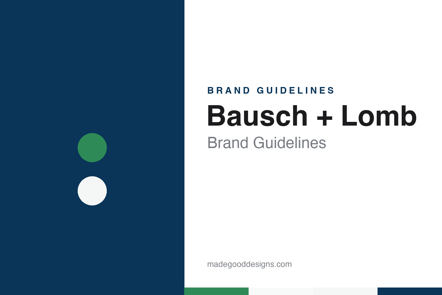
Bausch + Lomb Brand Guidelines
A Rochester optician’s shop, two surnames and, since 2010, a plus sign between them.
Aa
Two constants: a blue, green and white palette and a transitional serif register. Abstract homage — not a Bausch + Lomb product or mark; no pack, lens or logo is reproduced.
The Optical Institute of Rochester
Two German immigrants, a small shop and a handshake partnership.
Bausch + Lomb takes its name from two German immigrants who met in Rochester, New York. English Wikipedia’s biography of John Jacob Bausch says he was born Johann Jakob Bausch in Groß Süßen, in the Kingdom of Württemberg, worked as a lens grinder in an optical shop in Bern, and emigrated to the United States in 1850. He went first to a German community in Buffalo, the article says, but settled in Rochester and anglicised his name to John Jacob.
The shop came next. The same biography says that in 1853 Bausch opened a retail optical shop in Rochester selling spectacles, thermometers, field glasses, magnifiers and opera glasses. His friend Henry Lomb, a German immigrant from Burghaun in Hesse, put his savings into the shop and in 1855, on a handshake, became Bausch’s partner; by 1856, the article says, citing the American National Biography, Bausch had renamed the business the Optical Institute of Rochester. English Wikipedia’s company article dates the founding to 1853, describes Bausch as an optician and Lomb as a cabinet maker turned financial backer, and says the two men set up a small workshop making monocles.
The business grew through materials and instruments. Wikipedia’s company article, citing Rudolf Kingslake’s 1974 history of Rochester’s camera and lens companies, says that by 1861 the firm was making eyeglass frames in vulcanite, a hard rubber, and that during the American Civil War the Union blockade raised the price of gold and European horn, increasing demand for the vulcanite spectacles. In 1876 the optician Ernst Gundlach joined the company as it began to make microscopes, and the business appeared that year as the Bausch & Lomb Optical Company at the Centennial Exposition in Philadelphia.
The range widened with each decade. Wikipedia lists photographic lenses from 1883, spectacle lenses from 1889, microtomes from 1890, and binoculars and telescopes from 1893, and it records a cooperation with Zeiss in Germany from 1892. In 1902, the article says, William Bausch, a son of the founder, developed a process to cast molten glass directly into the shape of a lens. The founding family stayed in charge for decades: Wikipedia’s list of chief executives shows John Jacob Bausch as president from 1885 to 1926 and Edward Bausch from 1926 to 1935.
Colour
Ray-Ban, soft lenses and four changes of ownership.
The twentieth century added two names that outgrew their maker’s catalogue. English Wikipedia’s Ray-Ban article says that from 1929 the Army Air Corps officer John A. Macready worked with Bausch & Lomb on sunglasses for pilots, citing a 2012 article in The New York Times, and that the company created the Ray-Ban brand in 1936. In 1965, the company article says, Bausch & Lomb acquired the patent for hydrogel contact lenses developed by the Czech scientists Otto Wichterle and Drahoslav Lím, and in 1971 it launched soft lenses under the name Soflens. Wikipedia also records optics for the CinemaScope film process and, in the 1970s, the Spectronic 20 laboratory spectrophotometer.
The company then narrowed its focus. Wikipedia describes a restructuring from the mid-1980s, in which several lens-making divisions were sold, and the creation of a surgical products division in 1997 after a series of acquisitions. In 1999 Bausch & Lomb sold Ray-Ban to the Italian eyewear group Luxottica, a sale reported by The New York Times on 29 April 1999. In April 2006, Wikipedia says, the company stopped shipments of its ReNu with MoistureLoc contact-lens solution after an announcement by the Centers for Disease Control and Prevention.
Ownership then changed several times. Wikipedia says Bausch & Lomb was listed on the New York Stock Exchange until the private equity firm Warburg Pincus acquired it in 2007. In May 2013, the Los Angeles Times and Bloomberg reported, the Canadian company Valeant Pharmaceuticals agreed to buy it from Warburg Pincus, and the deal closed on 5 August 2013. Wikipedia’s Bausch Health article says that Valeant renamed itself Bausch Health Companies in July 2018, following an announcement made in May that year.
The eye-care business then returned to the stock market. Wikipedia, citing Barron’s, says that Bausch + Lomb completed an initial public offering on 6 May 2022, and its infobox lists Bausch Health as the parent and the company’s shares as traded on the Toronto and New York exchanges. Wikipedia describes Bausch + Lomb today as a Canadian eye health company based in Vaughan, Ontario, and pictures its Global Eye Health Center in Rochester. Brent Saunders, who led the company from 2010 to 2013, returned as chief executive in March 2023, Wikipedia says, citing The Wall Street Journal.
Typography
Design and documentation.
The brands in this group sit on the same few shelves of a pharmacy or supermarket: mouthwash, toothbrushes, toothpaste and eye drops. They belong to a category in which the pack has to carry a great deal in a small space, and in which many of the names have passed through several owners while staying on the shelf under the same word.
Each format sets its own limits. A mouthwash bottle is a tall, see-through container, so the colour of the liquid inside often becomes part of the look, and the label wraps around a curved surface. A toothbrush is usually sold in a blister pack, a clear plastic shell over a printed card, where the brush itself is on show and the card has to hold the name, the head and the range. Eye drops come in a very small bottle inside a folding carton, so the carton front does most of the work, and the type has to stay legible at a few centimetres across.
Each guide separates what independent sources record from what the company says about itself — who started the name, who has owned it since, and how its packs and advertising have changed — and leaves out anything that cannot be dated.
Aa
A transitional serif — the register of a nineteenth-century optical house name set as two surnames. (Specimen set in Libre Baskerville, a transitional serif STAND-IN; NOT the Bausch + Lomb logo.)
From ampersand to plus
A 2010 logo, traditional blue and green, and a name on every pack.
One dated moment in the identity concerns a small piece of punctuation. Ophthalmology Times reported on 3 March 2010, from Rochester, that Bausch + Lomb had unveiled a redesigned company logo and icon. Both, the report said, used hues of the company’s traditional blue and green colours, and both introduced a plus sign in place of the ampersand between the two founders’ names. English Wikipedia records the change the same way: since 2010 the company has styled itself Bausch + Lomb.
The roll-out was gradual. The same Ophthalmology Times report said the company would phase in the new logo and icon over time, and that they would co-exist with the former “pathways” logo while product packaging and other materials were updated. Gerald M. Ostrov, then chairman and chief executive, was quoted describing the new corporate identity as a reflection of the company’s ongoing evolution. The ampersand form, Bausch & Lomb, remains in use in historical records, in Wikipedia’s article title and in older press coverage.
The name itself has carried the company through several versions. It began, according to Wikipedia, as a shop and then as the Optical Institute of Rochester in 1856; by 1876 it was the Bausch & Lomb Optical Company; later simply Bausch & Lomb; and from 2010 Bausch + Lomb, now the name of the listed Bausch + Lomb Corporation. Through each change the two surnames stayed in the same order, so the identity has always rested on the founders rather than on a coined word.
The product names work under that corporate signature. Wikipedia mentions Soflens, ReNu, ULTRA and LUMIFY among the company’s lines across the decades, and the company’s current website groups its range under contact lenses, lens care, over-the-counter eye care and supplements, prescription pharmaceuticals, eye beauty and surgical products. Ray-Ban, the sunglasses name Bausch & Lomb created, left the company in 1999 and, according to Wikipedia, has belonged to Luxottica since then.
For a design guide, Bausch + Lomb shows how two founders’ surnames can hold an identity together for more than a century and a half of changing products and owners, and how a change as small as an ampersand becoming a plus sign can mark a new corporate identity. Compare it with Ray-Ban, the sunglasses brand it created in 1936, and Systane, an eye-drop name from another eye-care company. For this guide we use Rochester blue and optic green on lens-case white with a serif, an unofficial interpretation; no product or logo is reproduced.
Explore & save
Keep Bausch + Lomb’s identity on hand — save it to a board in the Made Good inspiration library.
Bausch + Lomb identity set
Pin the Bausch + Lomb blue, green and white palette and the transitional serif register to your own board.