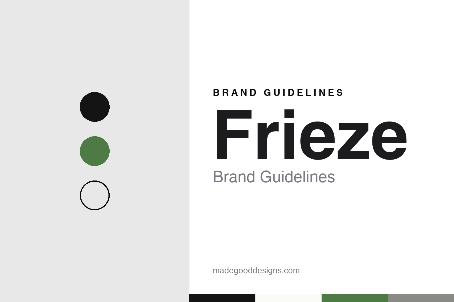
Frieze Brand Guidelines
A magazine that grew a fair in a park.
Aa
Two constants: a black, white, park green and grey palette and a typewriter slab register. Abstract homage — not a Frieze asset or mark; no masthead, logo or wordmark is reproduced.
From a magazine to a fair
A magazine in 1991, to Regent’s Park in 2003.
Frieze began as a magazine, not a fair. In an interview with magCulture published on 22 August 2016, Matthew Slotover said he co-founded frieze with Amanda Sharp in 1991, and that the launch issue carried an interview with a young Damien Hirst. Wikipedia names the artist Tom Gidley as the third founder and says the inaugural issue had a Hirst butterfly painting on its cover. Slotover told magCulture that the magazine started as a small publication, made by three people camped in the corner of a friend’s office, and that for about ten years it grew slowly, adding a few pages and one more member of staff each year.
The two founders edited the magazine together until 2001, magCulture said. Around 2000, Slotover recalled, they decided to start an art fair, and it opened in 2003. Wikipedia says the fair, then called Frieze Art Fair and now usually Frieze London, was held in Regent’s Park, and that in the same year Sharp and Slotover became publishing directors of the magazine and directors of the fair. Asked by magCulture about his own highlight, Slotover pointed to the opening day of that inaugural fair: the cleaning had not been finished, and there were long queues because there were too few people checking tickets.
The next step came nine years later. magCulture and Wikipedia both date Frieze New York and Frieze Masters to 2012. Wikipedia says the two were announced in May 2011 and directed by Victoria Siddall, and that Frieze Masters runs at the same time as the London fair and shows art made before the year 2000. The company also published Frieze d/e, a bilingual German and English quarterly edited in Berlin, from April 2011 to 2016, according to Wikipedia.
The magazine kept its own anniversaries. For its 25th year, magCulture reported in August 2016, frieze commissioned three special front covers from the artists Chris Ofili, Rosemarie Trockel and Sara Cwynar. At the time Slotover told the magazine that the London office was at the Rochelle School in Shoreditch, overlooking Arnold Circus, and that he and Sharp still oversaw the magazine, the fairs and the non-profit Frieze Foundation.
Colour
Los Angeles, Seoul and a change of owner.
The fair added a third city in 2019. Galerie reported on 30 November 2018 that the inaugural Frieze Los Angeles would be staged at Paramount Pictures Studios in Hollywood, on the studio’s New York backlot, with its Frieze Projects programme starting on 14 February. The programme was organised by Ali Subotnick, a former curator at the Hammer Museum, and placed installations, sculpture and performance on the faux city blocks and inside the fabricated buildings. Galerie said stickers designed by Barbara Kruger would put questions to visitors, among them “Who will write the history of tears?”
Asia followed. Wallpaper* reported on 2 September 2022 that Frieze Seoul had opened that day as the organisation’s fourth location and its opening venture in Asia, joining the Los Angeles, New York and London editions. It was held alongside KIAF, the fair run by the Galleries Association of Korea, and its director was Patrick Lee. Wikipedia says Frieze acquired two existing fairs in 2023, The Armory Show in New York and EXPO Chicago, and that both keep their own names. It also says a partnership with the Department of Culture and Tourism – Abu Dhabi, announced in 2025, renames Abu Dhabi Art as Frieze Abu Dhabi in 2026. In London the company runs a permanent space, No.9 Cork Street in Mayfair.
Ownership has changed twice. The Art Newspaper reported on 14 April 2016 that WME-IMG, the entertainment group run by Ari Emanuel and Patrick Whitesell, had invested in Frieze, “the London-based publisher and art fair”; the size of the holding was not disclosed at the time. Sharp and Slotover said the partnership would let them start realising innovations they had been developing for a year. Wikipedia describes the holding as a controlling stake by Endeavor, the group’s later name, and says Simon Fox became Frieze’s chief executive on 2 April 2020.
On 1 May 2025 The Art Newspaper reported that Endeavor would sell Frieze to a new company founded by Emanuel, its former chief executive, covering the fairs, the magazine and No.9 Cork Street, with Fox staying on. ARTnews reported on 8 October 2025 that Emanuel’s company, named MARI, had finalised the purchase a week before Frieze London and Frieze Masters opened. MARI has owned Frieze since October 2025.
Typography
Mastheads, tents and type.
Design and art events carry their identity in places a consumer brand rarely reaches. A recurring exhibition or festival often puts a year, an edition number or a season into its name, so the wordmark has to work as a stable root that accepts a changing suffix. The same name then has to hold together across a catalogue, a poster series, a website and a printed guide that is replaced every edition.
Host-city signage is a second surface. Banners on lamp posts, flags on venues and wayfinding panels in streets, stations and pavilions have to be read at walking pace and at a distance, often in more than one language. Typography chosen for these jobs tends toward clear letterforms, generous spacing and strong contrast against the street.
Catalogues and posters are the third surface, and the most collected. They outlast the event itself, and many organisers commission a different designer or studio for each edition, so continuity comes from the name, a grid or a colour habit rather than from a fixed logo. For a design guide, the useful question is which elements stay fixed from edition to edition and which are allowed to change.
Aa
A typewriter slab — after the curved brackets and slab serifs of the frieze masthead and its 2021 typeface. (Specimen set in Courier Prime, a monospaced slab STAND-IN; NOT the Frieze logo, masthead or any Frieze typeface.)
Frieze
Park photographs, then one typeface.
The fair’s early look was photographic. Graphic Thought Facility says on its website that it created the visual identity and a marketing campaign for the inaugural London fair that made extensive use of photography, which it calls unusual for an art fair at the time. The studio says it went on to art-direct a photographic campaign for each later fair, stressing the setting in Regent’s Park, and that in 2012 the identity was carried over, with a new campaign, to the opening edition of Frieze New York.
The present identity came with the magazine’s thirtieth year. It’s Nice That reported on 5 February 2021 that Frieze had revealed a rebrand made up of a new visual identity by Pentagram and a custom typeface designed with the typographer Luke Prowse. The work was led by the Pentagram partners Luke and Jody Hudson-Powell, with Frieze’s creative director David Lane. The magazine said a number of separate identities had grown up over time through sub-brands, including the publications frieze, Frieze Week and Frieze Masters Magazine, and that the aim was one consistent, recognisable system that could absorb new products easily.
The starting point was the magazine’s masthead. It’s Nice That said it was originally created by Tom Gidley and later redesigned by Paul Barnes. The new typeface comes in four weights and keeps the curved brackets, slab serifs and narrow uppercase characters of the masthead’s design language. Taking cues from the typewriter and monospaced features of the existing masthead, Pentagram widened the typographic system and set some distance between the updated masthead and the original wordmark. The system is presented in black and white, so that colour and texture come from the editorial content and the art itself.
The magazine listed where it appears: fair signage and programmes, magazine covers, print and digital advertising, website navigation and social media. Lane then commissioned artist campaigns for the 2021 milestones, including animations by Zach Lieberman for the anniversary and a shoot by Chris Rhodes for Frieze New York.
For a design guide, Frieze shows how a typeface drawn from a magazine masthead can tie a group of fairs and publications together while the art supplies the colour. Compare Art Basel, another fair that moved between continents, and White Cube, a London gallery of the same era. For this guide we use black, white, park green and grey with a slab serif, an unofficial interpretation; no product or logo is reproduced.
Explore & save
Keep Frieze’s identity on hand — save it to a board in the Made Good inspiration library.
Frieze identity set
Pin the Frieze black, white, park green and grey palette and the typewriter slab register to your own board.