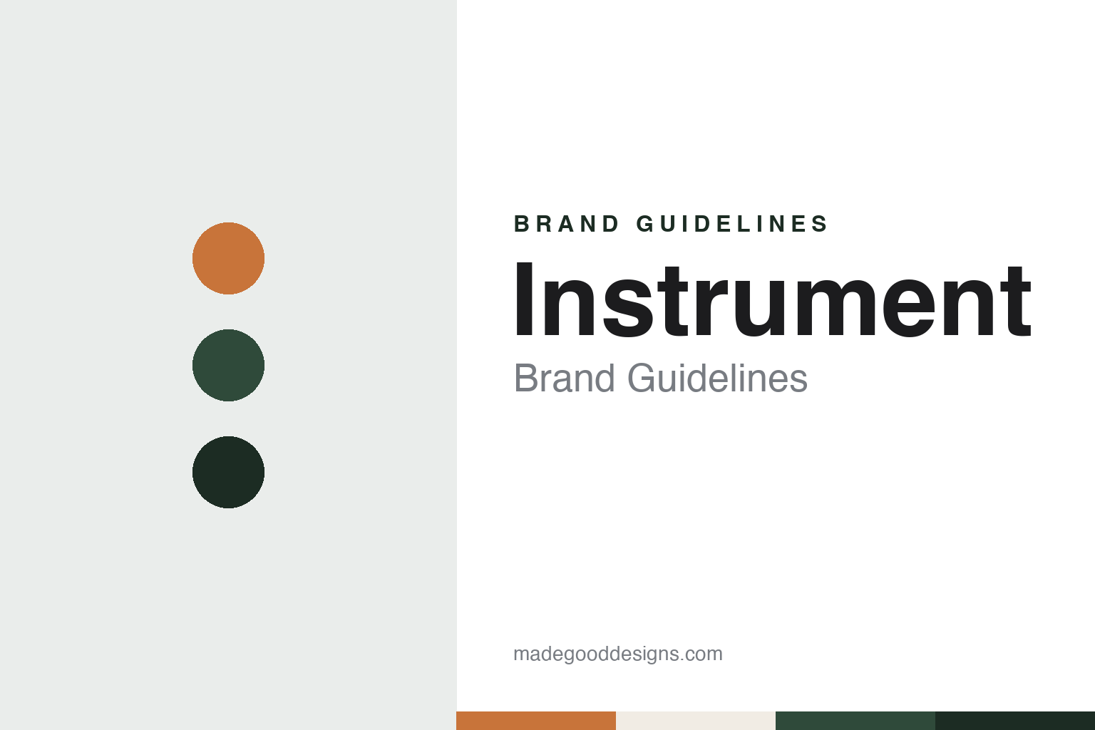
Instrument Brand Guidelines
A one-word name, a warehouse and a wooden tepee.
Aa
Two constants: a cedar, forest and deep fir palette and a Grotesque sans register. Abstract homage — not an Instrument asset or mark; no logo, icon or wordmark is reproduced.
From Vermont to Portland
Burlington, Vermont, then Portland, Oregon.
Instrument is a digital creative agency based in Portland, Oregon. Communication Arts, in a feature published on 7 May 2015, traced its start to Vince LaVecchia, who had worked in marketing at Burton Snowboards and wanted to go out on his own. The magazine said LaVecchia started Instrument in 2005 out of his apartment in Burlington, Vermont, and soon brought on Justin Lewis, a software designer and developer. The trade site MediaPost, reporting on 2 April 2018, gave the agency’s founding year as 2002. The two dates come from different accounts and both are given here.
The move west came early. Communication Arts said the pair moved the business to Portland to tap into the city’s stronger developer community, and that they began working with the designer JD Hooge on a freelance basis. LaVecchia described what followed as a relationship: “Then in 2009, we moved in together, and in 2011, we got ‘married,’” he told the magazine, meaning that Hooge became a full-time staffer and then a business partner. By 2015 the magazine described the three as the agency’s co-founders and partners: LaVecchia as general manager and the operational lead, Lewis as executive director and director of digital, heading development and usability, and Hooge as executive creative director, overseeing design.
A profile in 1859 Oregon’s Magazine, dated 28 August 2014, filled in Lewis’s side of the story. It said he had served in the Marine Corps, started coding HTML in 1999, and had helped build the business since 2004. It described him as one of the three owners of Instrument and the agency as a fully digital creative company working across marketing, advertising and graphic design.
LaVecchia set out a plain ambition for the company. “The original business plan was to break the agency model,” he told Communication Arts, adding that he had seen designer friends at big agencies feel stifled. Hooge, who had worked at a design studio and then as a freelancer before joining, said his lesson was that to push a business forward “you have to try different things.”
Colour
A fire, a hangar and a tepee.
One part of Instrument’s identity that the press has described at length is a building. Communication Arts reported that on the Fourth of July 2011 an illegal firework landed on the roof of the mixed-use building where the agency was a tenant and started a fire. LaVecchia, the magazine said, rescued the firm’s backup servers and accounting files and spent the night in the damaged office. 1859 Oregon’s Magazine placed that office on Alberta in northeast Portland.
After the fire the agency moved into a warehouse that had served as an aircraft hangar during World War II. 1859 Oregon’s Magazine said Lewis drove past the building, by then used as an event space, shortly after the fire, and the agency bought it. Communication Arts said the partners branded the space the Outpost because they felt like nomads, and that the move was meant to be temporary; three and a half years later the agency was still there.
At the centre of the warehouse stood a tepee built from reclaimed wood by the visual artist Mark Warren Jacques. Communication Arts said it worked as a soundproof meeting room with video conferencing for five people, and that it became key to the agency’s brand identity and publicity. “The tepee symbolized our attitude of, ‘All right, we had a setback, but we’re moving to a new place and let’s make the best of it,’” LaVecchia told the magazine. 1859 Oregon’s Magazine called the structure “The Outpost” as well and said it was in its third version by August 2014.
The building also shaped how the agency was organised. Communication Arts said Instrument grouped staff into multidisciplinary client teams that sat together, a model the partners had studied at Big Spaceship, a digital agency in Brooklyn. Lewis said the agency had tried two teams, then four, and had settled on three, adding: “We may change it again.” In August 2014 Lewis told 1859 Oregon’s Magazine that the agency was building a new office from the ground up, because “We want Instrument to have a physical presence in Portland.”
Typography
Rooms, teams and a client list.
Digital-agency identities tend to start from a name rather than a picture. Many of these businesses picked short words, clipped coinages or sets of initials that fit a browser tab, a social handle and a conference badge equally well. Typography then carries much of the personality: a slash or an ampersand between two parts of a name, an all-lowercase setting, or a single word in a heavy sans can act as the logo with little else added. Because the name has to sit on screens of every size, simple letterforms that survive being shrunk to a favicon are a practical requirement as much as a style choice.
The agency’s own website is usually its main brand surface. Case studies, project films and interactive demos stand in for the shop window, so the grid, motion and type rules of the site say as much about the agency as its logo does. Some agencies also release their own apps, games or tools, and those products carry the studio name into app stores and onto phones that have nothing to do with client work.
For a designer, the useful lesson is how an identity built mostly from type, layout and motion keeps a recognisable voice while changing constantly from project to project.
Aa
A grotesque sans — after a one-word agency name set plainly. (Specimen set in Space Grotesk, a sans STAND-IN; NOT the Instrument logo or any Instrument typeface.)
Instrument
Clients, own projects and new owners.
Two Portland-linked clients appear throughout the agency’s coverage. Communication Arts said Instrument began working with Nike, which is headquartered in the Portland area, in 2007, and that by 2015 it had a team dedicated to Nike projects, including the Nike Community Forum, launched in 2012. The same feature said a team worked on assignments for Google, including a site for the Nexus 9, Nexus 6 and Nexus Player and a skydiving simulator called Map Dive for the Google I/O 2013 developer conference. The agency, the magazine noted, did not describe itself as agency of record for any client and preferred project-by-project relationships.
Instrument also made its own content to show what it could do. Communication Arts listed The Build (2012), an interactive documentary about motorcycle builders in Portland, This Place (2013), a film and interactive journal about the Pacific Northwest coastline, and Rivals (2014), an immersive piece on rivalry in sport. “It is an example of us going out on a limb with our own high-production content,” Hooge told the magazine.
Ownership changed in 2018. MediaPost reported on 2 April 2018 that MDC Partners was acquiring a majority partnership stake in Instrument, with terms not disclosed. It said the agency would keep operating under its own name and in its own office, led by chief executive Justin Lewis, chief creative officer JD Hooge and chief operating officer Vince LaVecchia, and listed clients including Google, Nike, Levi’s, Airbnb, Sonos and Dropbox. Wikipedia says MDC Partners merged with The Stagwell Group in a deal completed in August 2021, and lists Instrument among Stagwell’s agencies. Instrument has been part of Stagwell since that merger.
Leadership has since changed. Silicon Florist reported on 3 December 2024 that Leon Anderson, president of Instrument, led a three-day Build Week with the Portland group Vanport Studio, relaunching the agency’s pro bono programme Build, Grow, Serve and working with three BIPOC-owned Portland businesses on branding, marketing and product development.
For a design guide, Instrument shows how an agency without a founder’s name can build its identity from places and habits: a rescued hangar, a wooden meeting room and a city it chose to stay in. Compare Google, a long-running Instrument client, and MetaLab, another digital design studio. For this guide we use cedar, forest and deep fir with a sans, an unofficial interpretation; no product or logo is reproduced.
Explore & save
Keep Instrument’s identity on hand — save it to a board in the Made Good inspiration library.
Instrument identity set
Pin the Instrument cedar, forest and deep fir palette and the Grotesque sans register to your own board.


