LACMA Brand Guidelines
A county museum on Wilshire, a grid of old street lamps and a gallery floor raised over the boulevard.
Aa
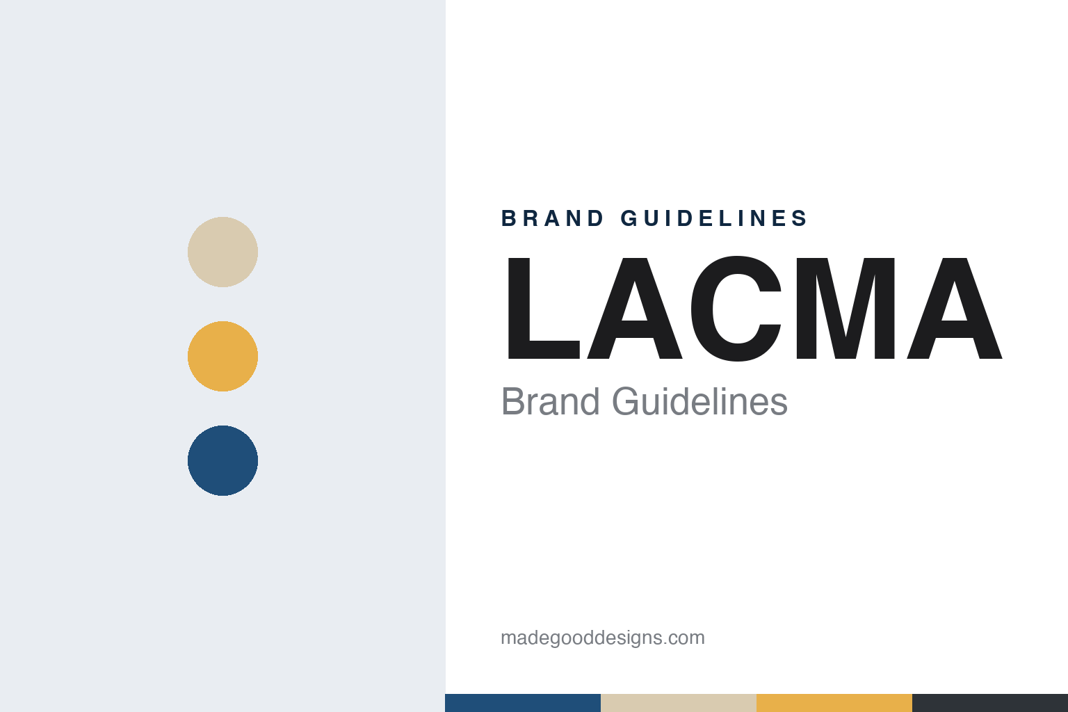
Two constants: a Wilshire blue, concrete sand, lamp glow and lamp iron palette and a Wilshire grotesk sans register. Abstract homage — not a LACMA asset or mark; no logo, Baldessari image, photograph or artwork is reproduced.
An art museum that left a museum
Exposition Park, a park on Wilshire and three Pereira pavilions, 1913–1965.
The Los Angeles County Museum of Art, known by its initials as LACMA, began inside another institution. English Wikipedia says that before it was established as a museum in 1961, it was part of the Los Angeles Museum of History, Science and Art, founded in 1913 in Exposition Park near the University of Southern California. The split created a county museum devoted to art alone, and its name has stayed close to that origin: a county institution, named for its county, and a set of four letters that has become its everyday signature.
The new museum needed money and a site. Wikipedia says the businessman Edward W. Carter helped organise the fundraising, and that Howard F. Ahmanson Sr., Anna Bing Arnold and Bart Lytton were the principal early patrons, with Ahmanson’s lead donation persuading the board that a new building could be funded. The land came from the county itself. Wikipedia says Los Angeles County had received the ground as a gift from G. Allan Hancock in 1916, and that in 1960 part of the Hancock gift was turned over for the museum campus, next to the La Brea Tar Pits on Wilshire Boulevard.
The architect was a local choice. Wikipedia says the board selected the Los Angeles architect William Pereira over the directors’ recommendation of Ludwig Mies van der Rohe. Pereira’s campus, in a style Wikipedia compares to Lincoln Center and the Los Angeles Music Center, consisted of three buildings: the Ahmanson Building, the Bing Center and the Lytton Gallery, which was renamed the Frances and Armand Hammer Building in 1968. Construction began in 1963 and was completed in early 1965, when the museum moved to Wilshire Boulevard as an independent, art-focused institution.
Some of the campus’s outdoor character dates from that opening. Wikipedia says Alexander Calder’s three-piece mobile Hello Girls was commissioned by a women’s museum-support group for the museum’s opening in 1965. The museum’s director from 1961 to 1966 was Richard F. Brown; Wikipedia lists Michael Govan as director since 2006.
Colour
A courtyard plan, a Japanese pavilion, a department store and 202 lamps, 1986–2012.
The campus grew in layers. Wikipedia says the firm Hardy Holzman Pfeiffer Associates designed the Robert O. Anderson Building for twentieth-century art, which opened in 1986 and was renamed the Art of the Americas Building in 2007. With that expansion, visitors entered through a new, partly roofed central court bounded by the museum’s four buildings. The Pavilion for Japanese Art, designed by Bruce Goff, opened in 1988, the same year as the B. Gerald Cantor Sculpture Garden of Rodin bronzes.
Wilshire Boulevard supplied another building. Wikipedia says LACMA bought the neighbouring former May Company department store, a streamline moderne building by Albert C. Martin Sr., in 1994, and opened it as LACMA West in 1998; the building is now home to the Academy Museum of Motion Pictures. After a plan by Rem Koolhaas stalled, the trustees approved a transformation led by Renzo Piano in 2004. Its opening phase, completed in February 2008, brought the BP Grand Entrance and the Broad Contemporary Art Museum, named for Eli and Edythe Broad, and Piano also designed the Resnick Pavilion.
The work that now marks the Wilshire entrance arrived in the same year. English Wikipedia says Chris Burden’s Urban Light (2008) stands at the Wilshire Boulevard entrance and is made of 202 restored street lamps from the 1920s and 1930s, the majority of which once lit the streets of Southern California, in sixteen different models arranged in a near grid. Burden began collecting the lamps in December 2000 without a specific work in mind, and Govan visited his Topanga Canyon studio in 2006 as a prospective buyer.
Other artists’ projects shaped the grounds around it: Wikipedia says a palm garden by Robert Irwin surrounds the Broad building, and that Michael Heizer’s Levitated Mass arrived from a Riverside County quarry in March 2012.
Typography
Four letters, a pencil and palm, and a long concrete floor over Wilshire.
An art museum’s identity often starts with its building. The façade, the roofline or a single unusual window becomes the shape people remember, and posters, tote bags and membership cards borrow from it long before any logo is drawn. Names do similar work. A long official title is shortened in everyday speech to a surname, a place or a set of initials, and many museums eventually adopt that short form as the word mark, sometimes reduced further to a single letter or monogram that can sit on a banner, a ticket or a phone screen. A collection that spans centuries asks for a mark that stays quiet next to the art, so house identities tend to rely on a restrained typeface, a narrow palette and plenty of empty space.
Exhibitions pull in the other direction. Each major show usually gets its own title treatment, colours and imagery drawn from the works on display, and the house mark steps back to a corner of the poster or the catalogue spine. Inside the building, wayfinding carries the identity in its plainest form: floor numbers, gallery names and directions set in the house typeface on walls, lifts and printed maps. The shop and the ticket desk extend it to bags, labels, admission tickets and membership material, where colour can code a ticket type or a membership level. Online, a digital collection site turns the identity into an interface, with image grids, object records and search filters that have to work for researchers and casual visitors alike.
Aa
Wilshire grotesk sans — after the plain capitals of the museum’s four-letter name. (Specimen set in Archivo, a sans STAND-IN; NOT the LACMA logo or any LACMA or Baldessari lettering.)
LACMA
From a Baldessari image in 2007 to the David Geffen Galleries in 2026.
LACMA’s current logo came from a designer working with an artist. The museum says, on its own print site, that the logo debuted in 2007 and was designed by the firm 2×4 in collaboration with John Baldessari, using an image of a pencil and a palm tree that Baldessari had originally made in the 1960s. It sits with the four capital letters that have become the museum’s shorthand on banners, tickets and the Wilshire frontage.
The building that now carries the collection took more than a decade to reach the street. Wikipedia says plans for the director Michael Govan to work with the Swiss architect Peter Zumthor on the eastern part of the campus were made public in November 2009, that Skidmore, Owings & Merrill collaborated on the design, and that the Los Angeles County Board of Supervisors approved the building on 8 April 2019. The four older buildings on that side, the Ahmanson Building, the Bing Center, the Hammer Building and the Art of the Americas Building, were demolished in 2020.
Dezeen reported on 30 June 2025, with photographs by Iwan Baan, that the building, called the David Geffen Galleries, stretches in an undulating form along the eastern side of the campus and crosses Wilshire Boulevard, carrying an exhibition floor that the museum describes as elevated almost 30 feet above street level. The magazine said the glass-and-concrete form sits on seven structural pavilions holding restaurants, shops, a theatre and service spaces, that a single band of glazing wraps the upper level, and that the museum describes a single-level plan in which no gallery is permanently assigned to any department and no single route is prescribed. It traced the project back to a 2001 campus competition and Zumthor’s initial studies of 2009.
blooloop reported on 20 April 2026 that LACMA had opened the galleries, describing a 900-foot-long horizontal structure along Hancock Park and across Wilshire, with a single exhibition floor above a new outdoor green space, an inaugural installation drawn from the collection by 45 curators, and an education centre due to open on 3 May.
For a design guide, LACMA shows an identity carried by a short name, an artist’s image and a run of architecture on one boulevard: Pereira’s 1965 pavilions, Burden’s lamps and a concrete floor raised over the traffic. Compare the Getty and Metropolitan Museum of Art guides. For this guide we use Wilshire blue, concrete sand, lamp glow and lamp iron with a sans, an unofficial interpretation; no product or logo is reproduced.
Explore & save
Keep LACMA’s identity on hand — save it to a board in the Made Good inspiration library.
LACMA identity set
Pin the LACMA Wilshire blue, concrete sand, lamp glow and lamp iron palette and the Wilshire grotesk sans register to your own board.