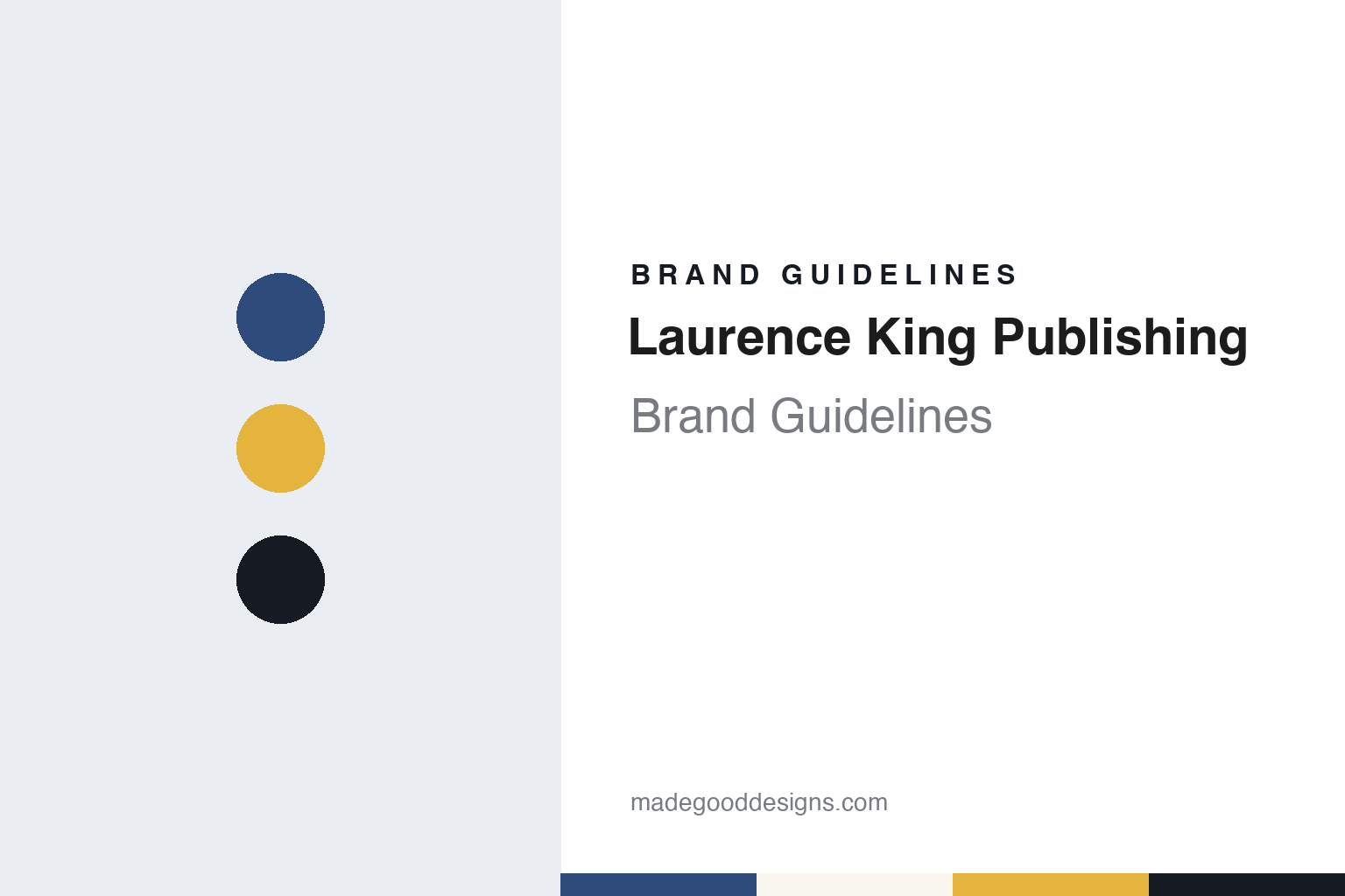
Laurence King Publishing Brand Guidelines
From a book packager to a design-led publisher.
Aa
Two constants: a spine blue, gift yellow and studio ink palette and a soft display serif register. Abstract homage — not a Laurence King Publishing asset or mark; no logo, colophon or wordmark is reproduced.
A packager that became a publisher
London, 1977 to 1991.
Laurence King Publishing carries the name of the man who bought it. Publishers Weekly reported on 11 April 2014 that Laurence King took a job in 1977 with the London book packager John Calmann, whose clients at the time included the American art publishers Abrams and Rizzoli and the London house Thames & Hudson. A packager develops and produces books that other publishers then sell under their own names, so the firm’s early work went out under other companies’ colophons rather than its own.
The change of name came after John Calmann’s death in 1989. According to the same Publishers Weekly report, King ran the company for two years and then bought it in 1991, renaming it Laurence King Publishing. In the early 1990s, during a recession, he raised money from a merchant bank to turn the packaging business into a publisher in its own right, so that the books would carry the house’s own imprint.
English Wikipedia describes the company as founded by and named after Laurence King in 1991 in London, where it is still based, with offices in Europe and the United States. It says the house works with illustrators, designers, artists and photographers to produce books and gifts. Titles it names include a monograph on the American designer Saul Bass, the art history text A World History of Art by Hugh Honour and John Fleming, and a book by the illustrator Marion Deuchars.
The list grew outward from the art school. The design firm Pentagram says on its project page that Laurence King Publishing began as a publisher for students and graduates of the visual arts, and that this shaped its design-led approach. When Publishers Weekly covered the company again on 2 September 2020, it described a business focused on books and gifts tied to the creative arts, and said it was the publisher of Johanna Basford’s adult colouring books. Wikipedia lists playing cards, games and jigsaw puzzles alongside the books.
The American market came through a partner. Publishers Weekly reported in 2014 that Chronicle Books had distributed Laurence King in the United States since 2006, and its 2020 report said Chronicle was still the American distributor. In the 2014 piece, King said the children’s list had begun almost by accident, when some adult art and fashion titles were revised for young readers.
Colour
A German subsidiary, then Hachette UK.
After 1991 the house was run by its founder, who was still its managing director in 2020. Two steps changed its shape, the earlier of them outward. The Bookseller reported on 15 September 2017 that Laurence King Publishing had created a new German subsidiary and bought the Amsterdam publisher BIS Publishers, as part of a plan to strengthen its international sales. English Wikipedia names the subsidiary Laurence King Verlag, based in Berlin, and says it publishes a select list of German-language books, children’s books and gifts while distributing the English-language list in Germany, Austria and Switzerland.
The second step was a sale. Publishers Weekly reported on 2 September 2020 that Laurence King Publishing had been acquired by Hachette UK, another British publisher, in a deal signed on 31 August 2020. The report quoted Laurence King, then managing director, saying he was sad to be leaving a company he had spent decades building and confident it would be in thoughtful hands. It also quoted Hachette UK’s chief executive, David Shelley, who named art, architecture, design, fashion, film, photography and children’s books among the house’s fields, and singled out its gift publishing.
The deal split the list into three. Publishers Weekly said Laurence King’s gift, trade and art publishing would become an imprint of the Orion Publishing Group; its student and professional publishing would become an imprint of Quercus; and its children’s publishing would join Hachette Children’s Group. Most of the staff, it reported, were expected to move to Hachette’s Blackfriars headquarters in London during 2021. Wikipedia gives the same three-way division.
Hachette UK has owned Laurence King Publishing since 2020. The Publishers Weekly report placed the purchase in a longer Hachette strategy of buying specialist publishers, alongside earlier acquisitions such as Nicholas Brealey and Summersdale.
One more strand runs through the company’s own account of itself. English Wikipedia says Laurence King Publishing is a longstanding participant in the Book Chain Project, an initiative set up to help publishers make informed buying decisions at each stage of the supply chain behind a printed book, from paper and board to printing.
Typography
An imprint name on a design-led list.
Colophons, credit lines and the catalogue as brand surfaces
For a publisher of illustrated books, the identity rarely lives in one big logo. It turns up in small, repeated places: the colophon on the title page, the device stamped at the foot of the spine, the imprint line on the copyright page. A reader may never notice any of these on their own, but a shelf of books from one house shows them all at once, and the spine mark is often the first thing a browser sees.
Series design does the heavier lifting. A shared grid, a fixed type family, a consistent cover format and a numbered sequence tell the buyer that one title belongs with the others. Good series work leaves room for each book’s own image while keeping the frame recognisable.
A picture agency works through different surfaces. Its name appears in the credit line printed beside or beneath a photograph, often in tiny type, and that line travels across newspapers, magazines, books and screens the agency does not control. Catalogues, archive websites, exhibition walls and print-sale pages then carry the fuller visual system, where typography, white space and image handling set the tone. In both trades, the brand is built less by declaration than by steady, quiet repetition.
Aa
A soft display serif — a nod to an art-book list built for designers and illustrators. (Specimen set in Fraunces, a serif STAND-IN; NOT the Laurence King Publishing logo or colophon.)
Laurence King
Series design and a long creative directorship.
At Laurence King Publishing the visual identity has been carried less by a logo than by the design of the books and the series they belong to. Much of that work is tied to one designer. Pentagram says Angus Hyland’s relationship with the publisher began in 1996, when he designed 20th-Century Type (Remix), a decade-by-decade study of typography and graphic design. Pentagram says Hyland wrote a book of his own for the house, Pen and Mouse: Commercial Art and Digital Illustration, in 2001, followed by a sequel, Hand to Eye, two years later.
Pentagram describes Hyland as creative director for Laurence King Publishing over a period of sixteen years. In that role, it says, he designed selected books, wrote a number of graphic design and art titles, and created “The Book of …” series of art-led titles on subjects such as dogs, cats, birds and trees. He also worked on games for the house.
Another series shows the same thinking. Publishers Weekly reported on 11 April 2014 that the house was preparing This Is, a series about twentieth-century artists presented in the style of graphic novels, with illustrations, reproductions and text. The opening titles covered Dalí, Warhol and Pollock, written by the art historian Catherine Ingram. King told the magazine the format took a long time to work out, and that Ingram chose an illustrator for each book whose style suited the artist in question. As part of the launch, Publishers Weekly said, the books would ship to American shops with canvas This Is tote bags printed with the artists’ faces, for booksellers to give away.
The catalogue followed the list. In the same 2014 report, King said the children’s list had grown to the point where the house would produce a separate children’s catalogue from the following year. After the 2020 sale, Publishers Weekly reported, the Laurence King lists were divided between Orion, Quercus and Hachette Children’s Group.
For a design guide, Laurence King Publishing shows how an art-book house can build its identity through series formats, a long creative partnership and the founder’s name on the spine, rather than through a single mark. Compare Phaidon, another London publisher of art and design books, and Thames & Hudson, a client of the packager from which the house grew. For this guide we use spine blue, gift yellow and studio ink with a soft serif, an unofficial interpretation; no product or logo is reproduced.
Explore & save
Keep Laurence King Publishing’s identity on hand — save it to a board in the Made Good inspiration library.
Laurence King identity set
Pin the Laurence King spine blue, gift yellow and studio ink palette and the soft display serif register to your own board.