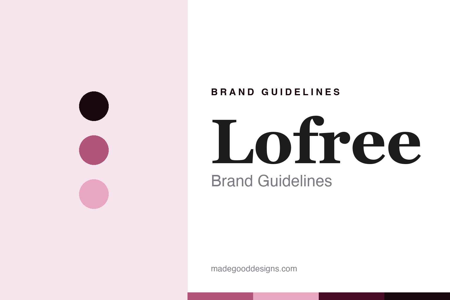
Lofree Brand Guidelines
The design-led retro keyboard.
Aa
Two constants: a retro-rose palette and a retro-serif register. Abstract homage — not a Lofree product or mark.
The design-led retro keyboard
Lofree is the design-led keyboard brand of the low-profile Flow — and the retro round-keycap look.
Lofree brings the round its aesthetics — the design-led brand whose low-profile Flow is a critically praised, smooth typing board, and whose retro round-keycap keyboards turn a desk into a typewriter-styled object. Lofree makes design-forward keyboards, and its answer to a round about the board-builders is looks and feel: not a spec sheet but an experience, a keyboard as a design object for a personal space. A board, made to be looked at.
Its identity is the design-led retro keyboard. Lofree’s Flow, its retro round-keycap aesthetic and its founder-designer are the story here. A board, design-led. The design-led retro keyboard.
(Honest notes, so the story stays precise. Lofree — at lofree.co — makes design-forward mechanical keyboards in two families: the low-profile Flow, Flow 2 and Edge, its acclaimed flagship marketed as the smoothest, and a retro line in a round-keycap, typewriter aesthetic such as the Block, Lipstick and 1970s, plus keycap sets, mice and desk accessories; it describes itself as a design studio for the personal space. Its founder is named on its site as Tim Chu, a designer with long experience across consumer electronics, and its Flow was crowdfunded on both Kickstarter and Indiegogo. Several details cannot be verified from a primary source, so we are careful. The founding year is not stated, so we do not print one. The country and headquarters are not stated either; Lofree is widely described as a Chinese design brand, so we say that rather than assert a specific city. The manufacturing location is not published, so we do not claim made-in-China as a sourced fact. On ownership, it reads as independent and founder-designer-led, with no parent group disclosed, so we do not name one. Some keycap sets reference outside art, such as public-domain Van Gogh, so we keep any homage abstract and reproduce no artwork. Its marks — Lofree — are IP we describe but do not reproduce, and there is no official brand hex; these tones are an unofficial interpretation. This is design commentary and does not promote any product.)
Colour
Lofree lives in a retro rose. Click a swatch to copy the hex.
Lofree’s identity is design-led, retro and tactile — a retro rose, an ink, a bloom, a deep rose, and a paper. The palette leans retro rose and bloom: a soft, pastel register that nods to a design-forward, typewriter-styled brand rather than a technical palette. It signals an aesthetic-first maker. The honest caveat: with no published brand hex, these values are an original, unofficial interpretation, not first-party colours.
The lesson is a retro rose signals a design-led, aesthetic identity. Lofree’s world is a design-led, made object. For designers, it is a reminder that a soft rose and a pale bloom can carry a keyboard brand — the tone of a design object. Because these tones can fail as small text, keep type dark and let the colour live in the accents, palette and band. The takeaways: lead with design; make a keyboard an object; be honest about what is unverified; and treat any single hex as unofficial.
Typography
The register is a retro serif — design-led, warm, considered.
Lofree’s identity carries a design-led, warm, considered spirit — a design studio, not a spec house. A retro serif captures the mood: elegant, nostalgic and a little playful, the register of a typewriter-styled board. Set in a retro-rose palette, the retro serif feels design-led and warm — exactly the personality Lofree carries. It is a design object rather than a logo, mirroring moulded round keycaps. (Lofree’s real wordmark, and its keycap artwork, are things we describe but do not reproduce, and the exact typeface is not ours to use.) Because it is not ours to use, the honest description is “a retro-serif spirit,” shown here in a stand-in. The type behaves like the board: design-led, warm and considered.
Aa
A retro-serif spirit — design-led and warm. (Specimen set in Cormorant Garamond, a retro-serif STAND-IN; NOT the Lofree logo.)
The board-builders
Lofree stands for the design-led retro keyboard.
Lofree brings the round its aesthetics. A retro-rose palette, a retro serif and a design object make one thing — the design-led retro keyboard — the whole identity: design-led, retro and tactile. The Flow and the round-keycap look are the differentiators, and the design-first ethos is the meaning. The point is a brand that treats a keyboard as an object for a personal space — smooth to type on, nice to look at — rather than a spec sheet.
Put to work, the identity is design-first thinking told straight, as design. A maker in this spirit would lead with design, make a keyboard an object, and be honest about what it cannot verify. A reader in this spirit would keep the facts right: Lofree makes the low-profile Flow and a retro round-keycap line; its founder is named as Tim Chu, and its Flow was crowdfunded on Kickstarter and Indiegogo; its founding year is not stated, so none is printed; it is widely described as a Chinese design brand, though its exact country, headquarters and manufacturing location are not published, so none is asserted; and it reads as independent and founder-designer-led. Lofree sits in the round’s design-led thread with NuPhy, both low-profile design-forward brands, and its where-made thread is the round’s most hedged — a widely-described Chinese brand whose specifics stay unverified. The honest editorial moves are to print no founding year, to say widely-described-Chinese rather than assert a city, to not claim made-in-China as sourced, and to omit any unverified parent link. The lesson Lofree teaches is that a design-first ethos can be a whole identity, and honesty about the unverified specifics keeps the design credible.
For designers and brand-builders, Lofree continues the board-builders: lead with design — and say what you cannot verify. The lessons: make the object beautiful; build a feel, not just a spec; be candid about unknowns rather than inventing certainty; keep third-party art out of your homage; and never reproduce a logo. It is also a reminder to stay precise: Lofree is the design-led keyboard brand of the low-profile Flow and the retro round-keycap look — with the palette here an unofficial interpretation, and several facts honestly left unverified. Read that way, Lofree is less a spec than a design object: a keyboard made to be typed on and looked at. The lesson for a brand is that a design ethos and honesty about unknowns reinforce each other, and refusing to invent a year or a city keeps the design earned. Lofree made the-design-led-retro-keyboard the identity — proof that looks and feel can define a maker.
Explore & save
Keep Lofree’s identity on hand — save it to a board in the Made Good inspiration library.
Lofree identity set
Pin the retro-rose palette and the retro-serif register to your own board.