Moe’s Southwest Grill Brand Guidelines
Atlanta, 2000: a greeting, an acronym and a burrito counter.
Aa
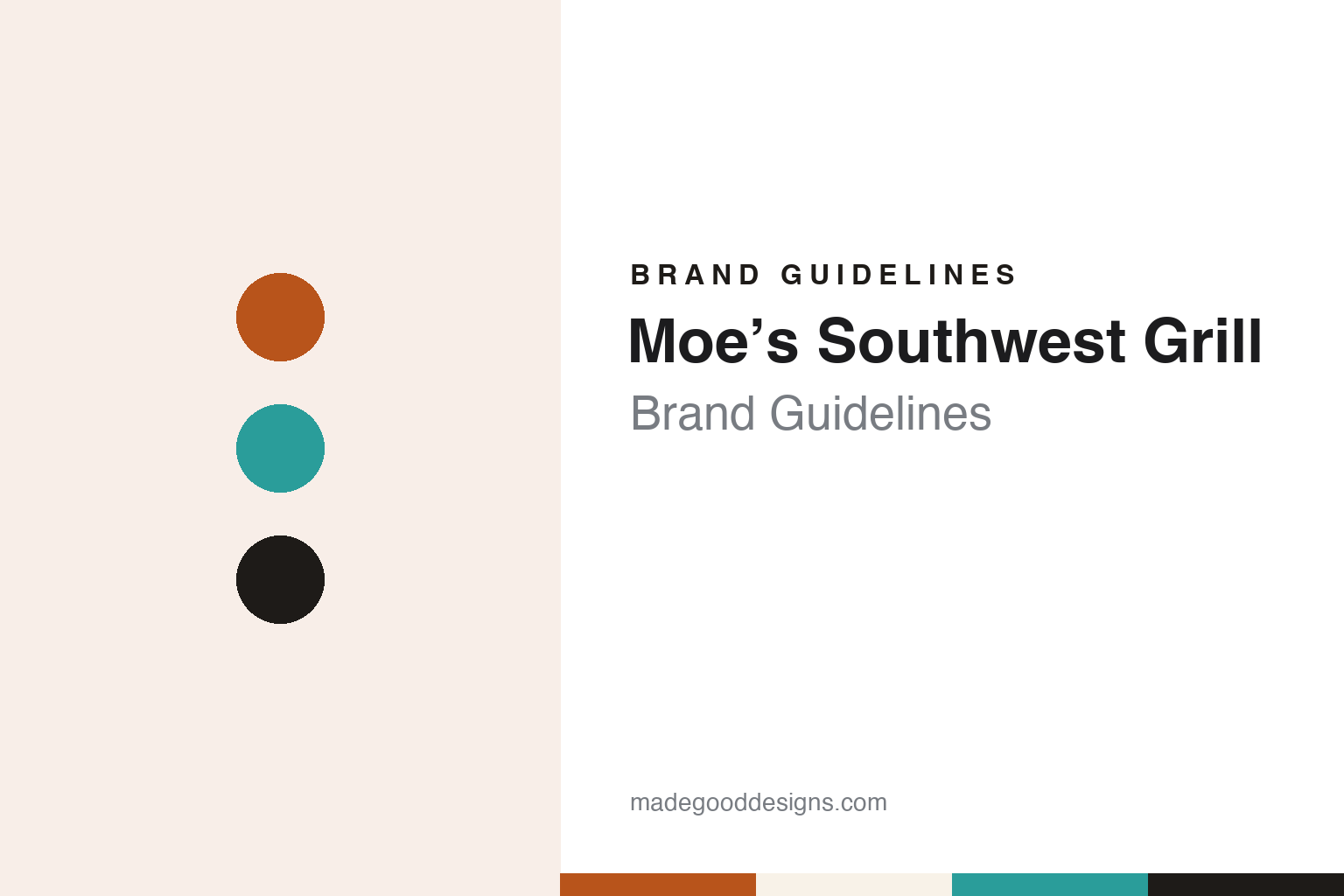
Two constants: a burnt orange, turquoise and charcoal palette and a condensed counter sans register. Abstract homage — not a Moe’s Southwest Grill product or mark; no sign, cup or logo is reproduced.
Welcome to Moe’s
A Buckhead burrito counter and a name that is not a person.
Moe’s Southwest Grill began in 2000 on Peachtree Road in the Buckhead district of Atlanta. The local news site ToNeTo Atlanta said so in October 2018, naming the restaurateur Martin Sprock as the man who started it, and the Buckhead newspaper later published as Rough Draft Atlanta reported in April 2007 that Sprock had founded Moe’s in 2000 and that the chain was part of his Raving Brands portfolio.
The name is not a person’s. The same 2007 report said Moe’s stands for “Musicians, Outlaws and Entertainers”, and the company still explains it that way. In a September 2023 cover story in Retail & Restaurant Facility Business, Moe’s chief brand officer Tory Bartlett said many people assume the chain was named after someone called Moe, and that a mural in its dining rooms now tells the story of the acronym. The same article describes quirky menu names as part of the brand, and Bartlett said the company wanted its food, music and décor to fit together.
Part of the brand is spoken rather than drawn. The company says on its website that employees at the first Moe’s, in Atlanta in 2000, shouted “Welcome to Moe’s!” at the first guests, and that the phrase has defined its culture ever since. Bartlett called the greeting the brand’s “signature calling card” in 2023 and said research showed the restaurants’ atmosphere was one of the brand’s main differentiators.
The original visual identity was bright and informal. Nation’s Restaurant News reported in March 2018 that Moe’s had used the same logo since it was established in 2000, built on stark red lettering with a chili-pepper apostrophe, and ToNeTo Atlanta described the restaurant’s name in red letters on a circular yellow background.
Colour
From Raving Brands to Focus Brands and GoTo Foods.
In 2007 Moe’s changed hands. Rough Draft Atlanta reported on 20 April 2007 that Focus Brands, the franchising company owned by the Atlanta private equity firm Roark Capital Group, had agreed to buy Buckhead-based Moe’s Southwest Grill from Raving Brands for an undisclosed price, with the deal expected to close that summer. At the time, the report said, Focus owned Schlotzsky’s, Carvel, Cinnabon and Seattle’s Best Coffee International. ToNeTo Atlanta later summarised the history in 2018 as a chain started by Sprock and sold to Focus Brands, a division of Roark, in 2007.
The parent company itself has since been renamed. Restaurant Dive reported on 20 February 2024 that Focus Brands had become GoTo Foods, with chief executive Jim Holthouser announcing the change at the company’s biennial franchisee conference and FocusBrands.com redirecting to GoToFoods.com. The report listed Moe’s Southwest Grill alongside Auntie Anne’s, Carvel, Cinnabon, Jamba, Schlotzsky’s and McAlister’s Deli, and said the company described the renaming as part of its move toward being a platform company with shared systems across its brands. GoTo Foods, still owned by Roark Capital, has owned Moe’s since 2007.
Within that group Moe’s remains headquartered in Atlanta, as both the 2018 and 2023 trade reports describe it. In the 2023 cover story Bartlett said the chain planned to open restaurants in traditional streetside sites and also in non-traditional locations such as college campuses, military bases, airports, casinos and travel plazas, using new formats designed for different kinds of real estate.
Typography
Design and documentation.
A restaurant brand is read from the road before it is read on a plate. Its identity lives in a building’s outline, a sign raised high enough to be seen from a moving car, a colour picked to stand out against sky and asphalt, and a name lettered on a menu, a placemat, a cup and a uniform. For chains that grew along highways or around a theme, the roofline, the dining room and the mascot can carry as much of the brand as the logo itself.
That identity can also outlast the business that made it. Restaurants change owners, franchisees rebrand or close individual sites, and a name can pass from one company to another or be split between different trades. A sign, a roof shape or a character may stay familiar long after the company behind it has changed.
Each guide below sets out who started the brand, where and when, who has owned it since, and how its name, signs, buildings and mascots have changed. It separates what independent, dated sources record from what the company says about itself, and marks plainly what rests on the company’s own word.
Aa
A condensed counter sans — the register of a menu board and a window sign. (Specimen set in Oswald, a sans-serif STAND-IN; NOT the Moe’s Southwest Grill logo.)
Moe’s Southwest Grill
Less whimsy, more Southwest, and a greeting on the glass.
The identity was redrawn in 2018. Nation’s Restaurant News reported in March 2018 that Moe’s had registered a new logo with black and orange lettering framed in turquoise, and quoted a Focus Brands spokesperson, Lindsay Haynes, as saying the logo was one part of a new store design being tested. In November 2018 the same publication reported that Moe’s was relaunching around the idea of the “Untamed Southwest”, with the new menu, design and logo appearing first at The Oasis, its test kitchen in Kennesaw, Georgia. Moe’s president Bruce Schroder said the updated logo “reflects a little less whimsy” and uses a muted burnt orange and turquoise, which he described as a nod to the gemstones of Southwestern Native American culture.
Schroder said the old décor was dated. The new interiors, he told the publication, used plenty of colour and textures reminiscent of the Southwest, from sun-bleached, wind-swept materials to table dividers decorated with lizards, and a digital display called the “Window to the Southwest”. Take-out orders were to be collected under a “to-go cactus”. ToNeTo Atlanta reported in October 2018 that a test restaurant on Roswell Road in Sandy Springs had reopened with the new logo and look.
A further refresh followed. Retail & Restaurant Facility Business reported in September 2023 that Moe’s had finalised a pared-down prototype in December 2022 and that its interiors were being aligned with a new logo and colours rolled out in 2021. Bartlett said cups and bowls were now colour-coded by size, with simpler graphics and the logo placed prominently in the brand colours, and that new graphics, directional signage, floor mats, the dining-room Mantra Mural and “Welcome to Moe’s!” lettering on the front windows were meant to make the greeting visible from the street before a guest walks in.
For a design guide, Moe’s Southwest Grill shows how a spoken greeting and an acronym can do as much brand work as a logo, and how a chain can move from red-and-yellow whimsy to a quieter Southwestern palette while keeping its greeting. Compare it with Chipotle, another burrito chain built around its counter, and Taco Bell. For this guide we use burnt orange, turquoise and charcoal with a sans, an unofficial interpretation; no product or logo is reproduced.
Explore & save
Keep Moe’s Southwest Grill’s identity on hand — save it to a board in the Made Good inspiration library.
Moe’s Southwest Grill identity set
Pin the Moe’s Southwest Grill burnt orange, turquoise and charcoal palette and the condensed counter sans register to your own board.