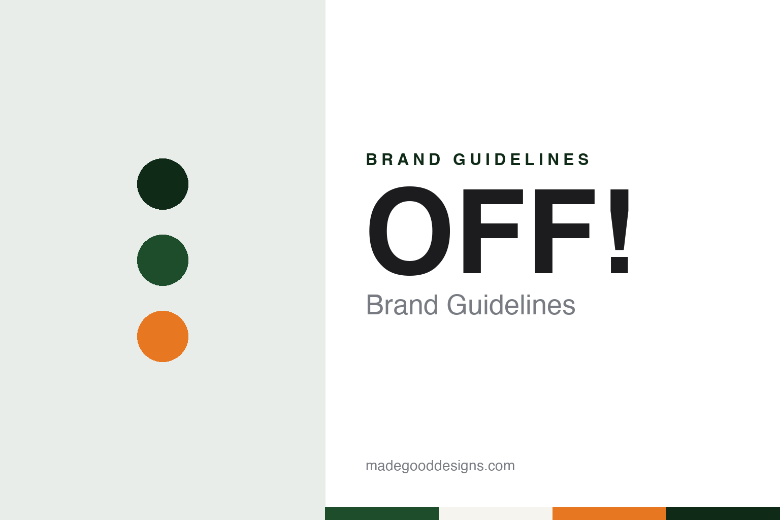
OFF! Brand Guidelines
S. C. Johnson’s insect repellent, launched in 1957.
Aa
Two constants: an evening green, dusk orange and porch white palette and a heavy exclamation sans register. Abstract homage — not an OFF! product or mark; no can, bottle, logo or label is reproduced.
A Racine company
A household-products maker that went outdoors in 1957.
OFF! is the insect repellent brand of S. C. Johnson & Son, the American household-products company based in Racine, Wisconsin. English Wikipedia records that S. C. Johnson was founded in Racine in 1886 by Samuel Curtis Johnson Sr., that it is privately held, and that it describes itself as “a family company.” Its headquarters is the Johnson Wax Headquarters in Racine.
The brand’s starting date is 1957. English Wikipedia gives that year for the first sale of OFF!, citing a Harvard Business School leadership database, and S. C. Johnson’s own website says the same: on a page about its insect science, the company lists 1957 as “the year we launched our first repellent brand, OFF!”.
S. C. Johnson ties the launch to its research. The company says it “opened our first insect research center in 1957, the same year we launched our first insect repellent.” It names that work today as the SC Johnson Center for Insect Science and Family Health, and says the center has two main priorities: product evaluation and development, which it says covers personal and area repellents and insecticides, and applied entomology research, in which researchers study insect behaviour. The company says both are supported by an insect-rearing facility it calls the Insectary. Those are the company’s descriptions of its own work.
OFF! sits in a portfolio of household names. English Wikipedia lists S. C. Johnson’s brands as including Raid, Windex, Scrubbing Bubbles, Glade, Ziploc, Pledge and Kiwi, as well as repellent and insecticide names used outside the United States, such as Autan and Baygon. That places OFF! beside cleaning products, food storage and shoe care rather than inside a garden-chemicals business.
Colour
A word, a mark of punctuation and a register.
The name is the identity. English Wikipedia gives the brand as Off! and notes that it is stylised as “OFF!” — in capitals, with an exclamation mark. S. C. Johnson writes it the same way on its own pages, followed by a registered-trademark sign. A three-letter word and a single mark of punctuation make a name that works as an instruction as much as a label, and the punctuation is part of the spelling rather than decoration.
The mark has been redrawn over time. The logo shown on the brand’s English Wikipedia page is captioned as the one used from 2009 to 2015, which places at least one change of logo in 2015.
What goes inside the packaging is set out in public documents rather than marketing. English Wikipedia names the active ingredients used across the range as DEET (N,N-diethyl-m-toluamide) or metofluthrin, citing a registration document from the New York State Department of Environmental Conservation for a product called the OFF! Insect Repellent Fan. That document is a regulator’s record of a registration, not a statement about how well any product works, and we use it only to show that the range spans both products applied to skin or clothing and area devices.
The brand also travels. English Wikipedia lists markets for OFF! that include the United States, Canada, the Philippines, Germany, Finland, Poland, Australia, Thailand, Malaysia, Turkey and South America. A name built from a short English word and an exclamation mark carries across those markets without translation, while S. C. Johnson uses other names, such as Autan, for repellents in some countries, according to the same Wikipedia list of its brands.
For a designer, that combination — a single word in capitals, a fixed piece of punctuation and a range that runs from personal sprays to area devices — is the core of the identity to respect.
Typography
Bottles, warnings and mascots.
Garden-care and pest-control brands share the shelf with paint, cleaning products and hardware, and they have to be read quickly by someone standing in a store aisle or a garden centre. Their identities are carried by a few repeated signals: a bottle, bag or can in a single strong colour, a name set large on the front panel, and, for some, a mascot or a short slogan that has run in advertising for years.
These packs also carry text the brand does not choose. In the United States, pesticide products are registered with the Environmental Protection Agency, and their labels set out directions for use, precautionary statements and a registration number. That regulatory panel sits beside the brand’s own graphics on the same container, so the designed part of the label and the required part have to work together.
Some of the names in this group have changed owners more than once, while others have stayed with the company that launched them. Each guide in this group sets out who started the brand, who owns it now and how its name and packaging are presented, and marks plainly what rests only on the company’s own word.
Aa
A heavy display sans for a three-letter name and its exclamation mark. (Specimen set in Archivo Black, a sans STAND-IN; NOT the OFF! logo.)
OFF!
A family company’s repellent name.
Ownership has not moved. OFF! has belonged to S. C. Johnson since its launch in 1957, and English Wikipedia records the company as privately held and family-owned, with Herbert Fisk Johnson III as chairman and chief executive.
That continuity shows in how the brand sits inside the company. On its insect-science page S. C. Johnson presents OFF! as its first repellent brand and links it to the research center it says it opened in the same year. The company’s account of its own history therefore puts the brand and the laboratory side by side from the beginning.
Its neighbour on the shelf is a sibling. Raid, the S. C. Johnson insecticide, covers the indoor and outdoor pest side of the same company’s range, while OFF! covers repellents. For a designer working across both, the two names show one company running separate identities for related jobs rather than folding them into one master brand.
The brand’s most stable assets are typographic. The capitals and the exclamation mark have stayed in the name even as the logo has been redrawn, and English Wikipedia’s dating of one logo to 2009–2015 is a reminder that the drawing changes while the spelling does not. A design system for a brand like this starts from the word itself: weight, spacing and the shape of the punctuation, then colour.
For a design guide, OFF! shows how a short name with fixed punctuation can carry a brand across decades and markets under a single family owner. Compare Raid, its S. C. Johnson sibling, and Windex, another of the company’s household names. For this guide we use an evening green, a dusk orange and a porch white with a heavy sans, an unofficial interpretation; no product or logo is reproduced.
Explore & save
Keep OFF!’s identity on hand — save it to a board in the Made Good inspiration library.
OFF! identity set
Pin the OFF! evening green, dusk orange and porch white palette and the exclamation sans register to your own board.


