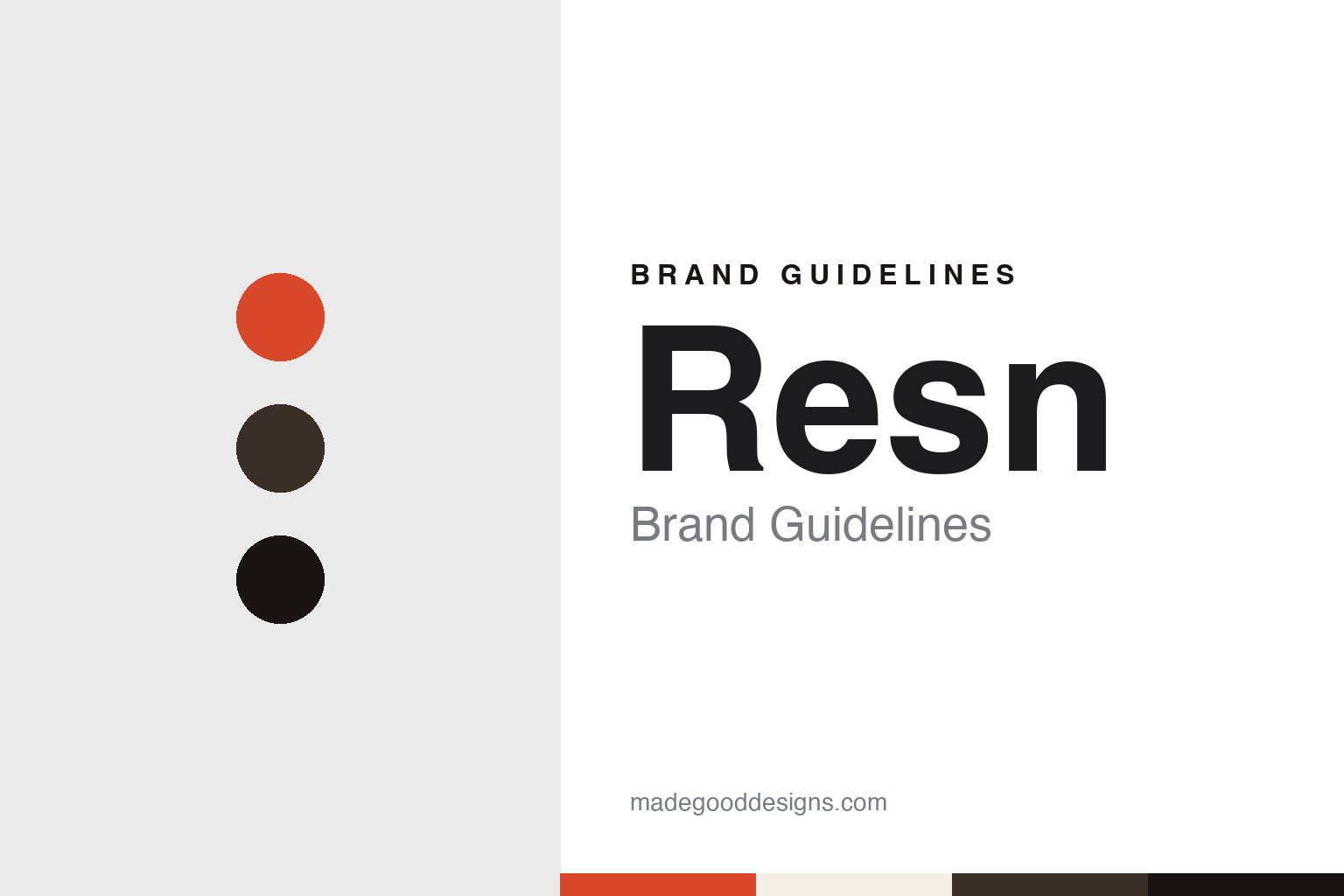
Resn Brand Guidelines
A comfortable cave, working in other time zones.
Aa
Two constants: a harbour red, veneer brown and cave black palette and a Compact grotesque register. Abstract homage — not a Resn asset or mark; no logo, icon or wordmark is reproduced.
Two friends and a Wellington studio
Wellington, 2004.
Resn is a creative digital production company from New Zealand that works within the advertising industry. Wikipedia says it was founded in 2004 by Rik Campbell and Steve Le Marquand. The New Zealand business site eCommerceNews, in a report published on 12 February 2018, said Resn was established in Wellington in 2004, and gave Campbell’s title as managing director and Le Marquand’s as global creative director. Idealog, carrying a StopPress story on 13 February 2018, described Campbell as co-founder and managing director.
From the start the studio looked offshore. Idealog profiled the company on 10 July 2013 in an interview by Sim Ahmed, describing it as a Wellington-based digital agency that had long had ambitions beyond New Zealand and whose clients were mostly overseas. Business development director Matt Walsh told the magazine that the company was almost entirely working on overseas projects, and that while it would like local clients, budgets for digital work were smaller at home. He said the time difference with Los Angeles was not really an issue; the harder part was persuading clients to take a leap with a studio they met mainly over video calls, when competitors in New York, Los Angeles and London could meet clients in person.
Walsh also explained how the studio hires. He said a degree was welcome but did not weigh heavily in its decisions, and that Resn looked for people with the self-drive to build their own skills and portfolios. He described the company as developer-heavy but not tied to any single programming language, with developers who worked across several. Resn had once been strongly associated with Flash, he said, and as that changed the studio expected the same to happen with other frameworks, so a mix of skills mattered. He added that most of the company’s production would continue to happen in New Zealand.
Wellington remained the home base. Stuff, in an “Inside the office” piece by Maria Slade published on 13 August 2014, described Resn as a Wellington creative digital production company and said all of its business was overseas, with much of it for the advertising industry in the United States. Campbell told the paper that the studio often worked into the night because of its clients’ hours, and that bunks had been installed for that reason.
Colour
From Wellington to Amsterdam and Shanghai.
The move abroad began in Europe. Walsh told Idealog in July 2013 that Resn had once handled London projects out of Paris, with most of the development still done in Wellington, and that it had been a real struggle. He said that was the main reason the company set up an office in Amsterdam in February 2012, to work with European clients. Asked why Amsterdam, he said the city was a hub of advertising and also produced many highly skilled developers, and that the studio needed access to strong developers to make an overseas office work.
Campbell gave a similar account a year later. He told Stuff in August 2014 that the Amsterdam office had been set up to serve European clients, because it was very hard to appeal to clients when a studio was not working in their daylight hours. He said it also helped Resn keep young staff when they set off on their OE, their overseas experience, and that the Amsterdam team was a mix of new hires and existing Resn people spending time there. Wikipedia lists the company’s offices as Wellington and Amsterdam.
Asia followed. eCommerceNews reported in February 2018 that Resn had expanded into Asia in May of the previous year by opening an office in Shanghai, China, and Idealog described the same Shanghai opening that month. Idealog also named Kris Hermansson as creative director of Resn Amsterdam, and quoted him saying the studio approached everything with deadly intent.
The Wellington studio itself is a large part of Resn’s identity in the press. Stuff reported in 2014 that the company’s old offices had a 1970s veneer built into them, which Campbell said the team had been quite comfortable with. When Resn moved to a new space on Wakefield Street, he said, it decided to keep that character and take it further, hence the objets d’art and a retro computer collection. Campbell told the paper the team liked having lots of quirky things around them, and called the result a kind of comfortable cave.
He also explained what the office was not. Because Resn’s clients were overseas, he told Stuff, the space had not been fitted out with visiting clients in mind: there were no big silver letters on the wall, not everything was white, and the studio was not trying to look professional in the way he said many offices worried about.
Typography
A studio site as the logo in motion.
Digital and interactive studios rarely have a product on a shelf, so the name and the website carry the identity work. Many of the names are made up rather than descriptive: a word with a numeral attached, a film-industry term borrowed and hyphenated, a phrase that hints at a way of working. The same name can also be written several ways over the years. Trade magazines may print it in lower case while the studio’s own site sets it in capitals, and a hyphen or a numeral can become a distinctive part of the mark.
The studio website is usually the main brand surface. It works as a portfolio, with full-screen video and case studies in front and the typography kept plain. Office cities are often written as short codes along the top of the page, and project credits, director rosters and archives are treated as part of the brand, because they show who made what and when.
These identities also change shape as the business changes. Studios open and close offices, split a film arm from an agency, or fold their work into new ventures under the original name. When reading them, look at how the name is set across the website, the credits and the trade press, how the studio lists its cities, and what it keeps from earlier eras in its archive.
Aa
A compact grotesque — after a short four-letter studio name set with a single capital. (Specimen set in Archivo, a sans STAND-IN; NOT the Resn logo or any Resn typeface.)
Resn
Client work and in-house tools, as dated facts.
Resn’s client list appears in the record as named brands rather than as a single signature campaign. Wikipedia lists digital productions for Panasonic, Coca-Cola, Ricoh, Toyota, Johnson & Johnson and the All Blacks. eCommerceNews reported on 12 February 2018 that the previous year had included campaigns for adidas, Ford and MailChimp.
The same reports described a move beyond the screen. eCommerceNews and Idealog both said in February 2018 that Resn had built hybrid physical-digital installations, including two projects for adidas called Speedfactory and Kick Creator. Hermansson told eCommerceNews that the studio worked with adidas’s internal teams on both. Le Marquand said that Resn had a team exploring the future of digitally enhanced physical retail.
The company has also built its own technology. Both February 2018 reports named CAKE, an interactive video platform developed by Resn, and said it had been used in projects including MailChimp’s Veilhymn, Pocket Mustang and FAFSWAGVOGUE.COM, an interactive documentary. Campbell described the team’s approach in the same coverage: share, learn and strategise, and then add what he called “the Resn” to each project.
The founders’ roles have shifted with the company. In 2014 Stuff called Campbell co-founder and managing director, and in 2018 he held the same title while Le Marquand was described as global creative director. The office record runs from Wellington in 2004 to Amsterdam in 2012 and Shanghai in 2017.
For a design guide, Resn shows how a studio far from its clients can make distance part of its character, with a Wellington office kept deliberately unpolished and satellite offices placed in its clients’ time zones. Compare Active Theory, a Los Angeles studio with an Amsterdam office, and UNIT9, another digital production company. For this guide we use harbour red, veneer brown and cave black with a sans, an unofficial interpretation; no product or logo is reproduced.
Explore & save
Keep Resn’s identity on hand — save it to a board in the Made Good inspiration library.
Resn identity set
Pin the Resn harbour red, veneer brown and cave black palette and the Compact grotesque register to your own board.


