Sketch Brand Guidelines
A student’s drawing program, a Dutch company and a diamond in the Dock.
Aa
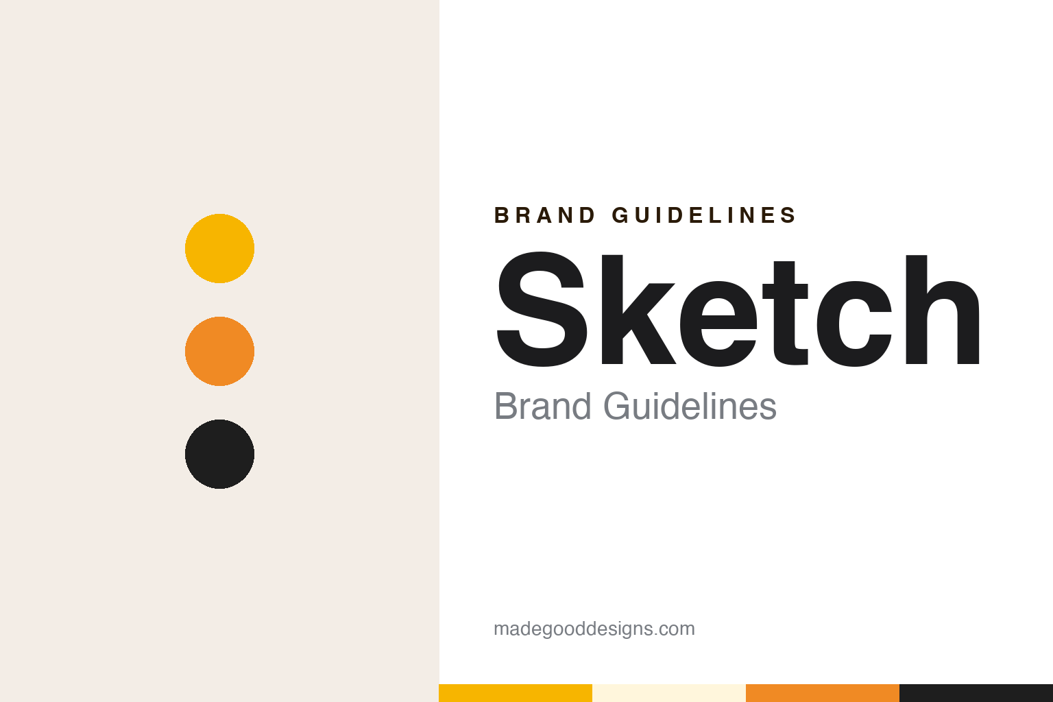
Two constants: a gem amber, facet orange and graphite palette and a rounded geometric sans register. Abstract homage — not a Sketch asset or mark; no logo, icon or wordmark is reproduced.
A student project
From a drawing app to Sketch 1.0.
Sketch began as one student’s drawing program. In an interview published on the LayerVault blog in October 2014, founder Pieter Omvlee told Kelly Sutton that the first code behind the app had been written about nine years earlier, under a different name and for a slightly different purpose, when he was about to begin his computer science studies at the University of Twente in the Netherlands. The idea, he said, was to make a simple drawing application at a time when the independent Mac software scene was much smaller than it later became.
He released early and charged from the start. Omvlee told LayerVault that he launched the app very quickly, perhaps too quickly, and began charging for it right away, because the small income from the first versions helped to support him through his studies. He said the steady feedback from paying customers kept him focused on what they actually wanted, rather than on grand new features dreamed up in isolation.
The company behind the app was called Bohemian Coding. Wikipedia says Sketch, a vector graphics editor for macOS, was first released on 7 September 2010, and that its developer is the Dutch company Sketch B.V., formerly named Bohemian Coding; the release date is cited there to a Bohemian Coding blog post titled “Sketch 1.0 finally released”. The company marked the anniversary itself: in September 2020 the Sketch blog opened a series of posts looking back over the decade with the line that Sketch was ten.
A second founder sits on the design side of the story. In that anniversary series the company introduced Emanuel Sá as Sketch’s co-founder and Chief Design Officer. He told the blog that he came to design from photography, moved into icon design because he could not find replacement icons he liked, and then designed themes for the Mac. He described the MacThemes.net forum of about a decade earlier as a strong influence on interface design, and said that when the iPhone arrived, members of that community were among the people asked to design early iPhone apps, often in the detailed, realistic style known as skeuomorphism.
Colour
A narrow brief and a diamond.
The product’s identity has long been tied to its scope. Omvlee told LayerVault in 2014 that Sketch was a professional digital design application for the Mac, made for people who design interfaces such as websites, mobile screens and icons. He said the team deliberately left out print design and, at that time, prototyping and bitmap editing too, preferring to add depth to core features rather than widen the app’s surface. He named Symbols, added in version 3.0, as one of the carefully chosen additions. Wikipedia notes that Sketch has since added features for prototyping and collaboration.
The app’s mark is a diamond. When Sketch redesigned its Mac app icon for macOS Big Sur, the company blog explained in December 2020 that the new icon arrived alongside a major interface refresh in version 70. Design lead Prekesh told the blog he began with concepts drawn on an iPad, some of them far from the original, before coming back to the diamond, which he called a strong part of the brand. The team tried diamonds with and without perspective and with more or fewer facets, then settled on a window-and-diamond idea on a simplified backdrop, with a subtle transparency in the sidebar. He used Blender to make rough 3D renders as a lighting reference, and a slightly tilted 3D diamond was drawn as part of the same project.
How Sketch is sold has also shaped how people meet the name. Business Insider reported on 1 December 2015 that Sketch had left the Mac App Store, citing a blog post by its developer, Bohemian Coding. The reasons the developer gave were Apple’s technical limits on what apps can do, the time taken by app review, and the lack of a way to charge customers for major upgrades. Wikipedia says the app was then sold through the company’s own website instead.
That arrangement still frames the company’s message. Its About page today says Sketch is an independent company focused on a Mac app for UI and UX designers, that it has been around since 2010, and that customers can either buy a licence and keep a copy of the app or take a subscription that adds cloud storage and web-based collaboration tools.
Typography
Wordmarks, symbols and screens.
Design software carries its identity on surfaces that most brands never have to think about. The first is the app icon: a square of a few hundred pixels that sits in a dock, a taskbar or a launcher beside dozens of others, and that has to be recognisable at a size smaller than a fingernail. Icons for creative tools are often redrawn when an operating system changes its visual language, so a single program can accumulate several generations of icon over its life.
The second surface is the splash screen or start window, the image that appears while the program loads. For many users it is the moment they see the product name at full size, and it is frequently refreshed with each major release.
A third surface is the file format. A document extension appears in file names, in email attachments and in folder listings, and a distinct document icon lets a user spot a working file among exports. The extension often outlives the interface around it.
Finally, release names and version numbers act as a kind of sub-brand. A numbered release, a year-based name or a renamed edition tells users which generation of the tool they have, and the way a developer numbers its versions becomes part of how the product is talked about.
Aa
A rounded geometric sans — after a short, lowercase-friendly product name. (Specimen set in Manrope, a sans STAND-IN; NOT the Sketch logo, wordmark or any Sketch typeface.)
Sketch
A remote team and a single symbol.
Sketch is made today by Sketch B.V. in the Netherlands, Wikipedia says. The team has worked at a distance from the beginning. Omvlee told LayerVault in 2014 that Bohemian Coding was a remote team that communicated mostly through chat and its issue tracker, and that he had never worked anywhere with everybody in the same physical space. He said the designers’ mockups were meant to be clear enough to tell a developer everything they needed, without the two having to sit together.
The story also turns on timing. Omvlee told LayerVault that the day Adobe announced it was abandoning Fireworks was a milestone for Sketch, because many people began looking for alternatives, and that Adobe’s move to subscriptions as the only way forward had a similar effect. He also pointed to version 3.0 as a step up, crediting general polish across the app as much as any single new feature.
The brand kit is small. The name is a plain English word for a quick drawing. The symbol is a faceted diamond, kept through the 2020 icon redesign rather than replaced, and the company’s About page offers a media kit with logos, app icons and screenshots for the press. The name also travels inside the work: Wikipedia says designs are saved in Sketch’s own .sketch file format and can be exported to PNG, JPG, SVG and PDF, so the word appears on every file a designer sends.
For a design guide, Sketch shows how a single gem-like symbol can be redrawn for a new operating system without losing what people recognise, and how a narrow product brief can become part of a brand’s character. Compare Figma, another tool for interface designers, and Affinity, another family of design apps. For this guide we use gem amber, facet orange and graphite with a sans, an unofficial interpretation; no product or logo is reproduced.
Explore & save
Keep Sketch’s identity on hand — save it to a board in the Made Good inspiration library.
Sketch identity set
Pin the Sketch gem amber, facet orange and graphite palette and the rounded geometric sans register to your own board.