Snøhetta Brand Guidelines
A mountain’s name, carried from an Oslo attic.
Aa
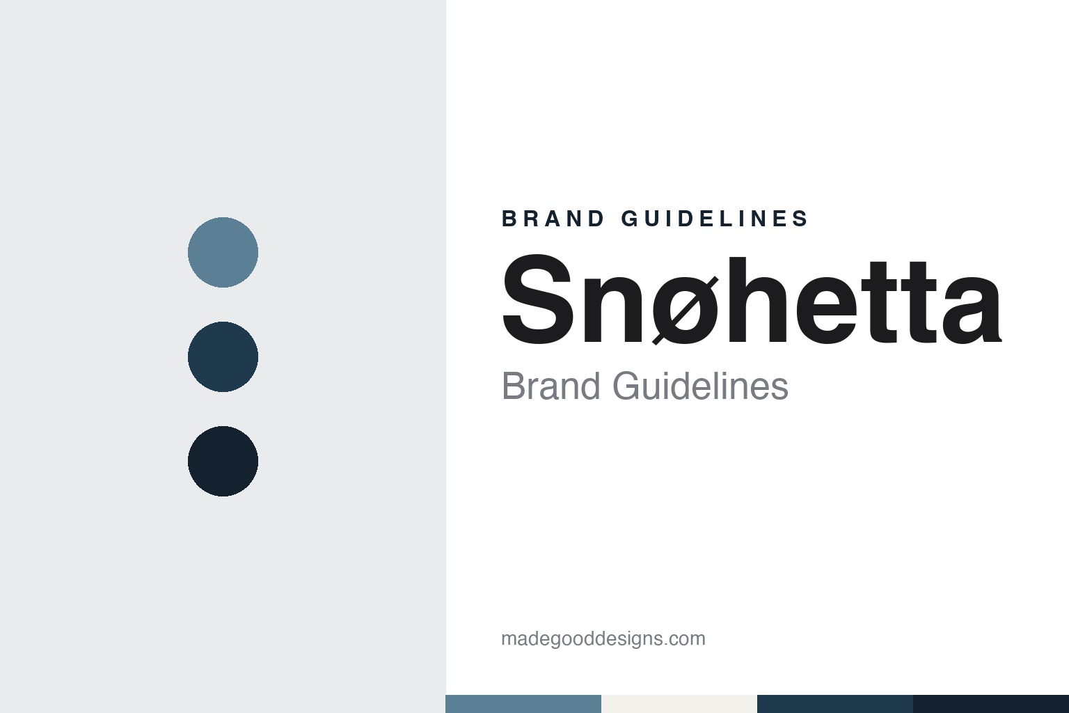
Two constants: a fjord grey, deep fjord and night granite palette and a Humanist sans register. Abstract homage — not a Snøhetta asset or mark; no logo, icon or wordmark is reproduced.
A collective named after a mountain
Oslo, 1987.
Snøhetta is named after a mountain. Dezeen reported on 11 December 2019, in an interview marking the practice’s 30th anniversary, that a collective of Norwegian architects and landscape architects borrowed the name from a peak in Norway’s Dovre region because their first office was in the attic above a pub called the Hall of Dovre. Co-founder Kjetil Trædal Thorsen had been part of that collective. When he teamed up with the US-based architect Craig Dykers, Dezeen said, the two carried on both the name and the collective’s landscape-oriented approach.
Thorsen dated the beginnings to 1987. He told Dezeen that in that year there was “a very loose constellation of landscape architects and architects”, with both professions present from the start. English Wikipedia places the group in an office space in Storgata in Oslo in 1987 and gives its early name as Snøhetta arkitektur . landskap, setting the words for architecture and landscape side by side with a dot between them.
The practice itself is usually dated two years later. Dezeen said in its 2019 interview that Thorsen and Dykers founded Snøhetta in 1989, together with a group of other architects who have since left the firm, after winning the competition for the Bibliotheca Alexandrina in Alexandria, Egypt. At the time, it added, neither of them had ever completed a building.
Wikipedia describes that contest as an open and anonymous competition, entered in 1989, to design a new library recalling the ancient Library of Alexandria. It says the design sets a large circular form beside the Alexandrian harbour under a tilting roof, and that the façade is a field of carved letters and symbols. Wikipedia says the building was completed in 2001.
Thorsen told Dezeen the library was drawn by hand, with no renderings and no building information modelling. He said working in Egypt meant listening to find out what was happening locally, adding that the team “had to be contextual from the very beginning”. A second major public building followed: Dezeen reported on 13 January 2025 that Snøhetta won the competition to design the Oslo Opera House in 2000, just as construction was completed on the library in Alexandria, its first major commission.
Colour
Architecture and landscape in one name.
The name Snøhetta is a place name rather than a list of partners, and that sets it apart from many architecture practices that carry their founders’ surnames. The mountain stays in the name, while the founders’ own names do not appear in it at all. The early form, Snøhetta arkitektur . landskap, spelled out the two disciplines the collective wanted to join, and Thorsen told Dezeen in 2019 that merging architecture and landscape “came very naturally” to the group.
He explained the reasoning in practical terms. “We were seeing at the time that construction projects didn’t have budgets for their outdoor areas,” he said, so whatever was left over from construction would be spent on the landscape. “We said that this can’t be the case, because we’re neglecting our public space,” he continued. “This is how we ended up at the Oslo Opera House, where there is no differentiation between public space, building and site.”
Dezeen said in January 2025 that it is the home of the Norwegian National Opera and Ballet, built on the edge of the Oslofjord in the city’s former docklands. The building has a wedge-shaped form with a sloping public plaza as its roof, and its outer surfaces are clad in Norwegian granite and Carrara marble. Inside, an oak “wave wall” wraps the horseshoe-shaped auditorium, and some of the wood was treated with ammonia to darken its tone. Dezeen said the building was completed in 2007, when residents were first invited to climb the roof, and officially opened in April 2008 at a ceremony attended by King Harald.
The practice describes its scope widely. Wikipedia says Snøhetta works across architecture, landscape architecture, interior architecture, product design and art, and publishes books under the name Snøhetta Books. It says the practice has studios in Oslo, Paris, Innsbruck, New York, Hong Kong, Shenzhen and Melbourne.
The mountain returns in the practice’s own routines. Wikipedia says that every other year staff from all the studios gather in Norway for a retreat called Dovre Conversations, in the Dovre mountains, and walk together to the top of the mountain that gave the practice its name. The firm’s philosophy of individual work inside a shared framework, Wikipedia adds, is often called “Singular in the Plural”.
Typography
A place name, a dot and a coastline.
An architecture practice’s identity usually begins with a name, and that name is often a list of founders’ surnames joined by commas and ampersands. Over time those lists tend to compress into initials or a single surname, and the shortened form becomes the working mark on letterheads, drawing sheets and websites. Other studios choose a single word or the name of one designer, which shifts the identity from a partnership to a studio.
Much of a practice’s visual identity lives on working documents rather than in advertising. Title blocks on drawings, the lettering on presentation boards, competition panels and the hoardings that wrap a construction site all carry the practice name, and each sets a typeface, a weight and a placement rule that repeats across projects. Monographs, exhibition catalogues and project books extend the same typography into print.
Physical spaces act as brand surfaces too. A studio’s own office, its reception and the model shop where physical models are built and photographed shape how clients and visitors meet the firm. For a design guide, the useful lesson is restraint: a short name, one typeface used with discipline, and a consistent way of presenting drawings, models and photographs.
Aa
A humanist sans — after a practice name set as one plain word. (Specimen set in Work Sans, a sans STAND-IN; NOT the Snøhetta logo or any Snøhetta typeface.)
Snøhetta
Graphics for a currency.
Snøhetta’s graphic work also reaches Norwegian wallets. Dezeen reported on 8 October 2014 that Norges Bank, Norway’s central bank, had selected pixellated designs by Snøhetta for the back of the country’s new banknotes, alongside designs by the Oslo studio The Metric System for the front. The two studios’ entries beat six others in a competition launched that year, and the bank’s brief asked for designs that conveyed the theme The Sea.
Snøhetta’s entry was called The Beauty of Boundaries. Dezeen said it celebrated places along Norway’s coastline, abstracted into patterns of coloured blocks in different shades. “The beauty of boundaries is about the transition between sea and land, where something meaningful and interesting happens,” Snøhetta said. A different colour leads each note, Dezeen reported: green on the 50 kroner, then red, blue and orange, up to purple on the 1,000 kroner. The bank said the final notes would differ somewhat from the competition designs once security features had been added.
The notes reached circulation in stages. Dezeen reported on 1 November 2018 that the 50 and 500 kroner notes had been released after four years of development, joining the 100 and 200 kroner notes released in 2017. It said this was Norway’s eighth banknote series, and that the coastal motifs appear on one side of each note. The same 2014 report noted that Snøhetta had also designed the graphics for Oslo’s bid to host the 2022 Winter Olympics, a bid the city withdrew.
Dezeen said in 2019 that Snøhetta had expanded beyond architecture and landscape into interiors, products and graphic design, and listed an underwater restaurant, a chair made from recycled fishing nets and the banknote graphics among its projects. The same interview named the National September 11 Memorial Museum in New York among the projects that followed the library and the opera house.
For a design guide, Snøhetta shows how a practice can take its name from a landscape rather than a founder and keep that name through changes of partners, studios and disciplines. Compare Bjarke Ingels Group, a Copenhagen practice known by its initials, and Skidmore, Owings & Merrill, a practice named after its founders. For this guide we use fjord grey, deep fjord and night granite with a sans, an unofficial interpretation; no product or logo is reproduced.
Explore & save
Keep Snøhetta’s identity on hand — save it to a board in the Made Good inspiration library.
Snøhetta identity set
Pin the Snøhetta fjord grey, deep fjord and night granite palette and the Humanist sans register to your own board.