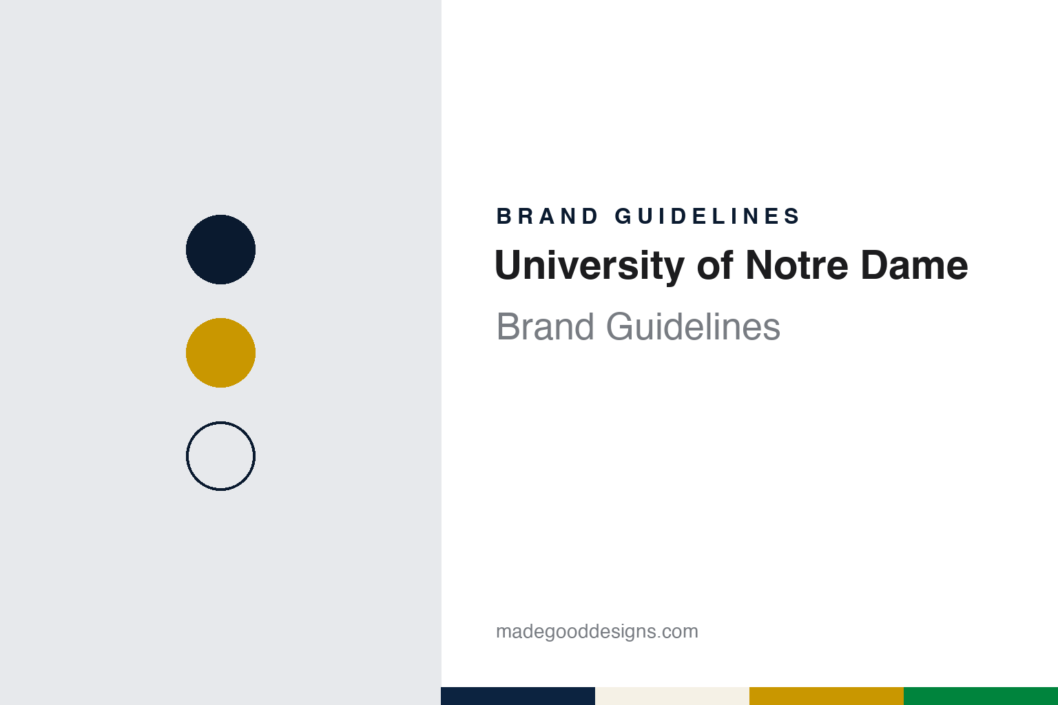
University of Notre Dame Brand Guidelines
Gold leaf on a dome, blue for truth and a leprechaun from an Elkhart drawing board.
Aa
Two constants: a navy, dome gold and Irish green palette and a basilica serif register. Abstract homage — not a Notre Dame mark; no seal, monogram, leprechaun or wordmark is reproduced.
Du Lac
A college named for Our Lady of the Lake.
The full name is a dedication. Wikipedia’s history of the university records that in 1842 the bishop of Vincennes, Célestin Guynemer de la Hailandière, offered a tract of land in northern Indiana to Edward Sorin, a priest of the Congregation of Holy Cross, on condition that he build a college there within two years. The land had been bought in 1830 by Stephen Badin, who had come to the area at the invitation of the Potawatomi leader Leopold Pokagon. Sorin arrived on November 26, 1842 with eight Holy Cross brothers from France and Ireland and started the school in Badin’s old log chapel. In 1844 the Indiana General Assembly granted a college charter under the name University of Notre Dame du Lac — the University of Our Lady of the Lake.
The building at the centre of the identity is the third of its kind. Wikipedia records that a fire destroyed the Main Building and its library in April 1879; the school closed and sent its students home, rebuilding began on May 17, and the new Main Building was finished before the fall semester. That is the building that now carries the dome and the statue of Mary, and it houses the university’s administrative offices, including the president’s.
The gold on top was a matter of argument. The Observer, the student newspaper serving Notre Dame and Saint Mary’s, reported on March 15, 2005 that the dome was added to the Main Building in 1882, and that administrators of the day thought gilding it would be extravagant and suggested yellow paint instead. Quoting the university’s news office, the paper wrote that Sorin insisted on gold, topped the dome with a statue of Mary, and got his way. The same article described the upkeep: the dome is covered by hand in 23.9-karat gold leaf, applied only on dry days without wind, and in 2005 the work was carried out by Conrad Schmitt Studios of New Berlin, Wisconsin, after an evaluation by the University architect rather than on any fixed schedule. The previous regilding had taken place in 1988.
Colour
From yellow and blue to gold and blue.
The colours follow the dome. The university’s athletics department says that when Notre Dame was founded in 1842 its colours were yellow and blue — yellow for light and blue for truth — and that some time after the dome and the statue of Mary on the Main Building were gilded, gold and blue became the official colours. Wikipedia’s article on the university gives the official pair as gold and navy blue, and notes that green is sometimes worn because of the Fighting Irish name.
That third colour has a long, intermittent history on the football field. The athletics department’s own account says the home jersey has switched between blue and green for more than fifty years. In the Knute Rockne era of the 1920s the varsity generally wore blue and the freshmen green, but the varsity sometimes wore green to stand apart from opponents who also wore blue — Navy among them. Coach Dan Devine put the team in green for the game against USC on October 22, 1977, and the team stayed in green until Gerry Faust’s first season in 1981, when it moved to royal blue jerseys with gold and white sleeve stripes. In 1984 the stripes went and the team returned to the plain navy worn in the Ara Parseghian years, with gold helmets and pants unchanged. Under Lou Holtz from 1986 the interlocking Notre Dame monogram was added to the jersey shoulder and the front of the pants.
Through all of these changes the gold helmets and gold pants stayed, the athletics department says, so that the gold of the dome, which The Observer described being laid by hand in 2005, runs through the uniform as it runs through the school colours.
Typography
Design and documentation.
Technical universities tend to build their identities from a small, durable kit: a formal seal or shield for diplomas and ceremonies, a wordmark for everyday communication, a short list of official colours, and a separate family of athletic marks that carries the same colours onto uniforms, courts and stadium walls. Because engineering and science schools often grew out of trade institutes or land-grant charters, their earliest symbols tend to be practical rather than heraldic, and later identity programmes usually tidy those older marks rather than replace them.
Colour does much of the work. Two-colour schemes, frequently a metallic gold paired with a dark neutral or a saturated red, are fixed by name long before they are fixed by number, so modern guides translate a traditional colour into print, screen and thread specifications. Some campuses add a registered tartan, which turns a colour story into a woven pattern for scarves, pipe bands and graduation regalia.
Mascots extend the system into three dimensions. Costumed characters, live animals and restored vehicles, from vintage cars to locomotive replicas, appear at games and parades, and each one is usually governed by its own usage rules alongside the logo, so that a single colour pair and a consistent letterform hold the whole family together.
Aa
A basilica serif for a dome-and-quad identity. (Specimen set in Cormorant Garamond, a serif STAND-IN; NOT a Notre Dame typeface or logo.)
University of Notre Dame
Fighting Irish, then a leprechaun.
The name of the teams arrived slowly. The University of Notre Dame Archives describe team names in the nineteenth and early twentieth centuries as very fluid: sports writers used Catholics, Hoosiers, Rockmen, Ramblers and others, sometimes several in one article, until Fighting Irish began to stick in the 1920s. Wikipedia’s article on Notre Dame athletics quotes the Detroit Free Press writer E. A. Batchelor after the 1909 game against Michigan — “Eleven fighting Irishmen wrecked the Yost machine this afternoon” — and records the term in the student magazine Scholastic by 1912 and in the Notre Dame Football Review by 1917. Francis Wallace, a student press agent for Knute Rockne, tried to promote “Blue Comets” from 1923 before giving up and helping to spread Fighting Irish in New York newspapers. In 1927 the university president, Matthew J. Walsh, authorised it as the official name, saying it seemed to embody the spirit the university liked to see in its teams.
Before the leprechaun there were dogs. The archives record that in January 1924 the Notre Dame alumni club of Toledo presented Rockne with an Irish terrier, named Tipperary Terrence after a student contest, and a series of terriers followed over the next four decades, several of them under the name Clashmore Mike.
The leprechaun replaced them in the 1960s. In a letter to The Observer published on March 28, 2007, the university’s assistant vice president for news and information, Dennis K. Brown, wrote that according to University records the leprechaun character was designed by Ted Drake of Elkhart, Indiana, and used from 1964; Drake, he added, also created the logo of the Chicago Bulls, drew several Notre Dame football program covers and did the print artwork for the children’s programme Kukla, Fran and Ollie. The Observer filled in how the commission came about in a report of November 23, 2014: according to the family of Jim T. Butz, a 1949 graduate who worked at Wilson Sporting Goods, the university wanted to replace the terrier in the mid-1960s, and Butz suggested Drake, an illustrator for Wilson. His son recalled the request as a symbol that would express the school’s Irish heritage. Butz passed the drawing to the university, and in 1965 the leprechaun became the official mascot. Wikipedia notes that the figure, fists raised, appeared on the cover of Time in November 1964 and that the mark was registered when it became the official mascot.
For a design guide, the University of Notre Dame shows how a single material can carry an identity — gold leaf on a dome that became gold in the school colours and on the football helmet, with a commissioned cartoon for the sporting side. Compare Duke University and Princeton. For this guide we use navy, dome gold and Irish green with a serif, an unofficial interpretation; no product or logo is reproduced.
Explore & save
Keep University of Notre Dame’s identity on hand — save it to a board in the Made Good inspiration library.
University of Notre Dame identity set
Pin the navy, dome gold and Irish green palette and the basilica serif register to your own board.